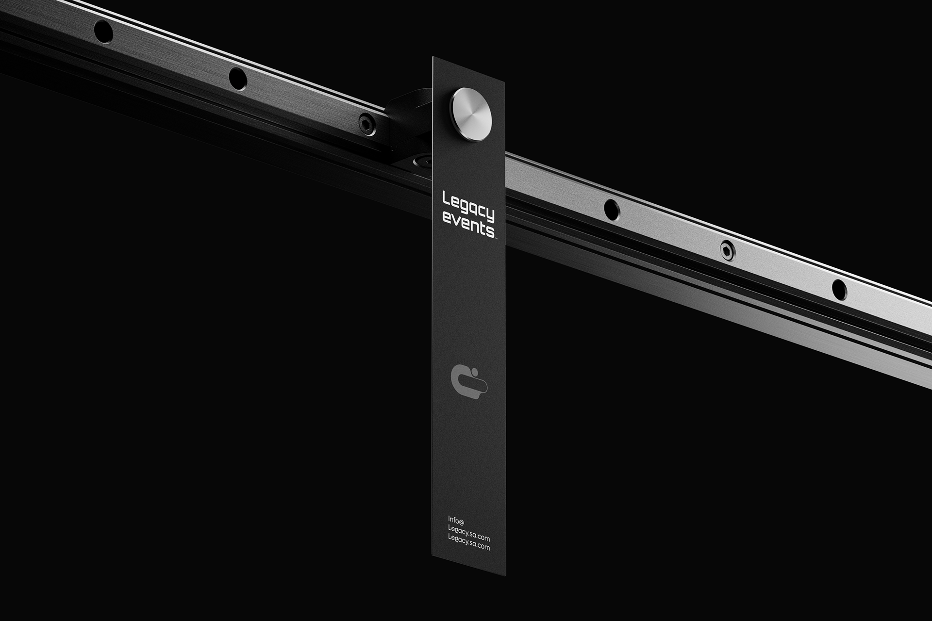
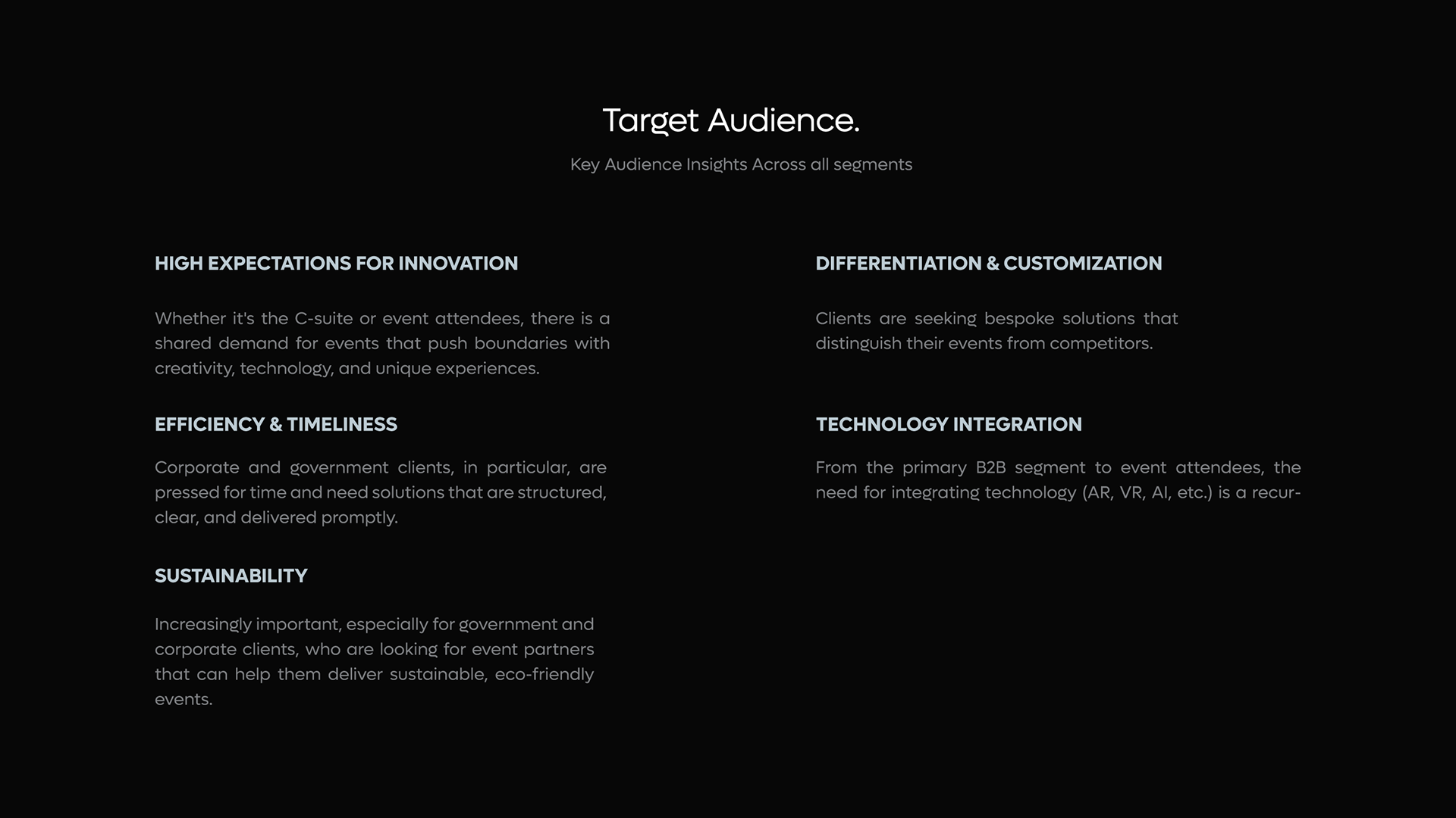
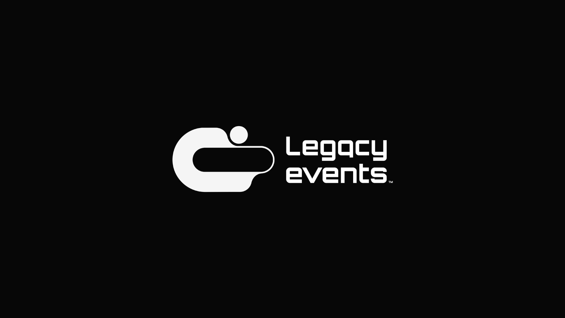
Legacy Events - Strategic Brand Development
ABOUT
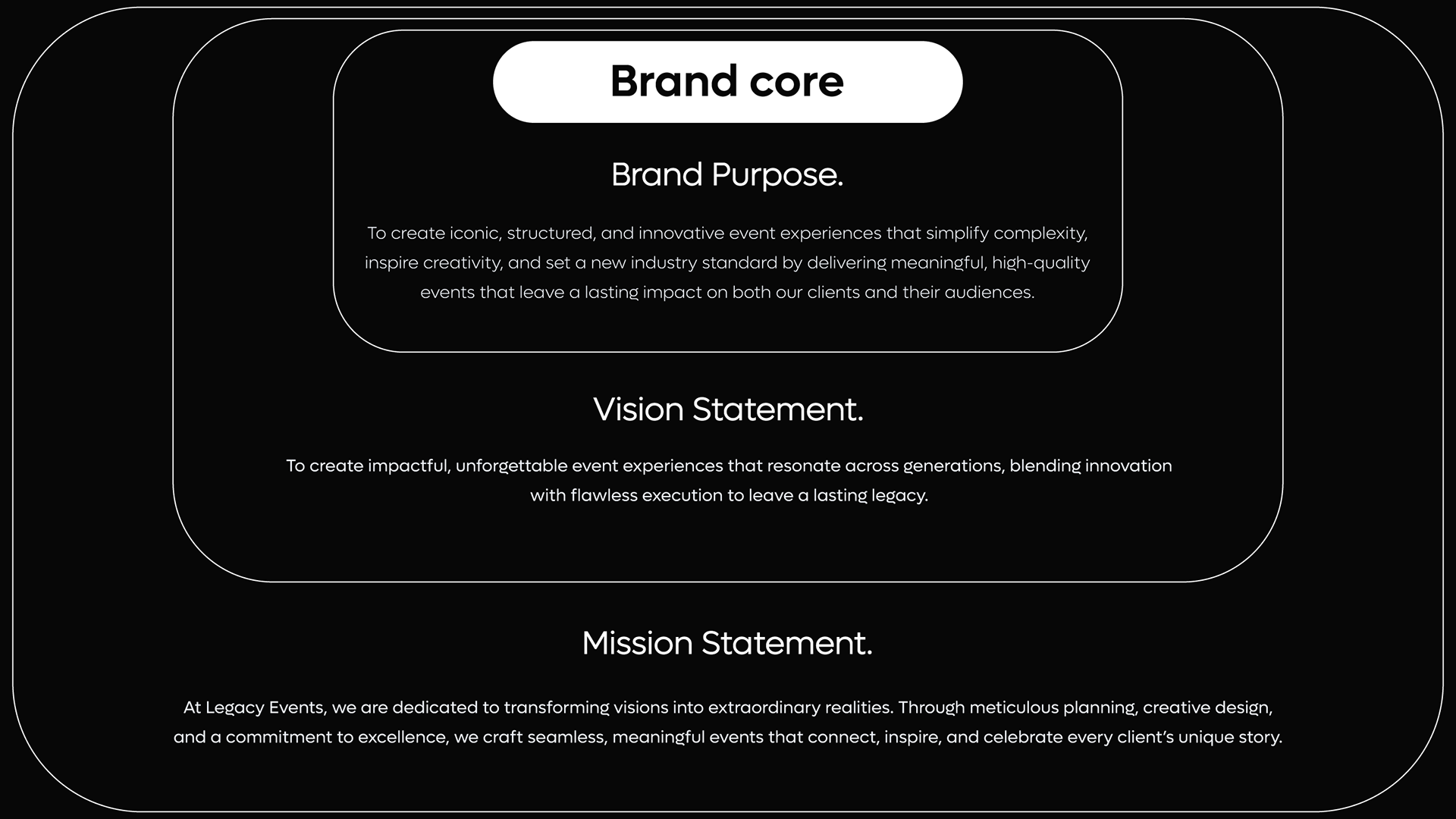
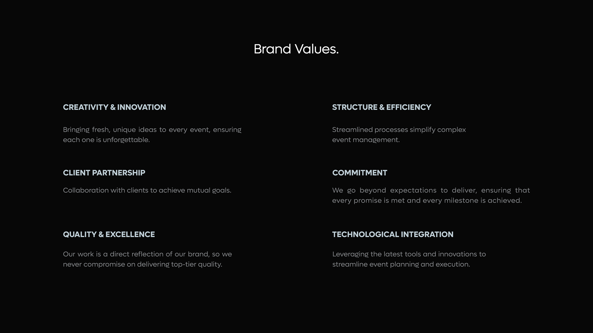
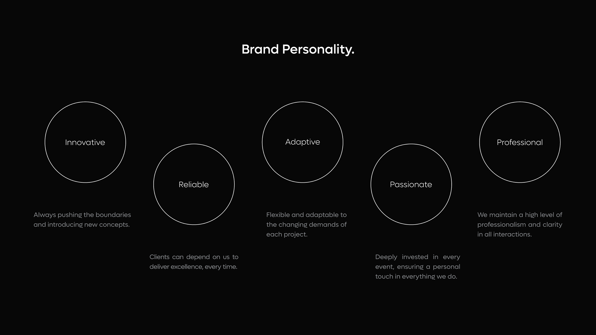
Legacy Events is a forward-thinking event management company focused on delivering structured, innovative, and high-impact experiences for corporate and government clients. The company specializes in simplifying complex event execution through precision planning, creative direction, and technological integration.
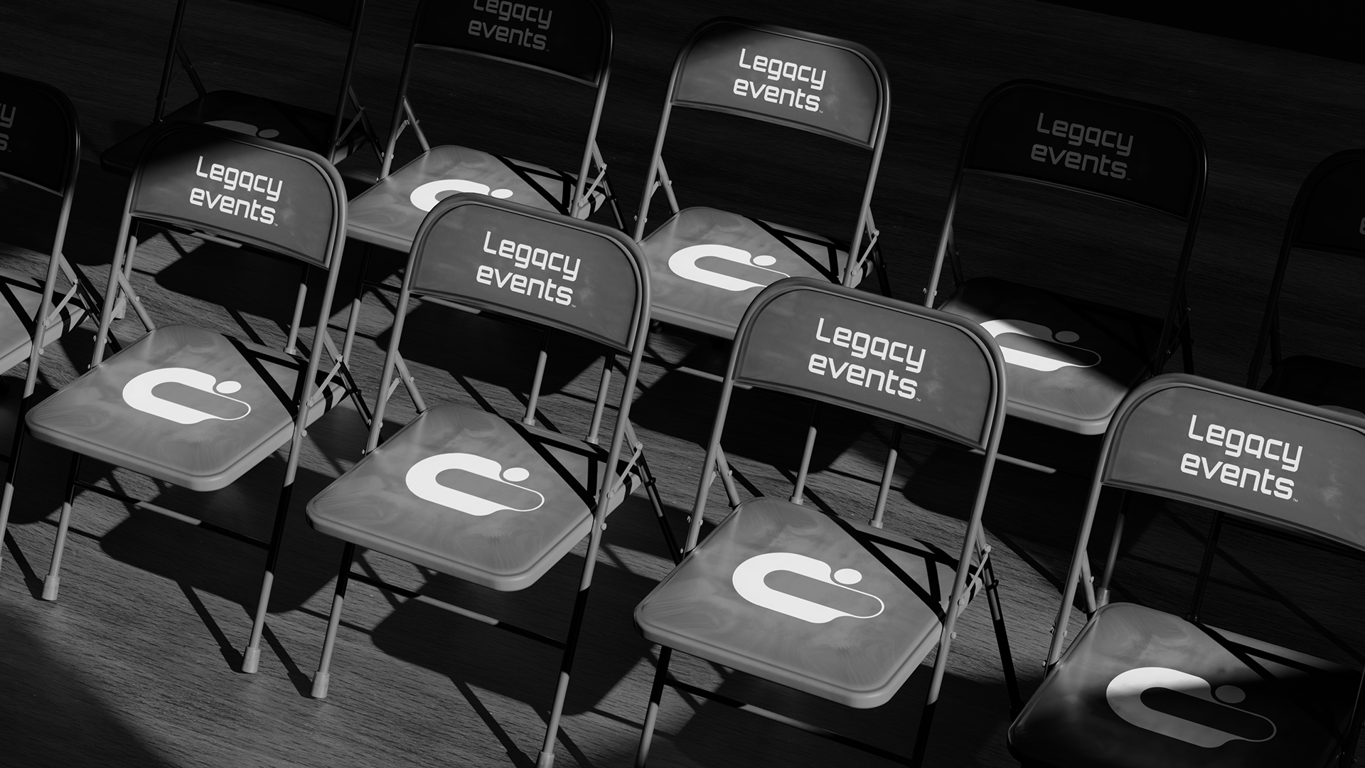
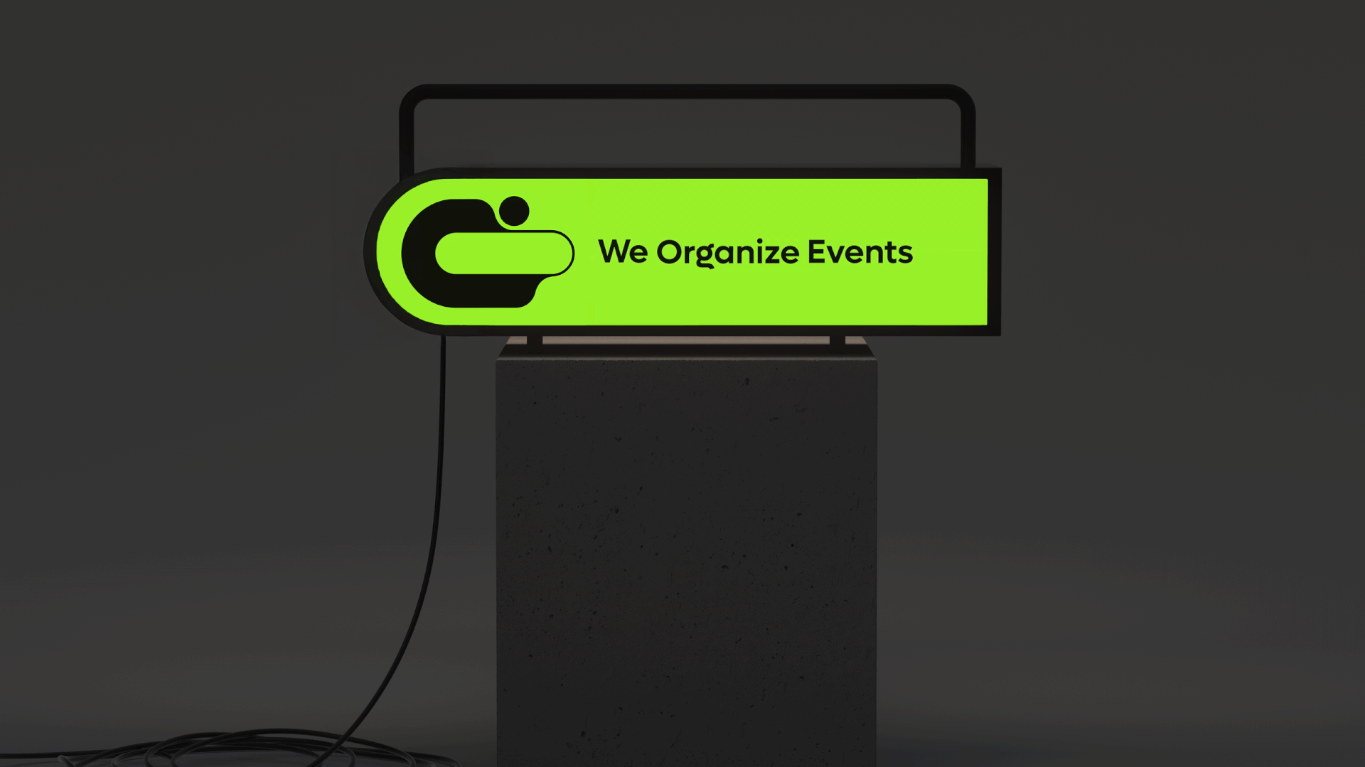
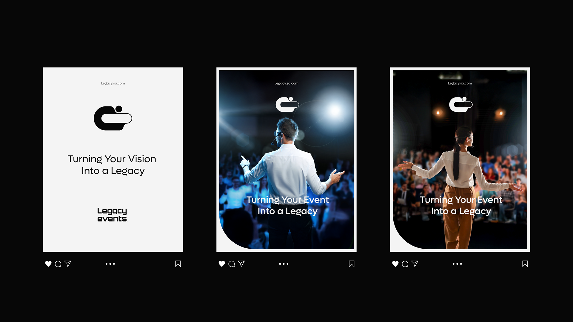
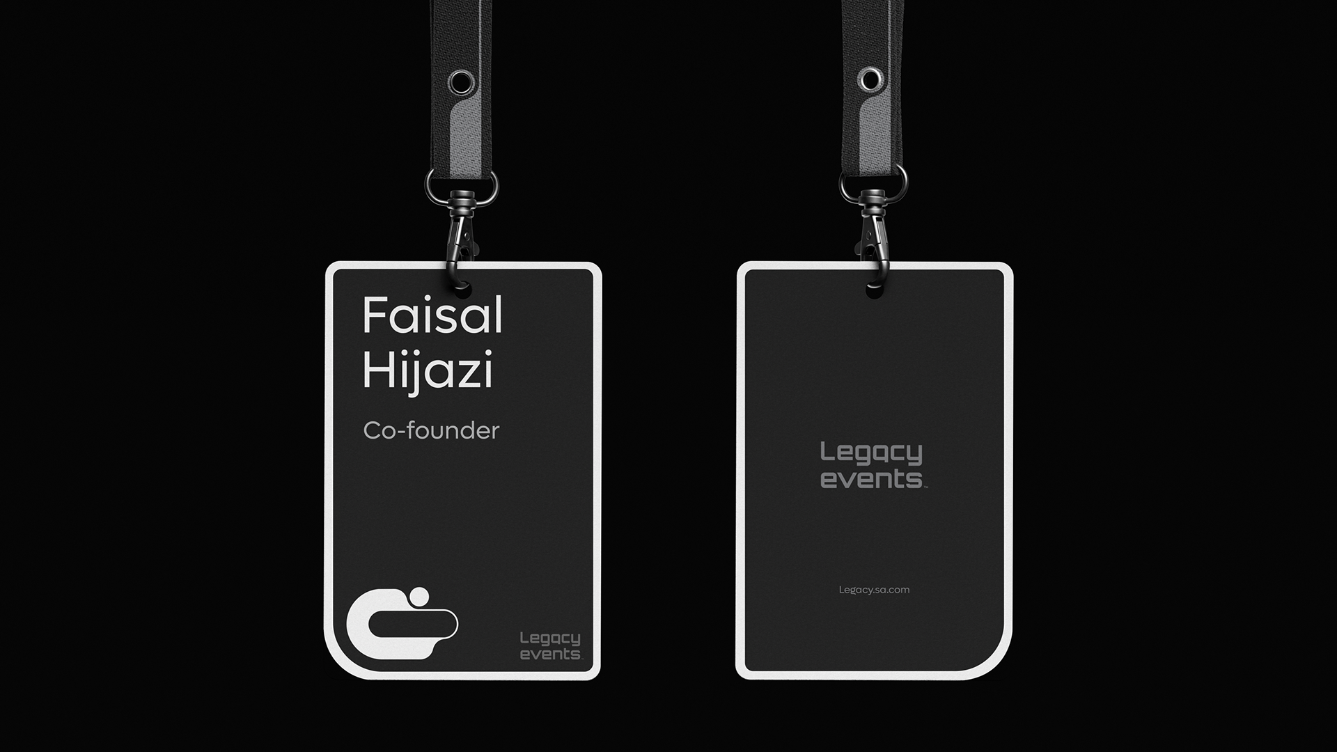
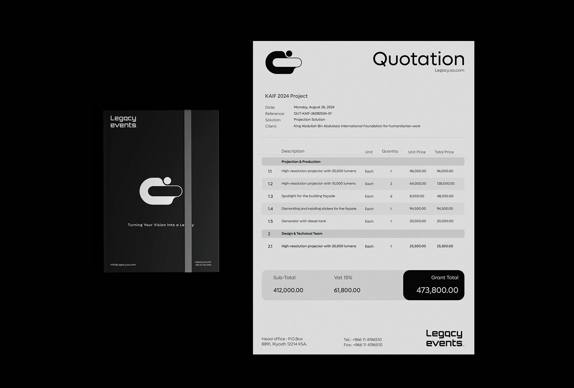
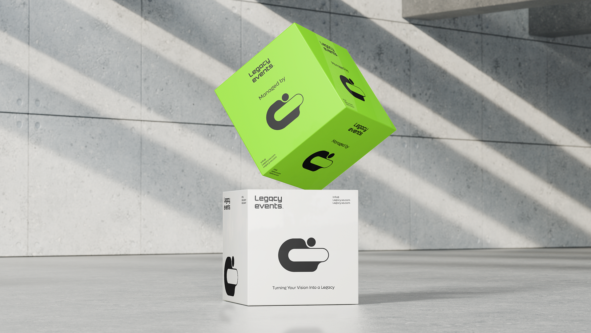
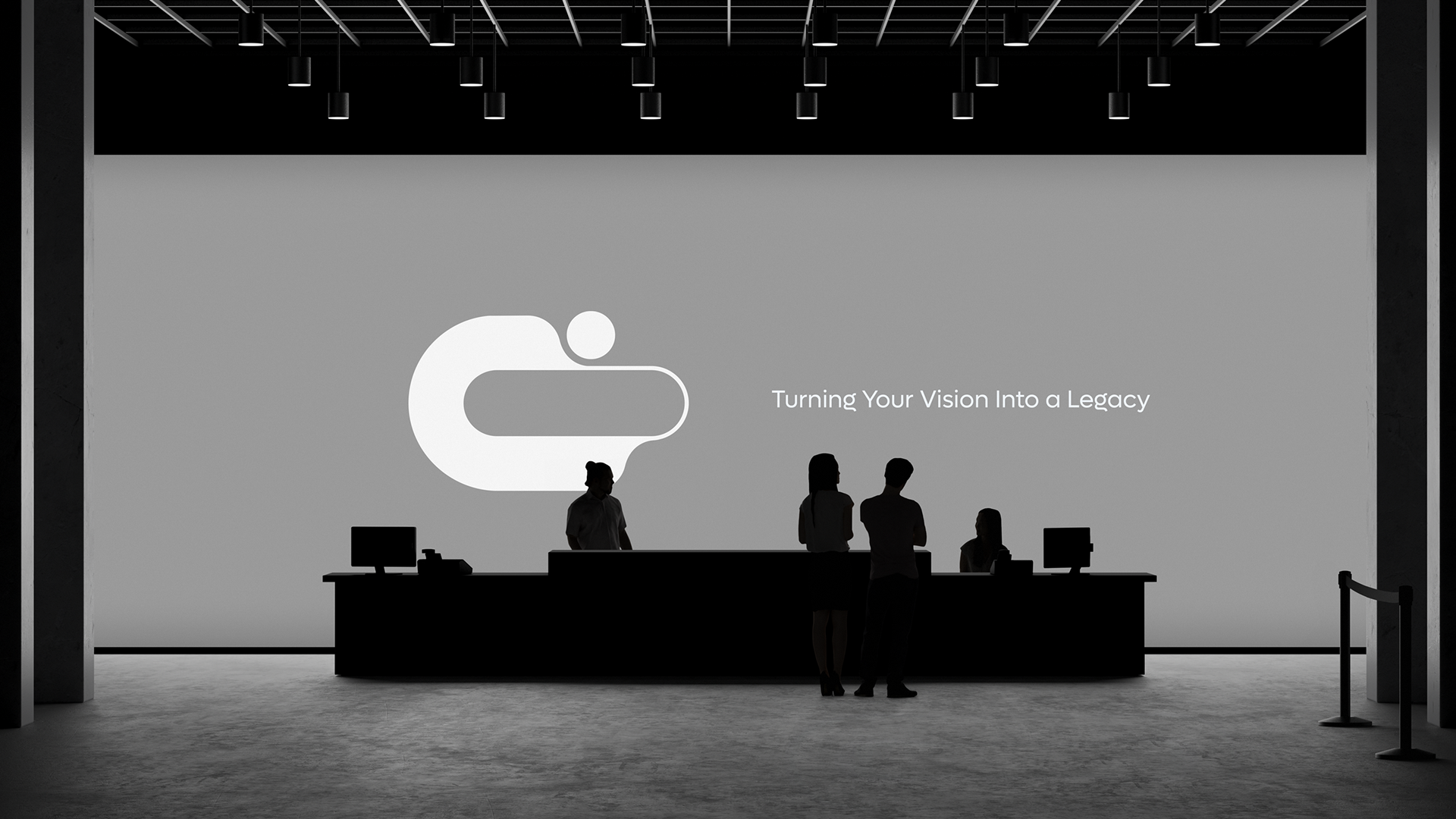
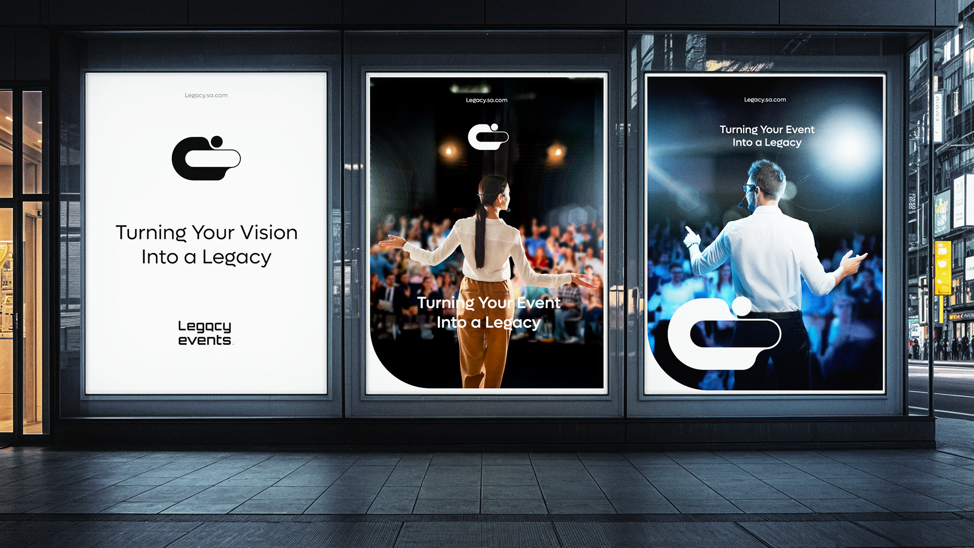
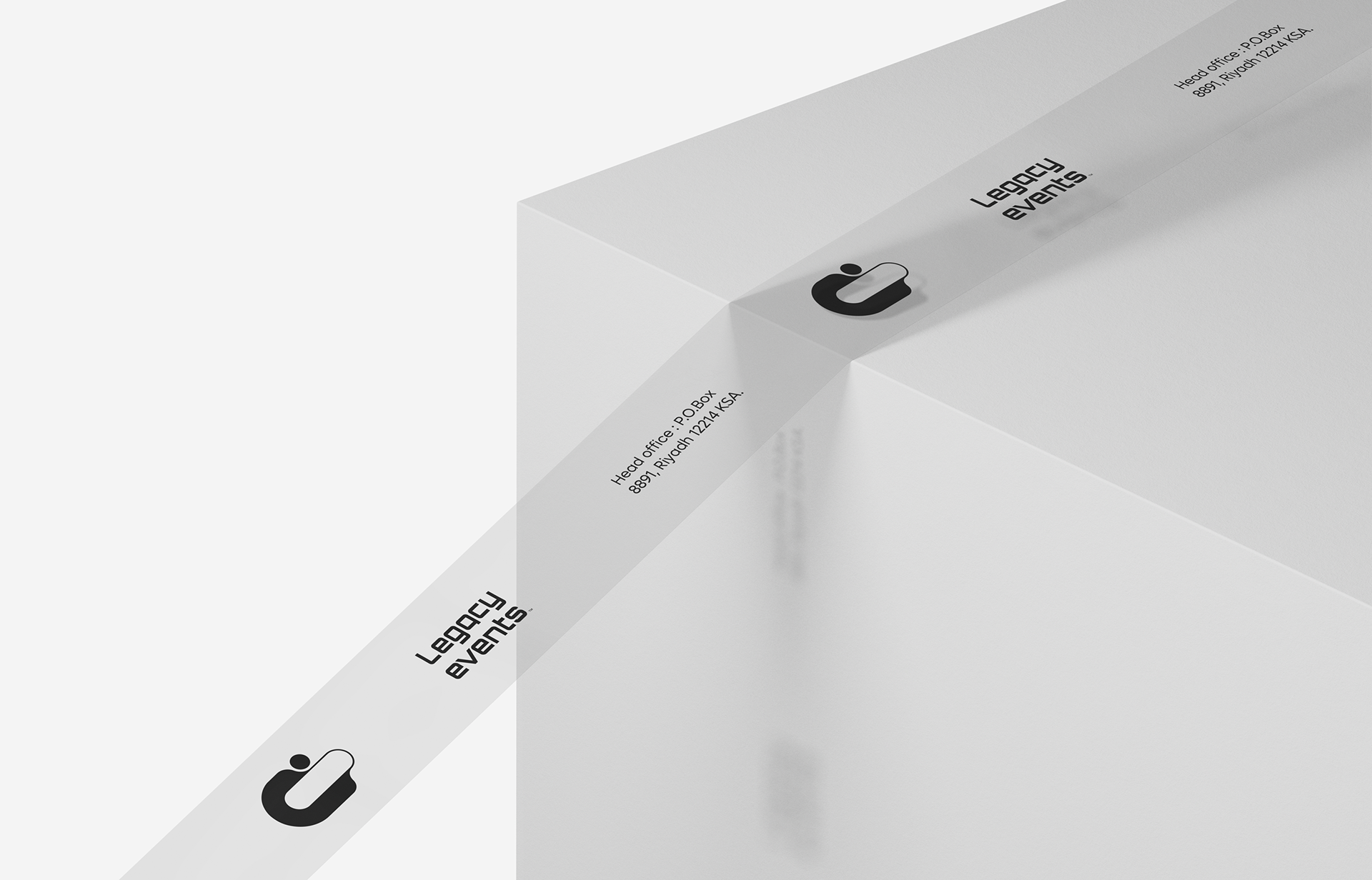
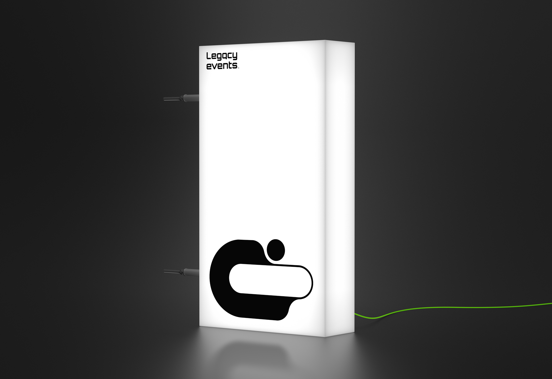
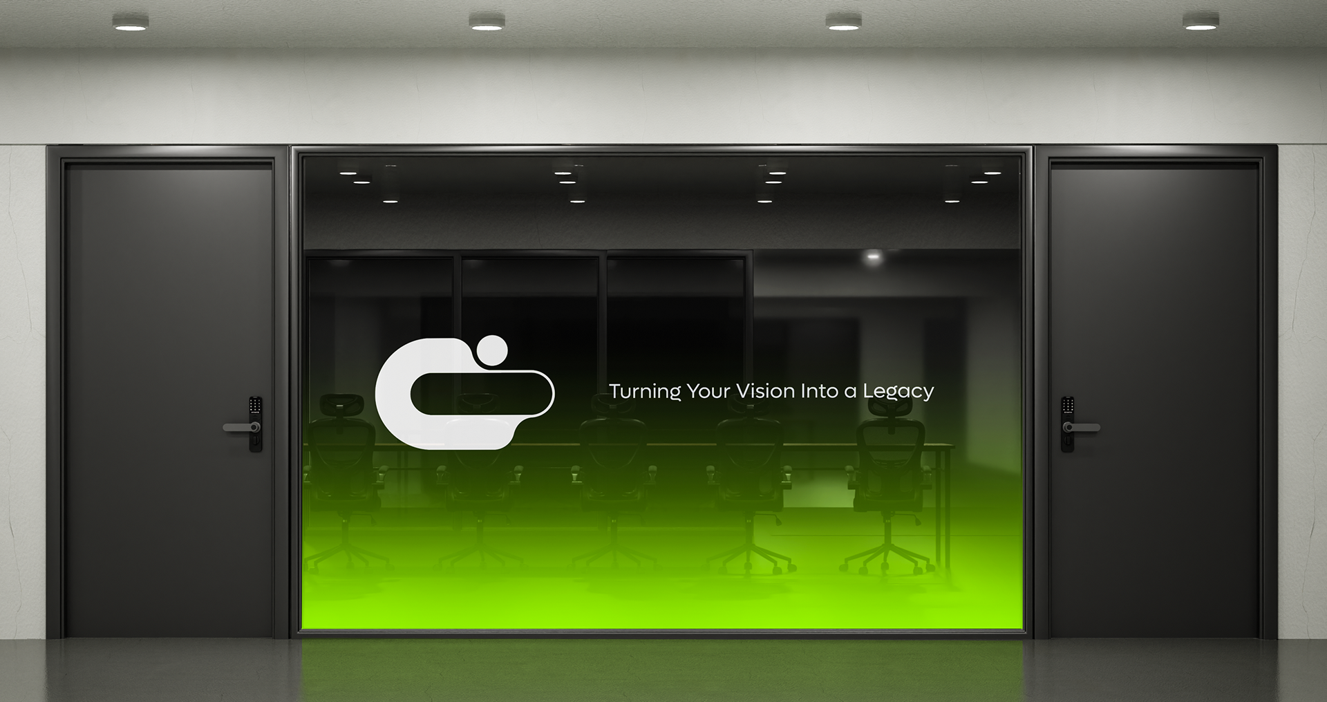
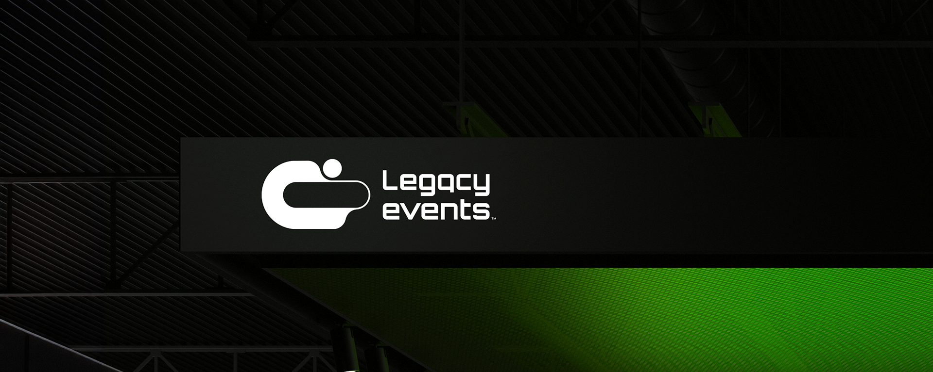
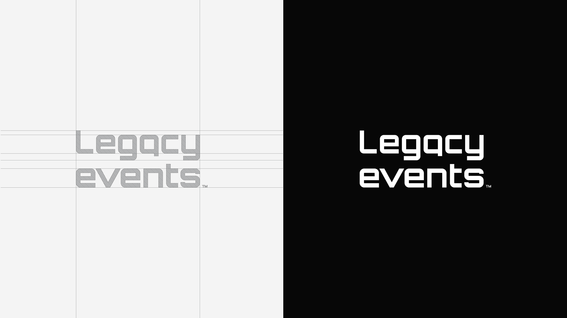
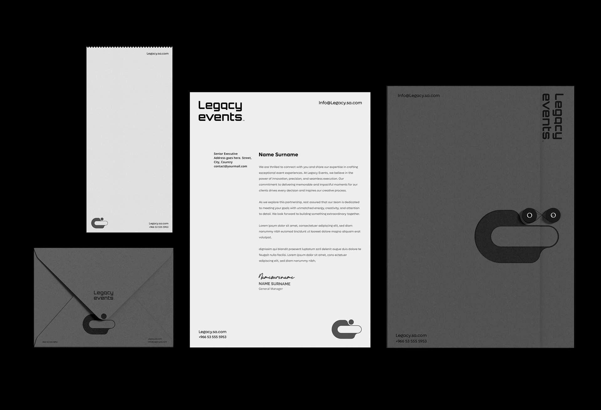
We repositioned the brand from the ground up, defining its internal strategy and developing a scalable visual identity system designed to express clarity, control, and innovation, helping Legacy stand out in a competitive industry.
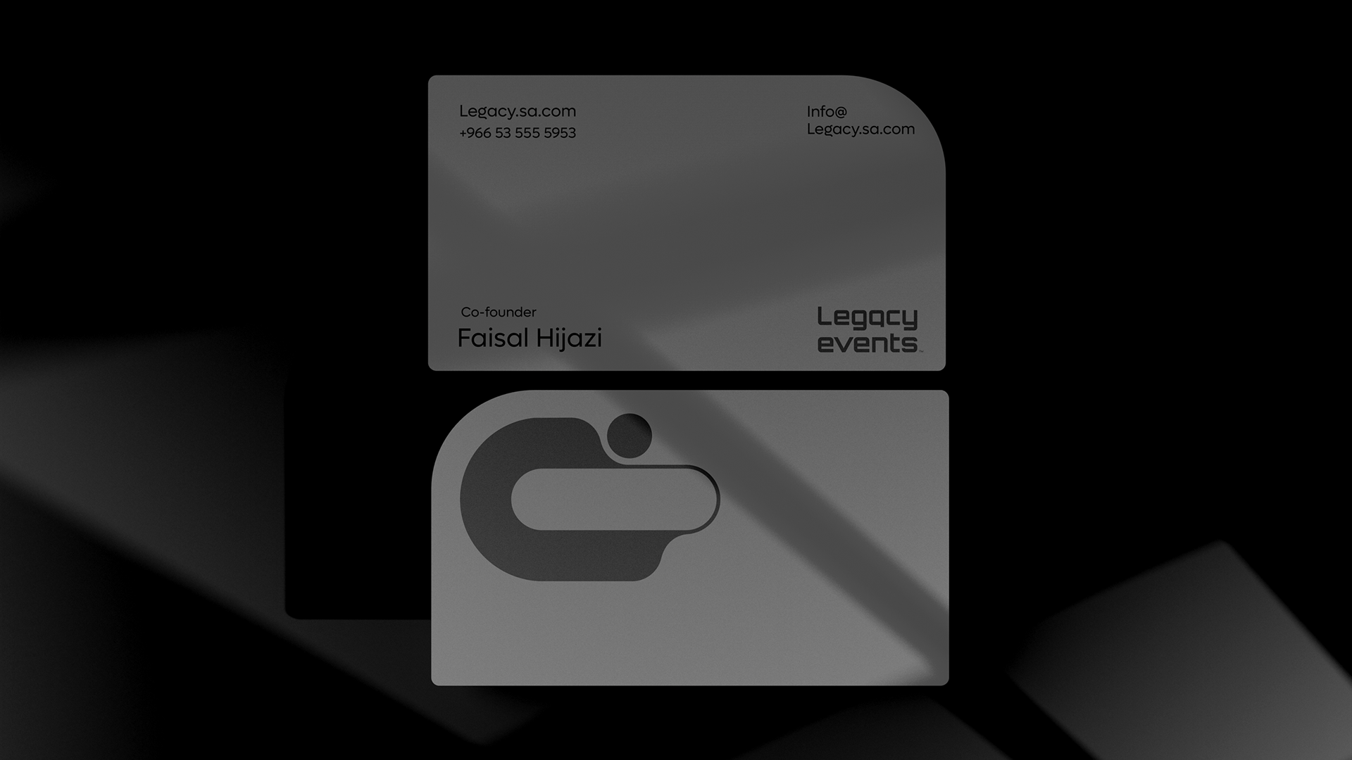
Client: Faisal
Location: Saudi Arabia
Location: Saudi Arabia
Scope: Internal Brand Strategy, Brand Positioning, Strategic Logo Development & Visual Identity System
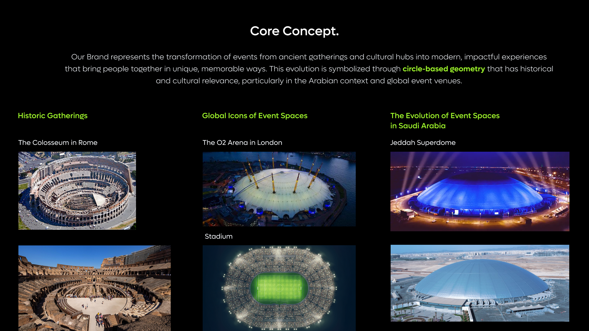
Throughout history, the circle has been a powerful symbol of unity, gathering, and inclusivity.
These shapes naturally bring people closer, creating a shared space where memories are made and connections are strengthened.
From ancient arenas where communities came together to witness events, to modern stadiums and cultural hubs that draw people from all walks of life, the circular form has been at the heart of shared human experiences.

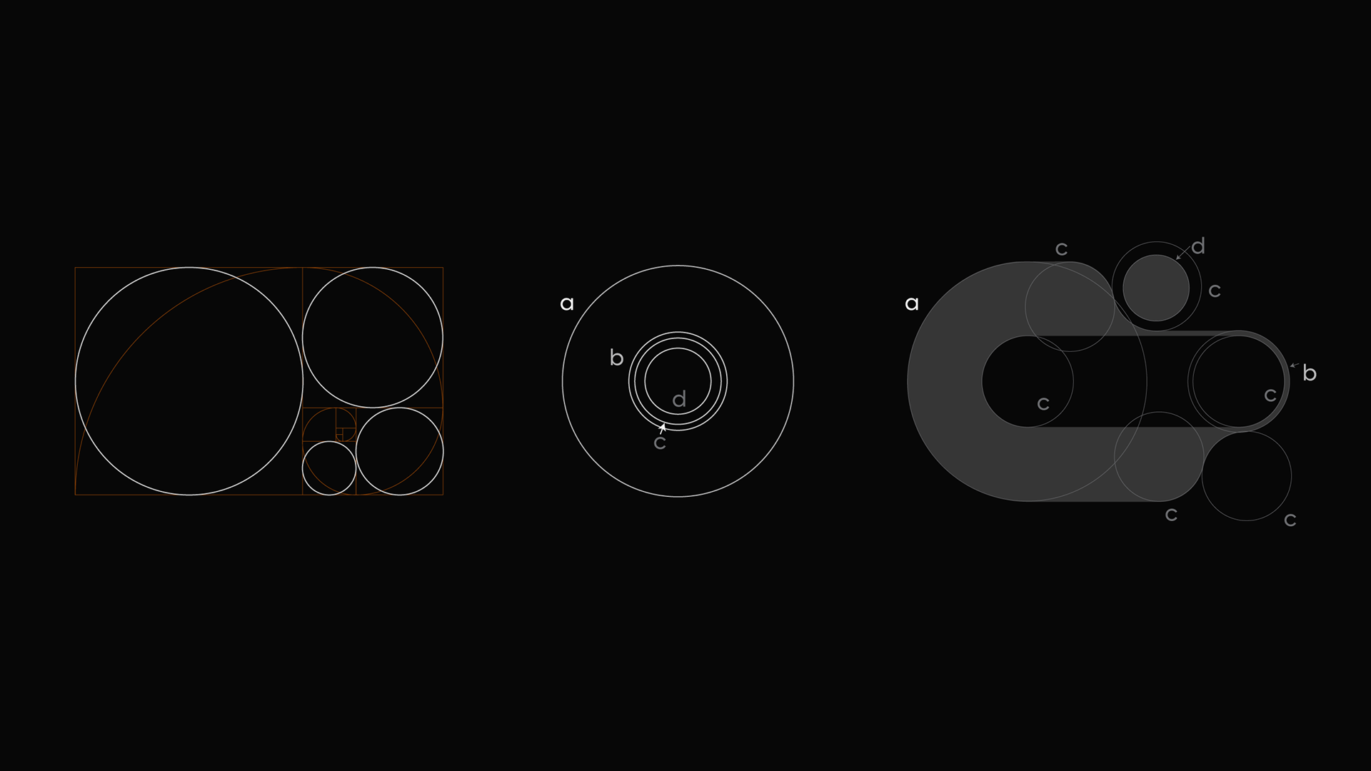
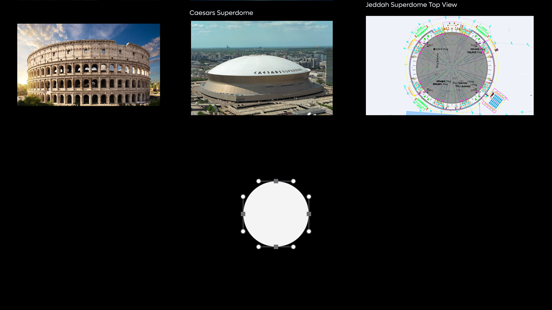
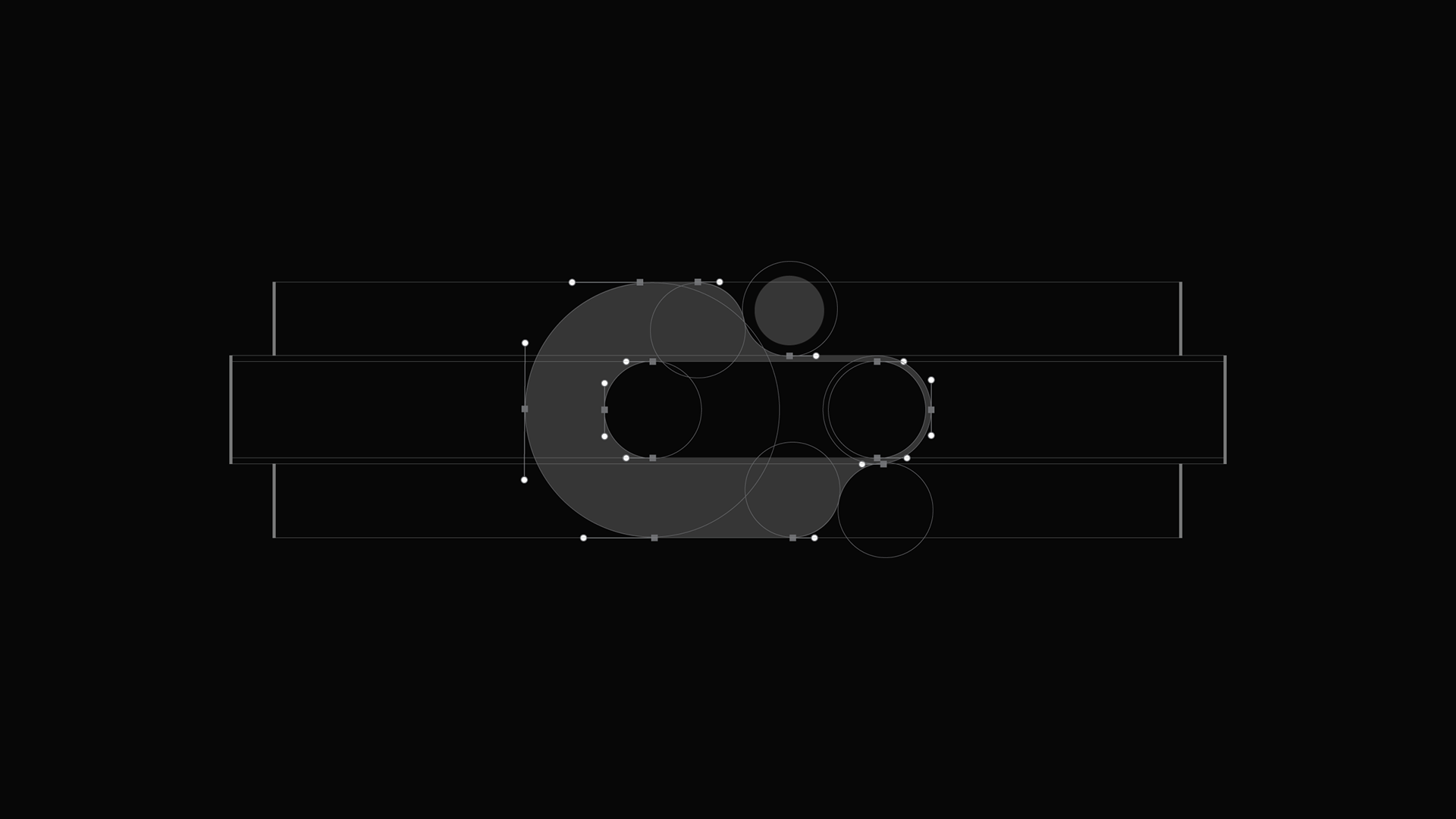
Our logo is crafted using four core circle sizes (a, b, c, and d), thoughtfully structured to echo the principles of the golden ratio.
This alignment with the golden ratio reflects our commitment to balanced, well-orchestrated events that leave a lasting impact.
The interconnected circles represent how each element of our event planning process is harmoniously integrated, resulting in a flawless and cohesive execution. The result is an experience that’s as cohesive and harmonious as our logo's design, symbolizing both the art and science behind unforgettable events.


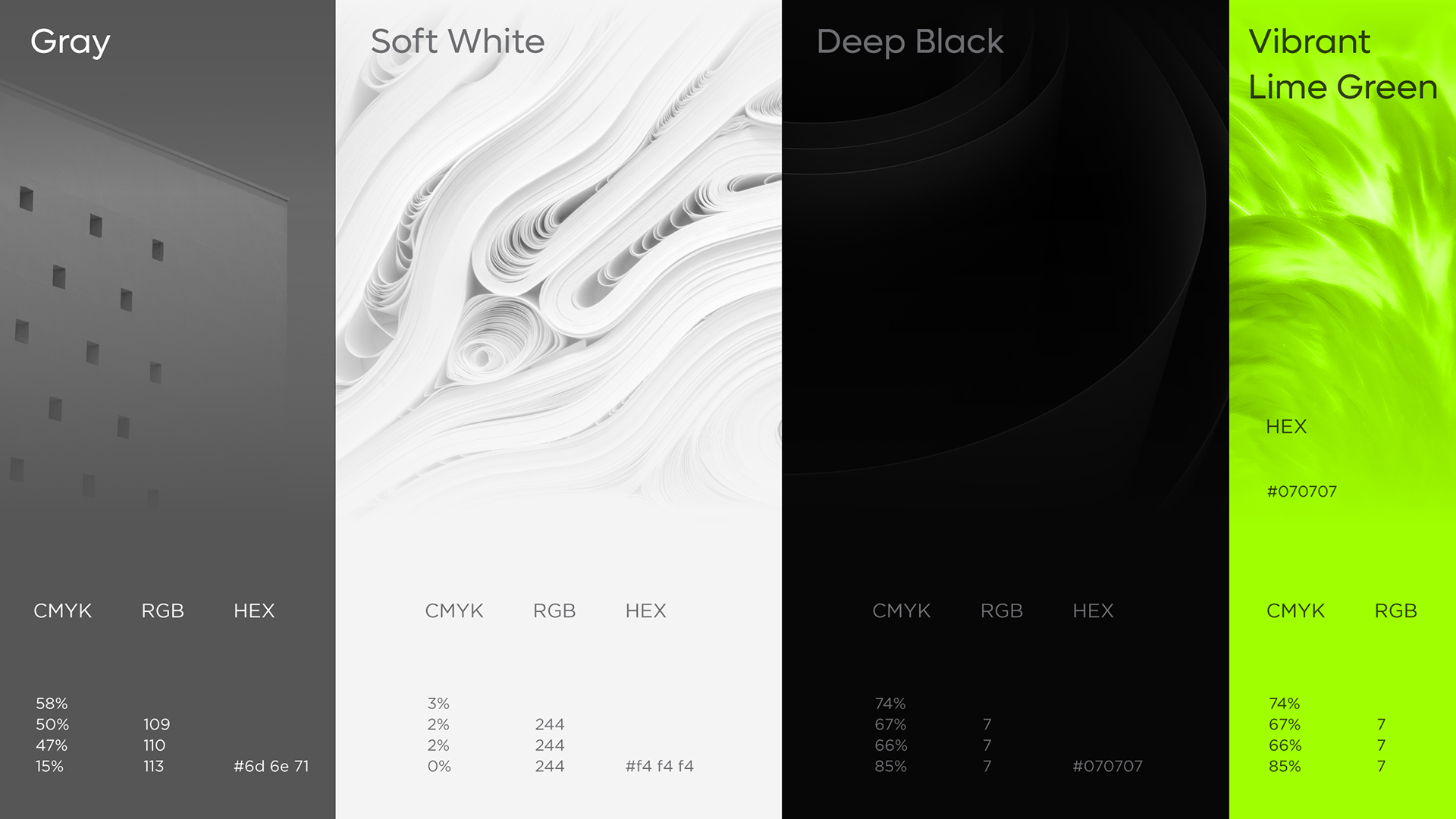
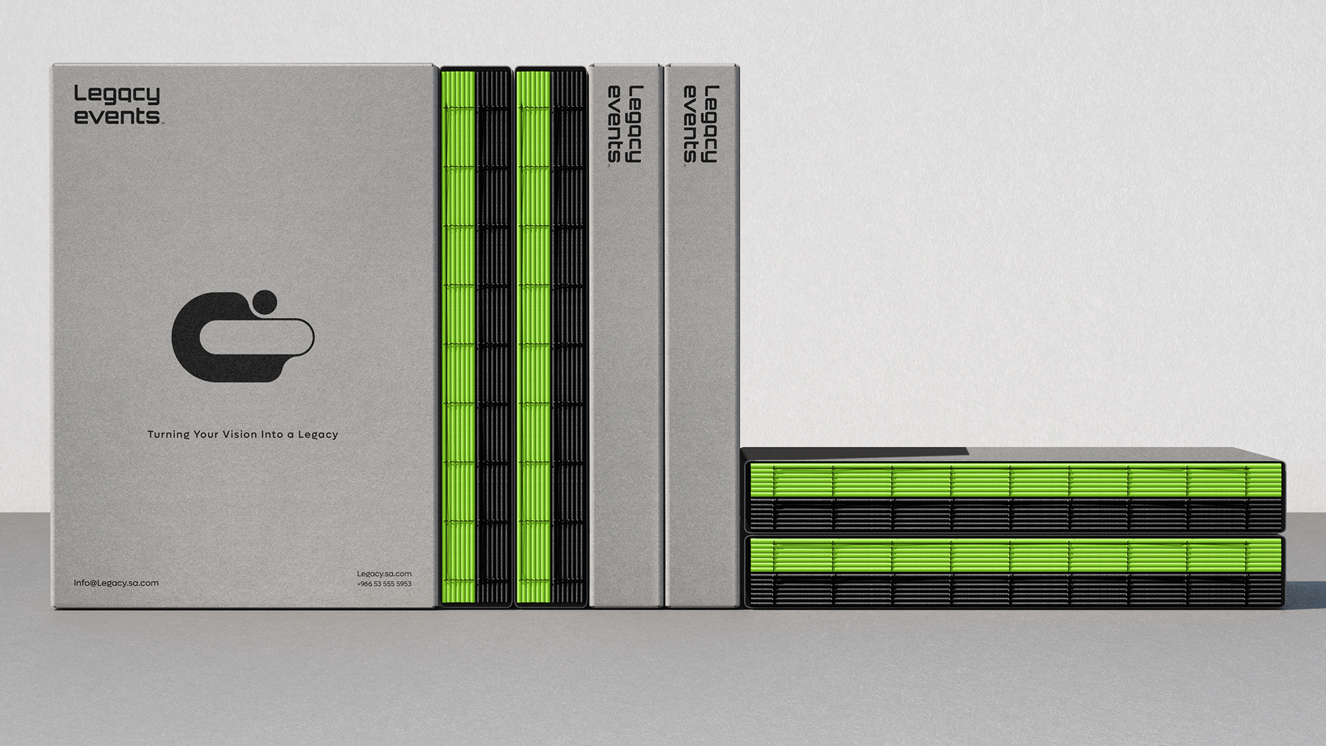
Color Emotion Guide.
- Gray: Stability, professionalism, and structure.
Our gray tone conveys a sense of reliability and calm, embodying the brand’s structured approach to event management.
- Soft White: Clarity, purity, and simplicity.
Our soft white represents clarity and a fresh canvas, embodying the brand’s mission to bring creativity and seamlessness to event planning.
- Deep Black: Strength, elegance, and sophistication.
Our deep black adds a bold and refined aesthetic, representing the brand’s commitment to high-quality, lasting impact in event management.
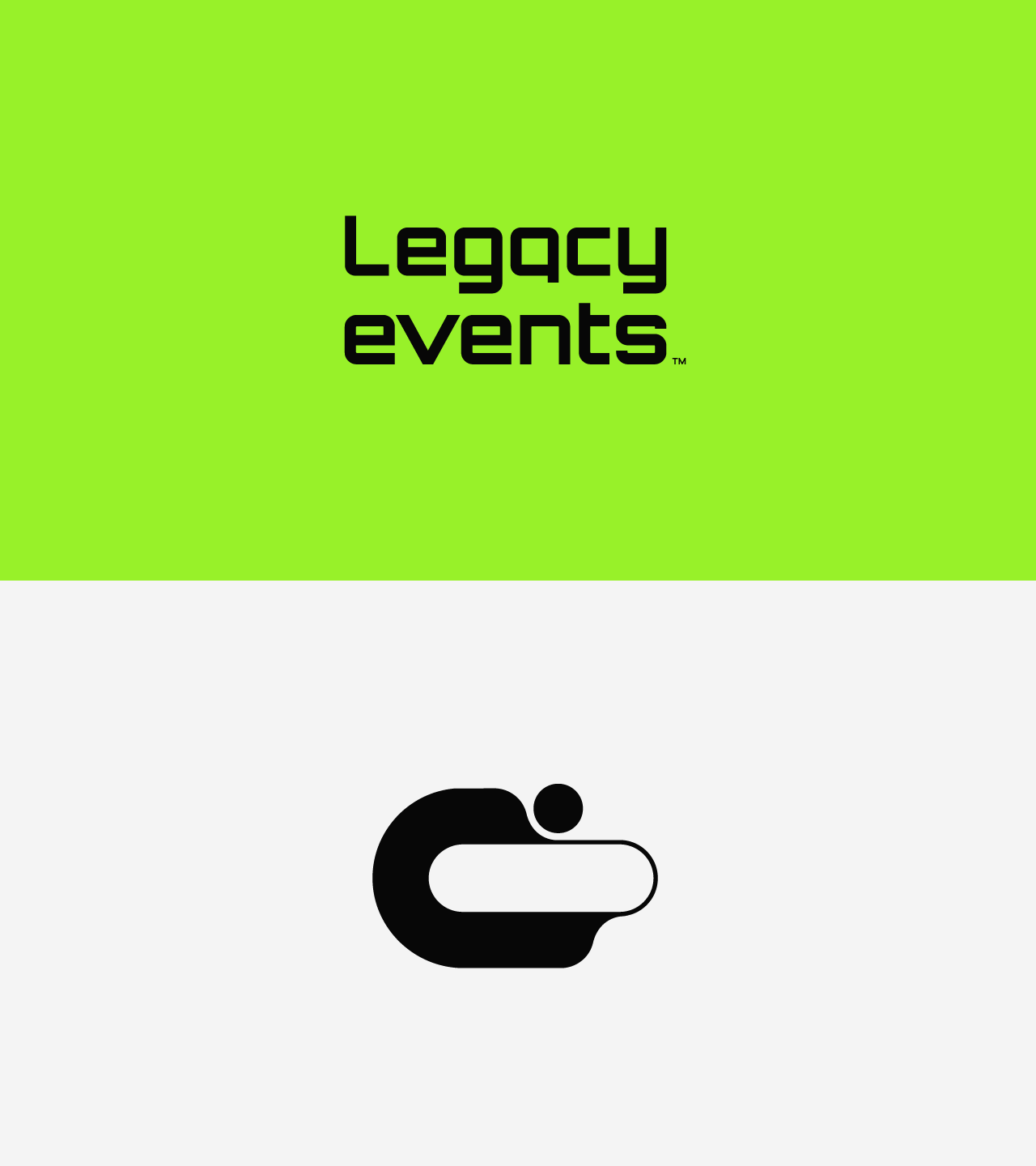
- Dynamic Lime Green: Energy, freshness, and forward-thinking.
Our deep black adds a bold and refined aesthetic, representing the brand’s commitment to high-quality, lasting impact in event management.
- Dynamic Lime Green: Energy, freshness, and forward-thinking.
Our bright lime green infuses the brand with a bold, refreshing touch, symbolizing innovation and the dynamic experiences we deliver to our clients. This vibrant hue embodies our commitment to creativity, growth, and a future-oriented approach, setting the tone for impactful, memorable events.