Rukkab
- Client
- Rukkab
- Location
- Bahrain
- Scope
- Brand strategy, bilingual visual identity, app icon, digital applications & launch campaign
About the project
Rukkab is a Bahrain-based ride-sharing brand connecting families with trusted drivers. We developed its brand foundations and a bilingual identity, balancing clear digital applications with an approachable, recognizable visual system.
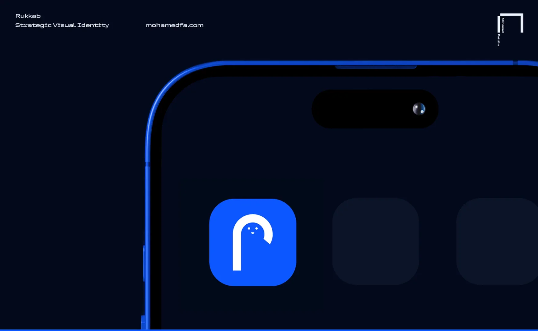
Connecting families with trusted drivers
Rukkab’s identity brings an approachable character to ride-sharing. The brand direction connects reliability and accessibility with a clear digital experience for families.
The brand foundations
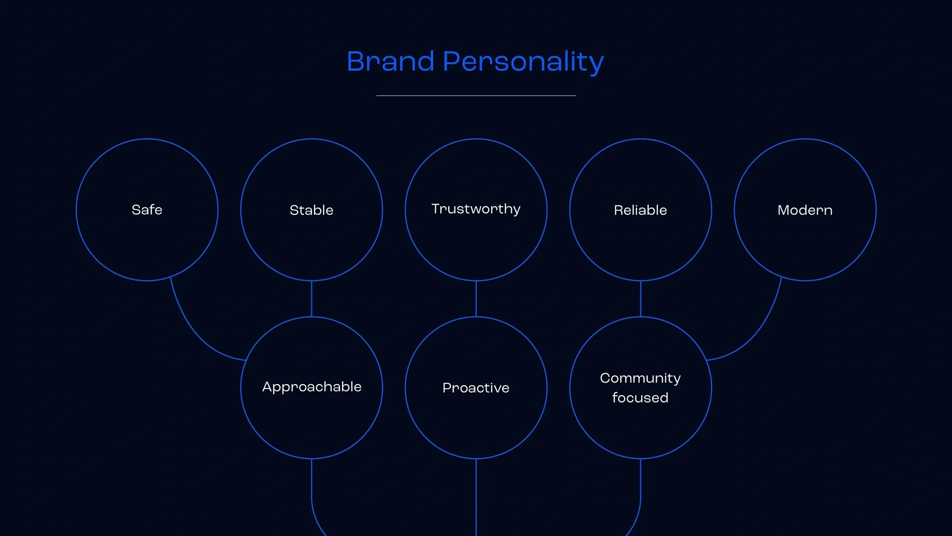
The purpose, values, and personality establish the direction for the service, with children’s transportation as its starting point and room for broader audiences.
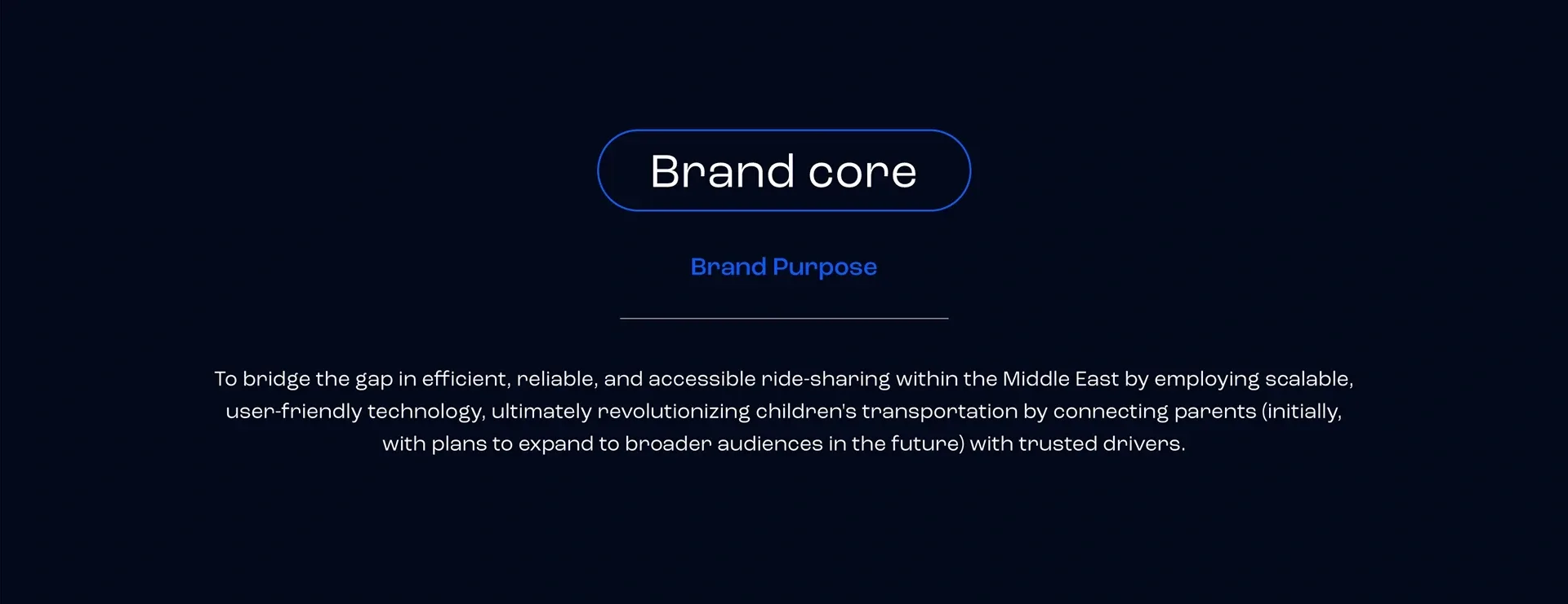
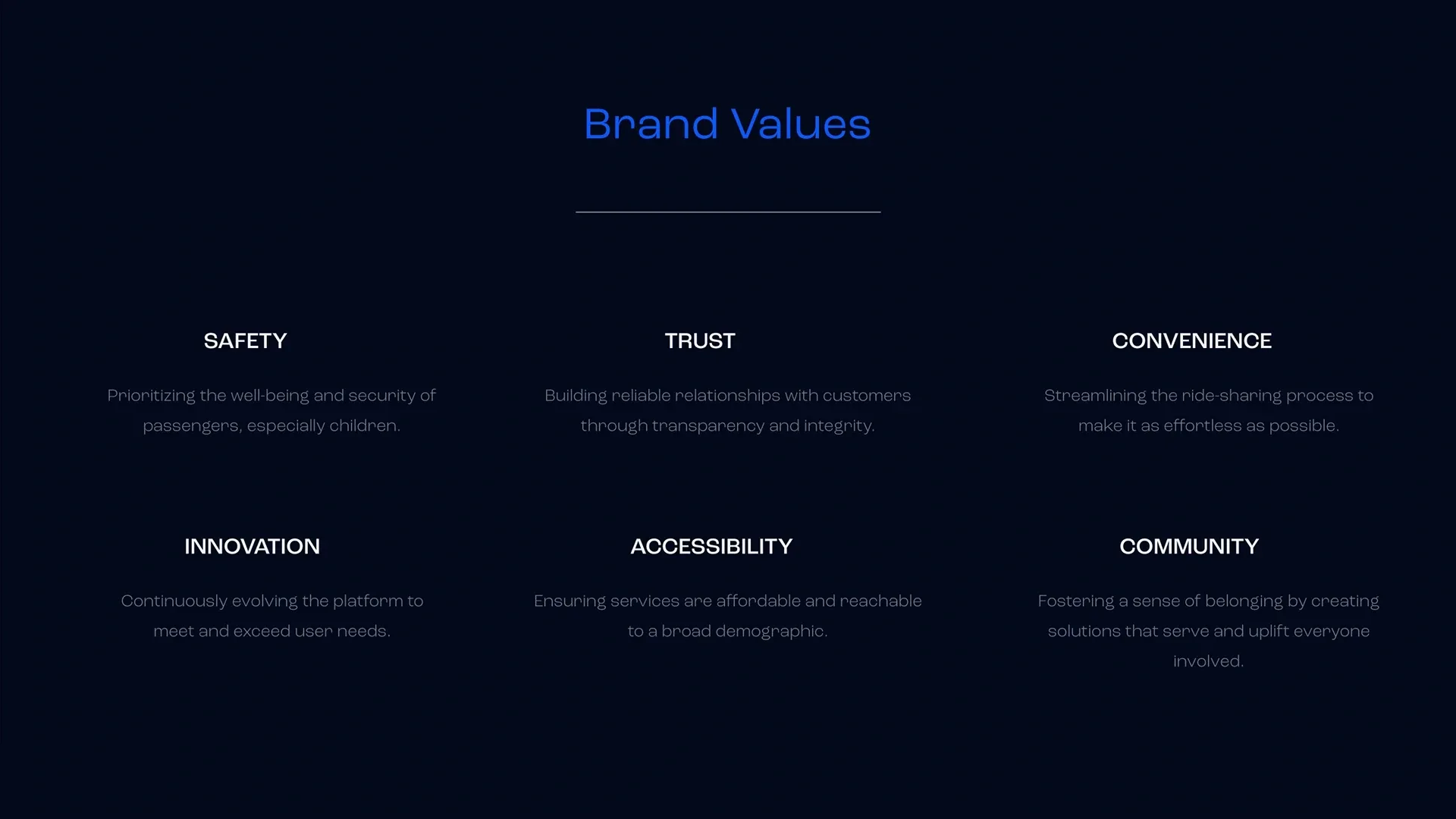
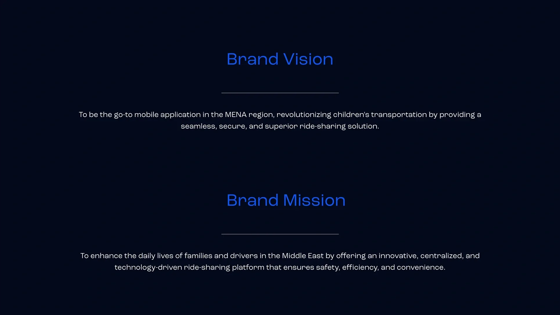
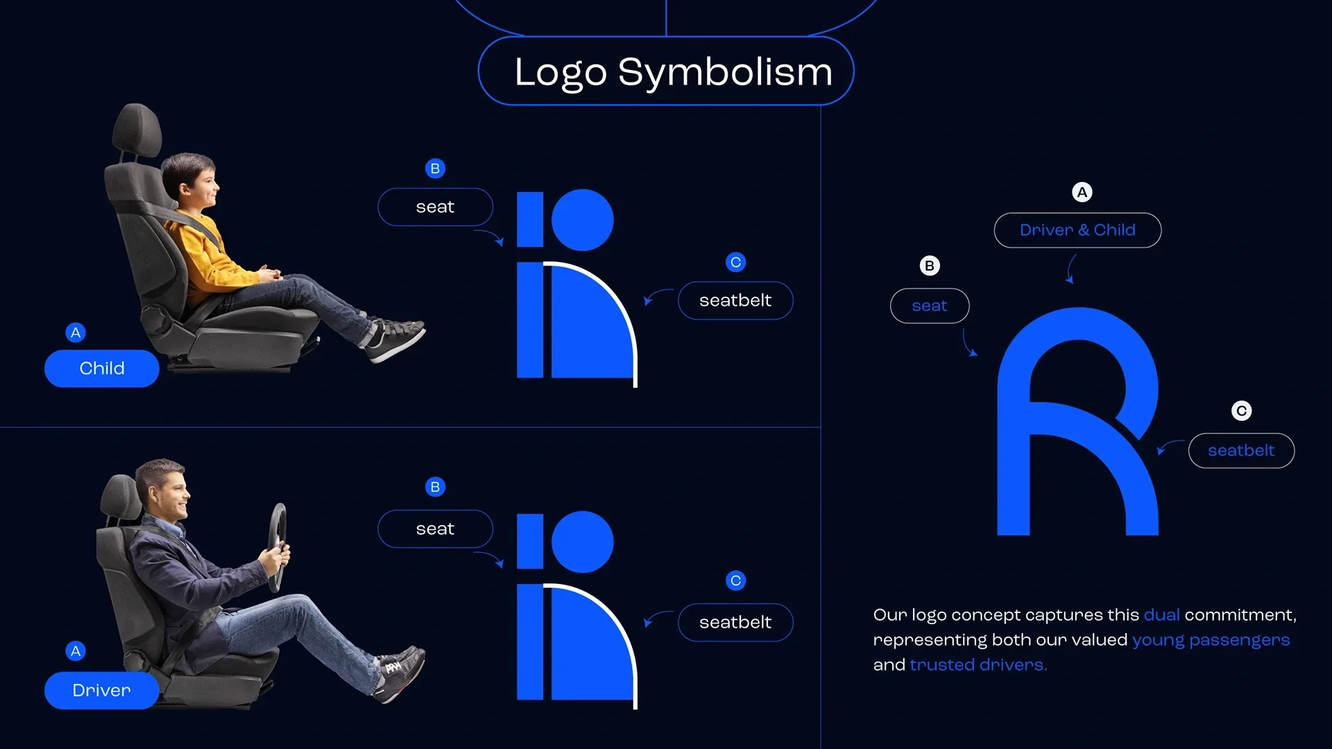
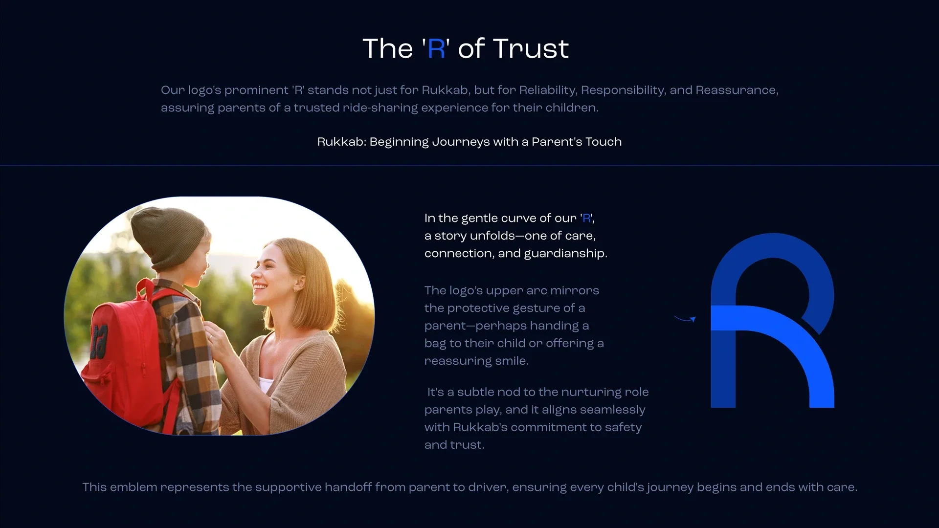
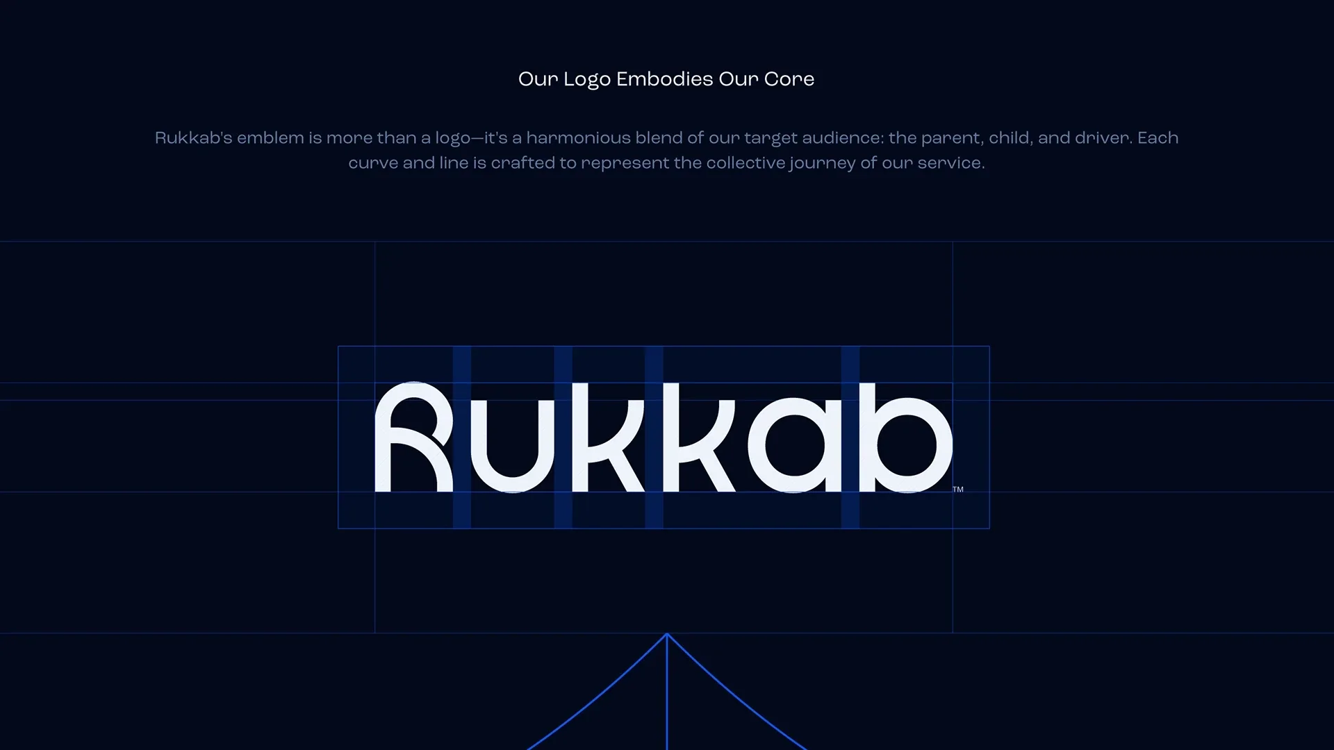
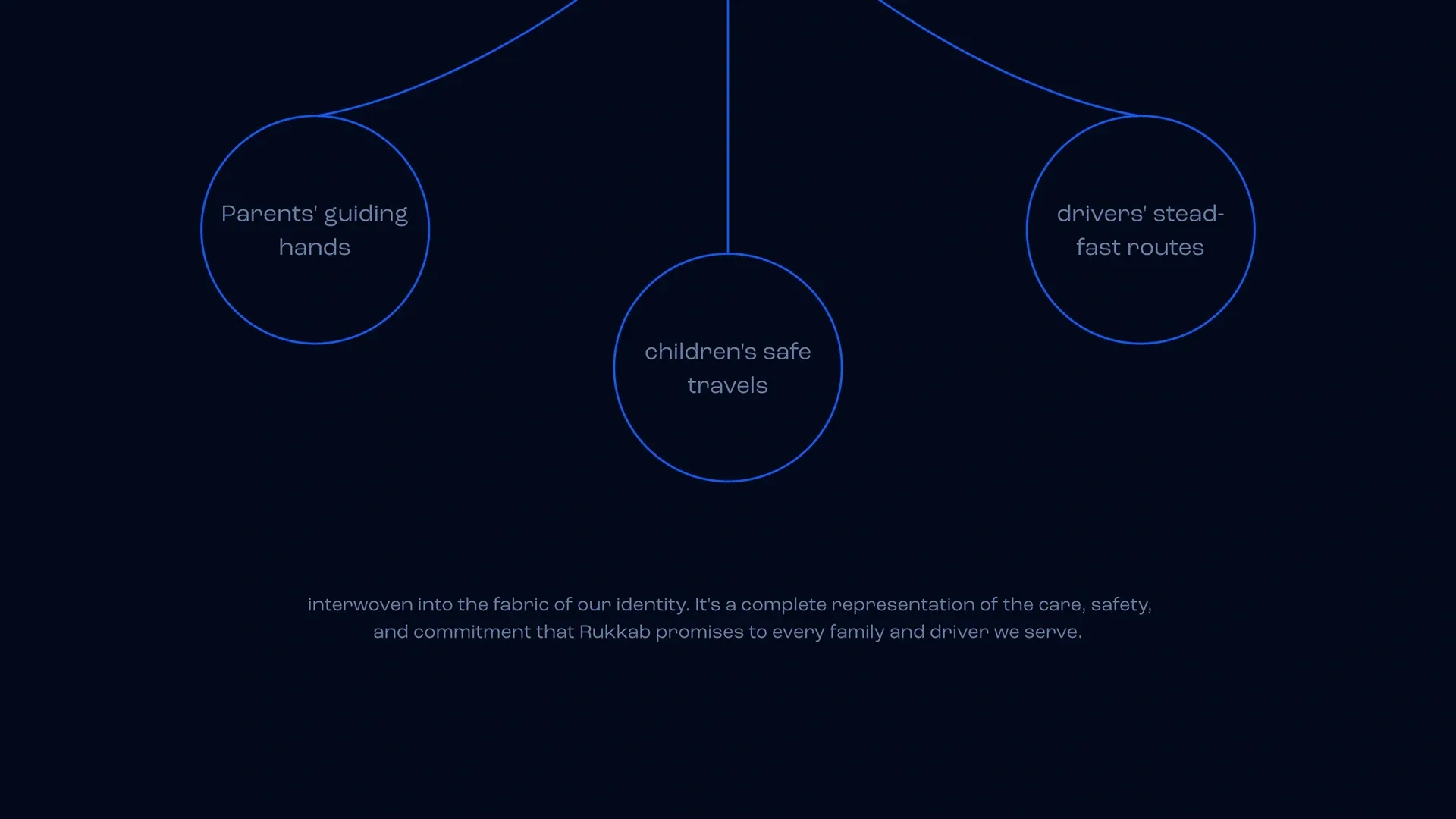
People at the center of the mark
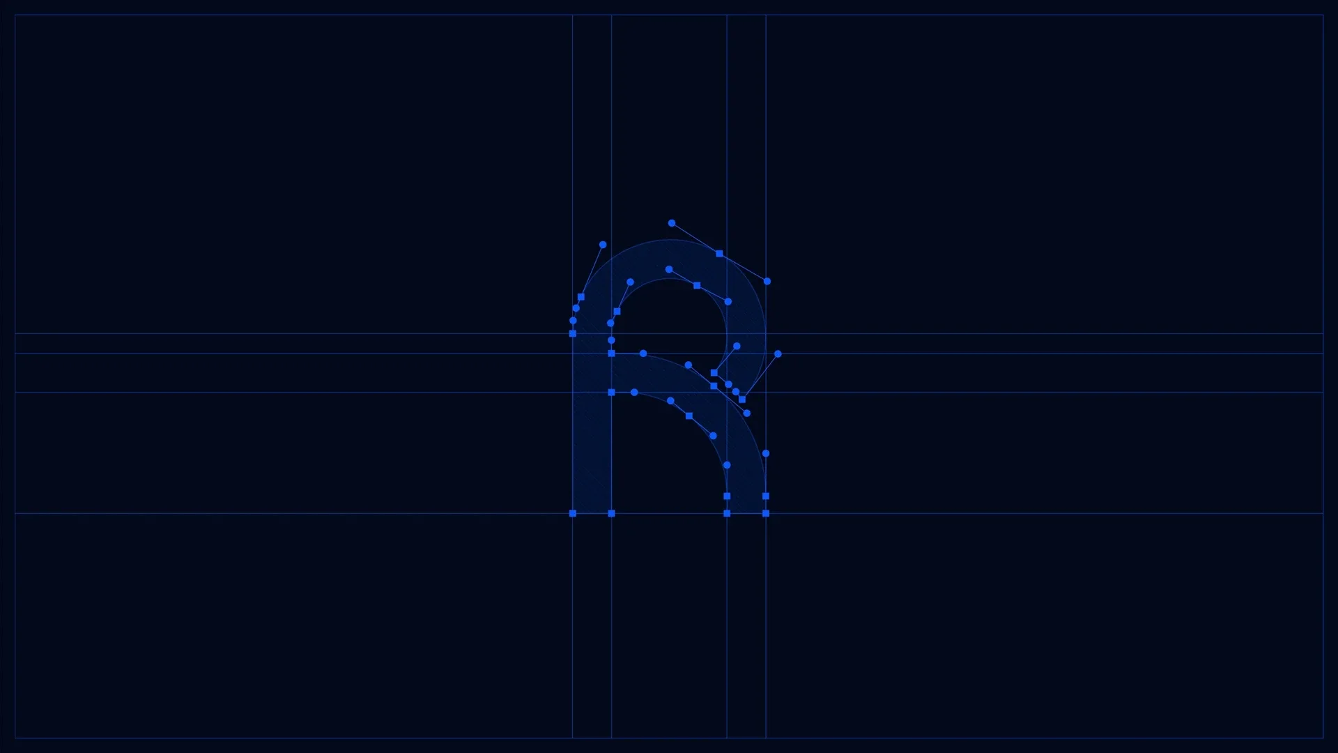
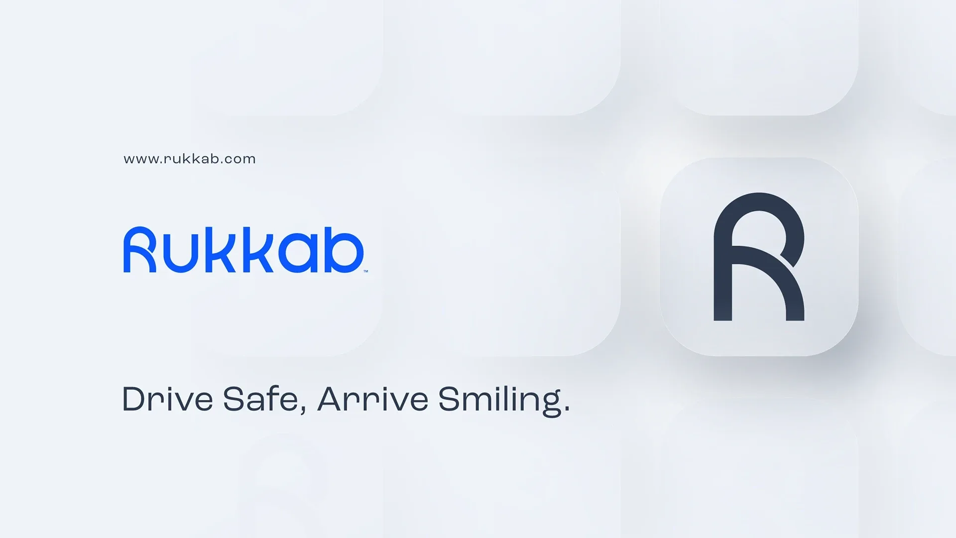
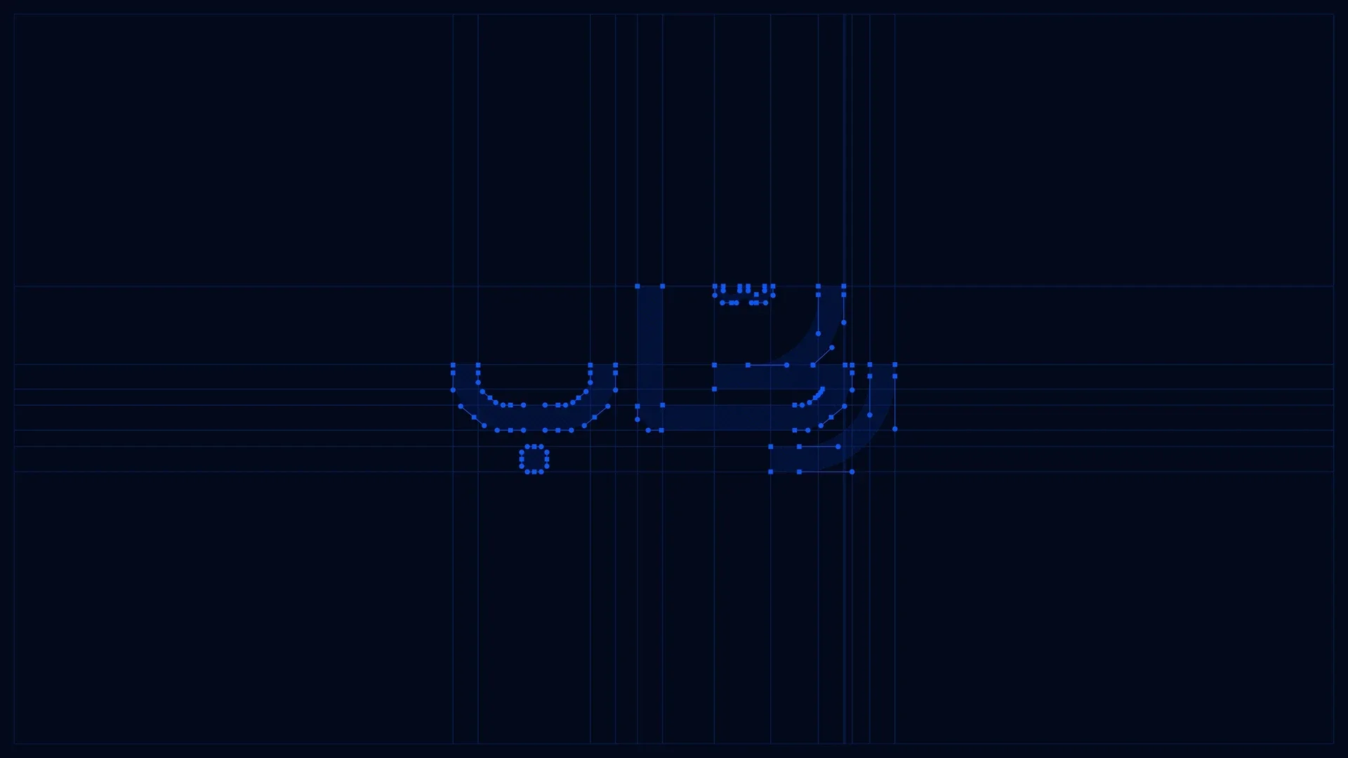
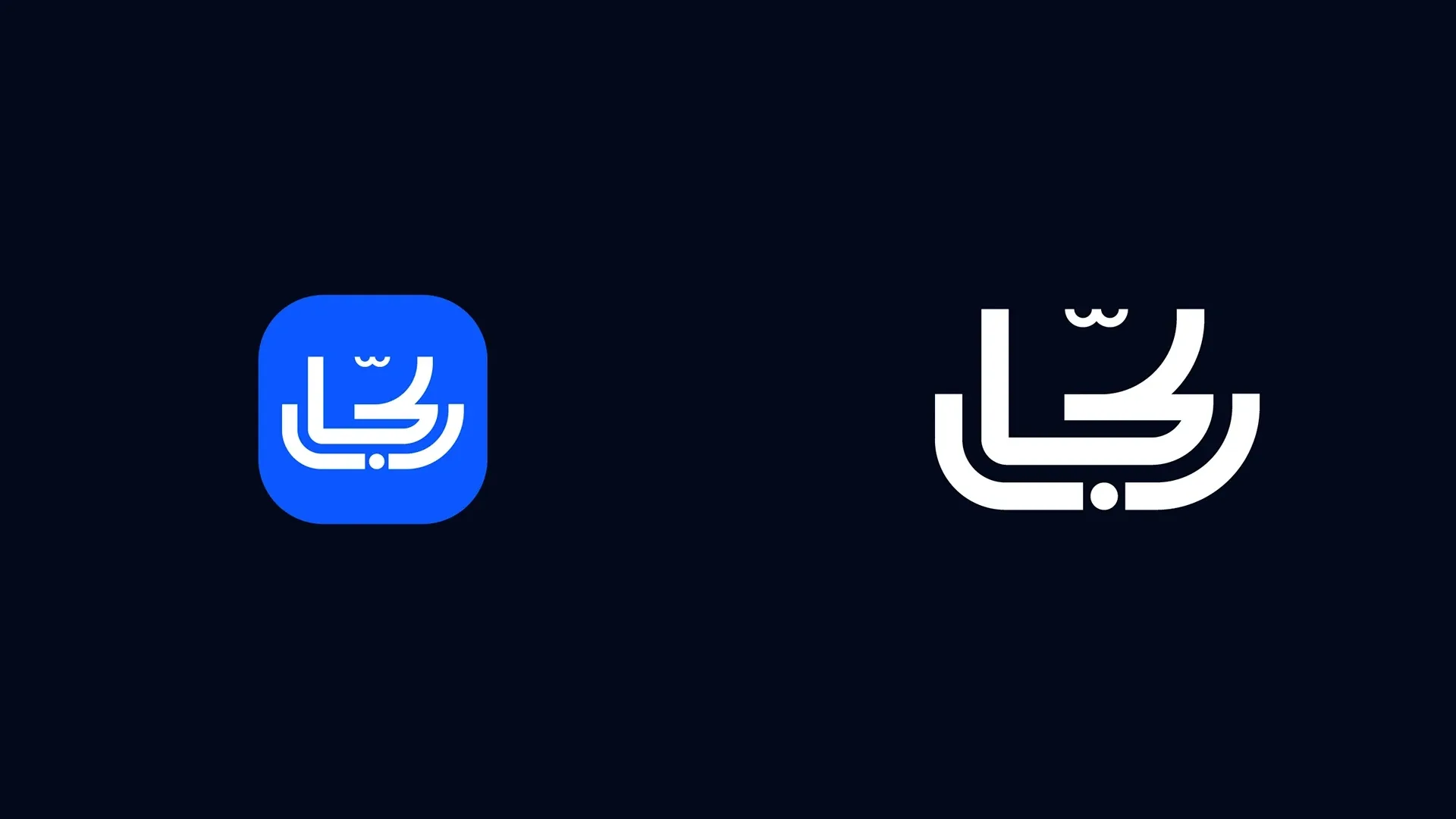
The symbol brings the driver and passenger into a shared form. Its construction and wordmark establish a recognizable signature across the identity.

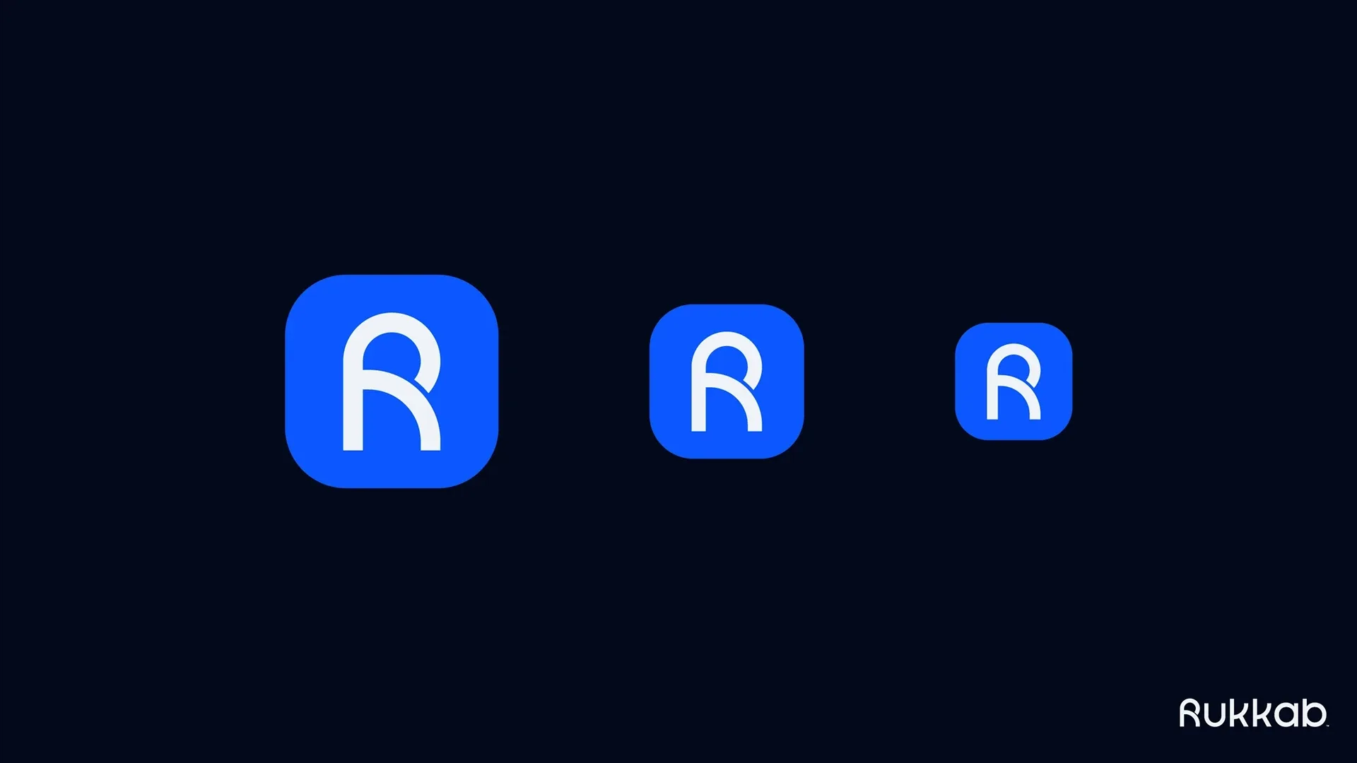
A system designed for screens
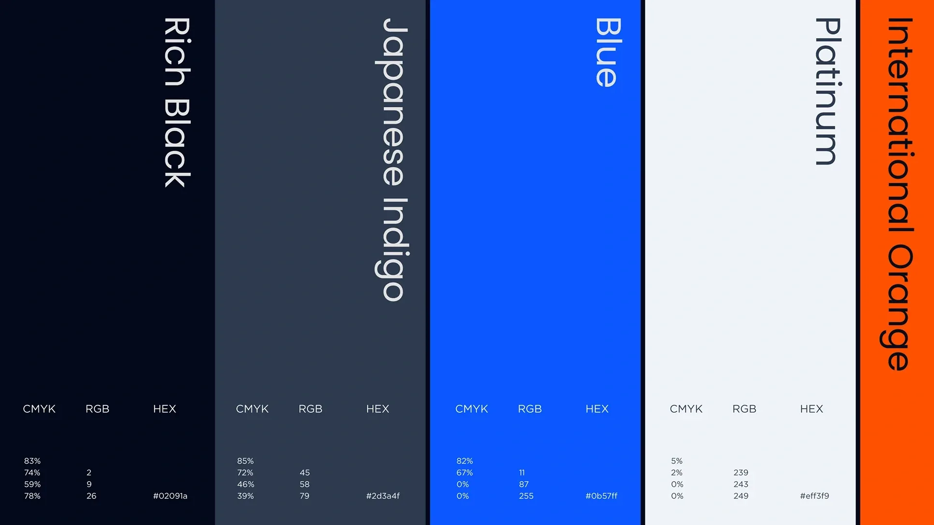
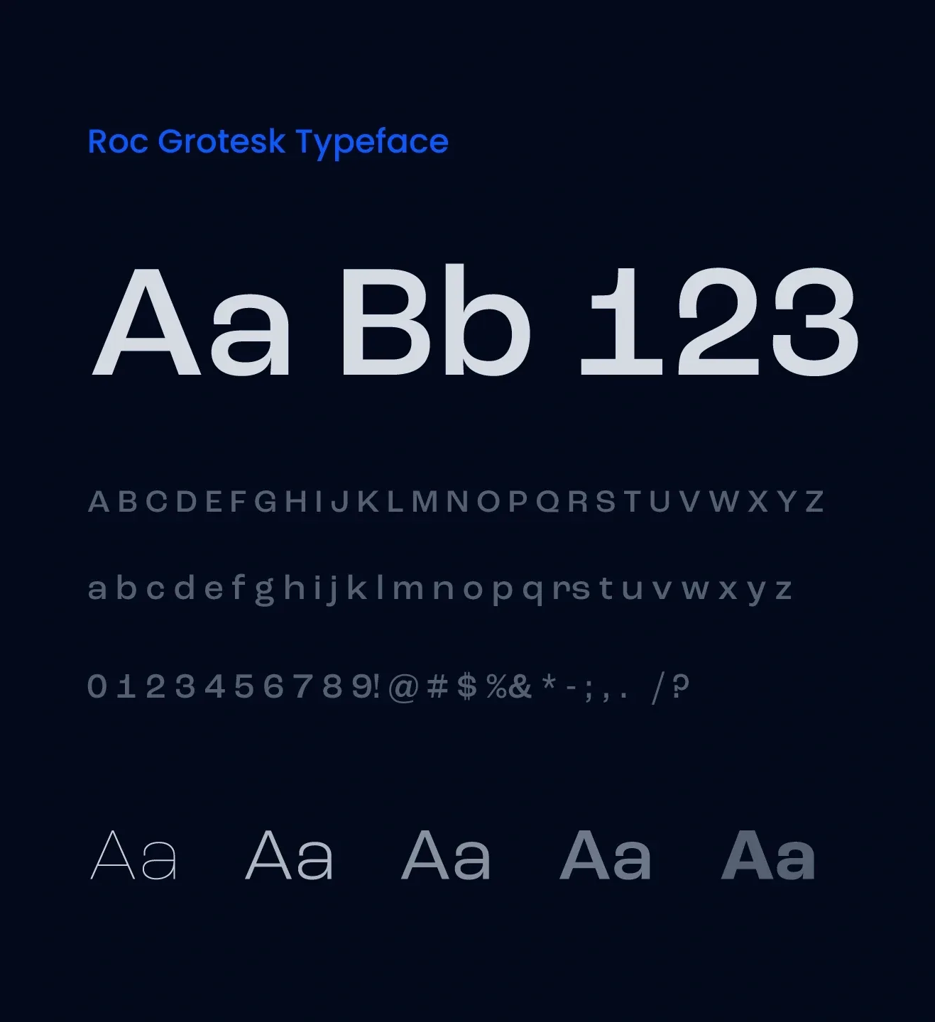
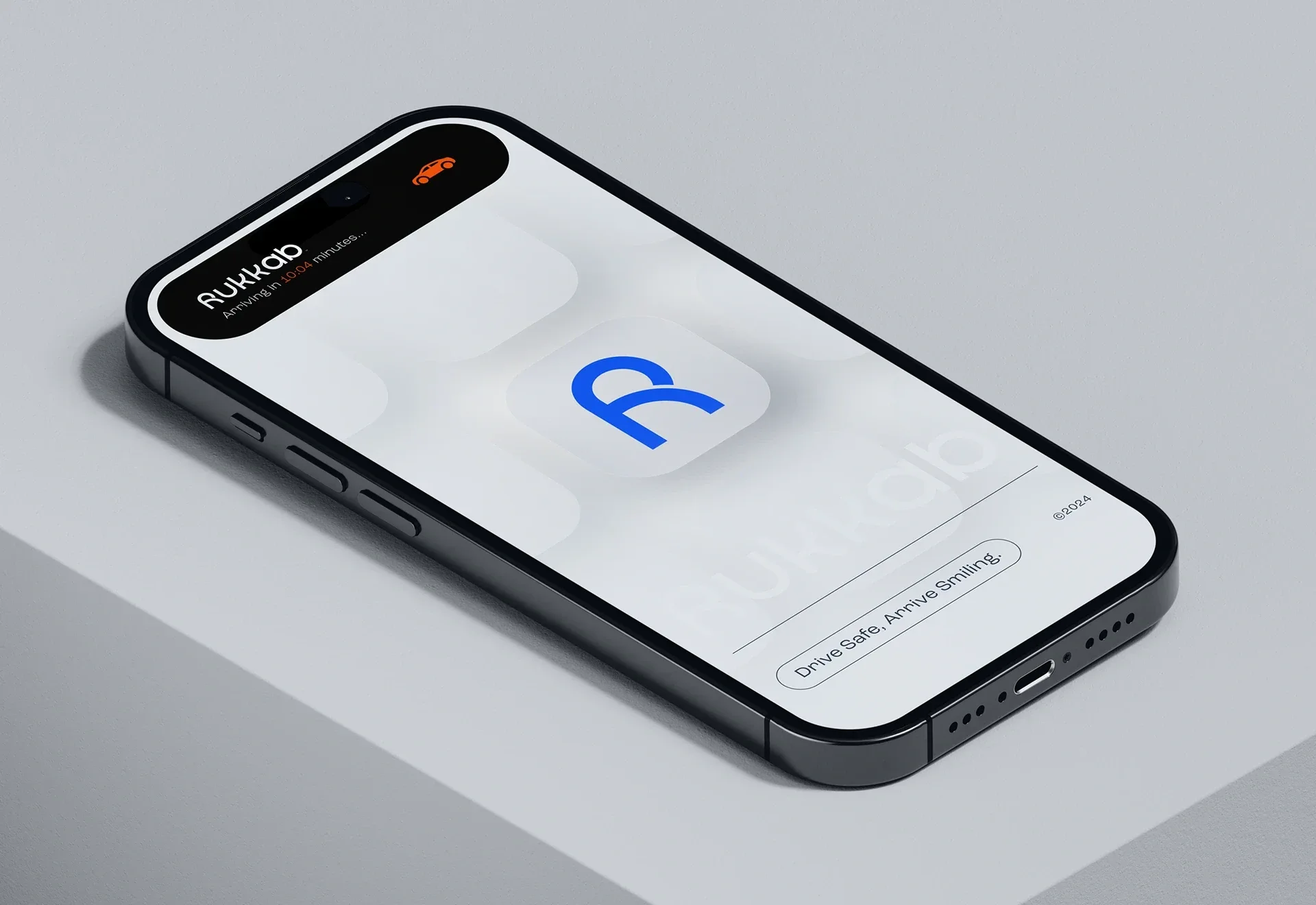
Blue, dark neutrals, and a bright accent give the interface contrast. The app icon and typography keep the brand clear at everyday digital sizes.

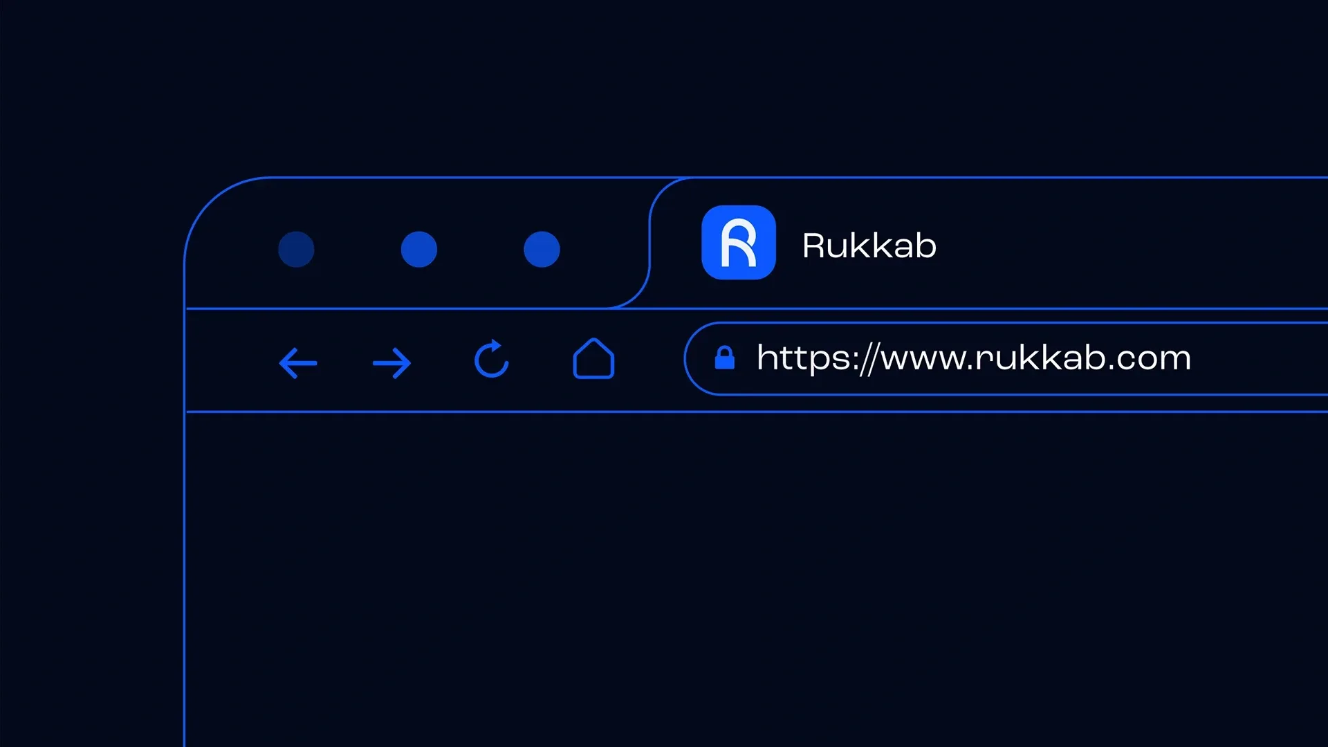
The identity in everyday use
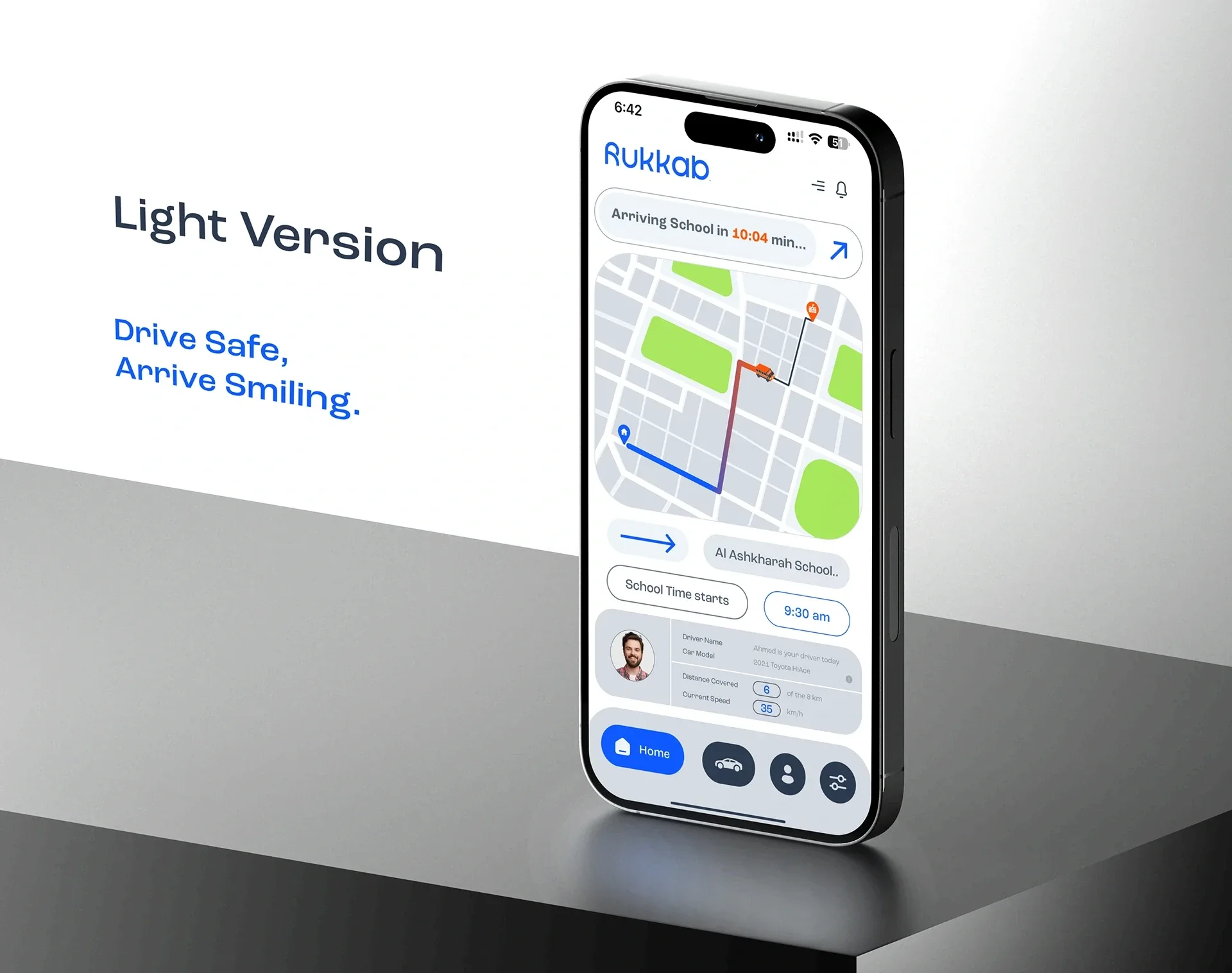
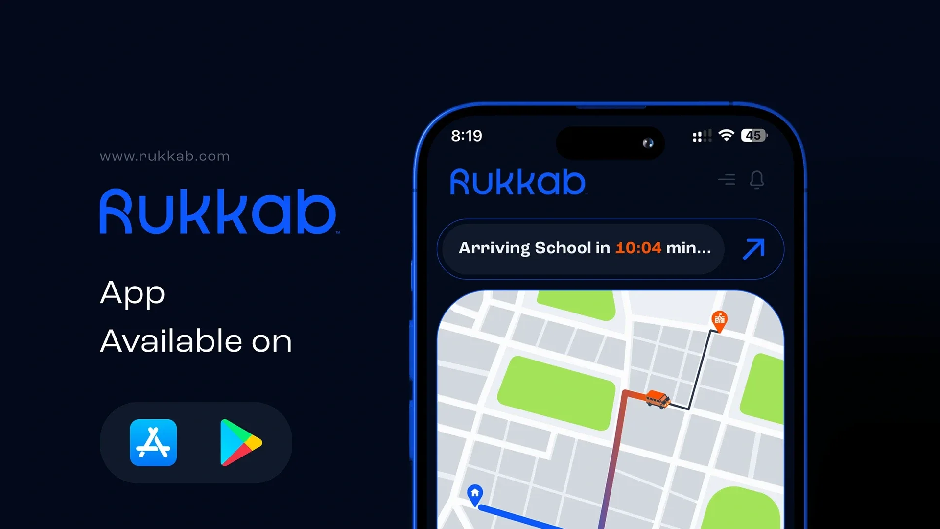
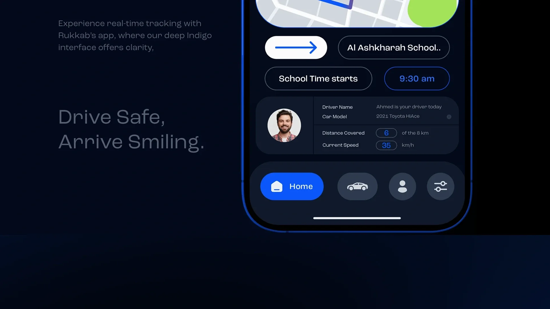
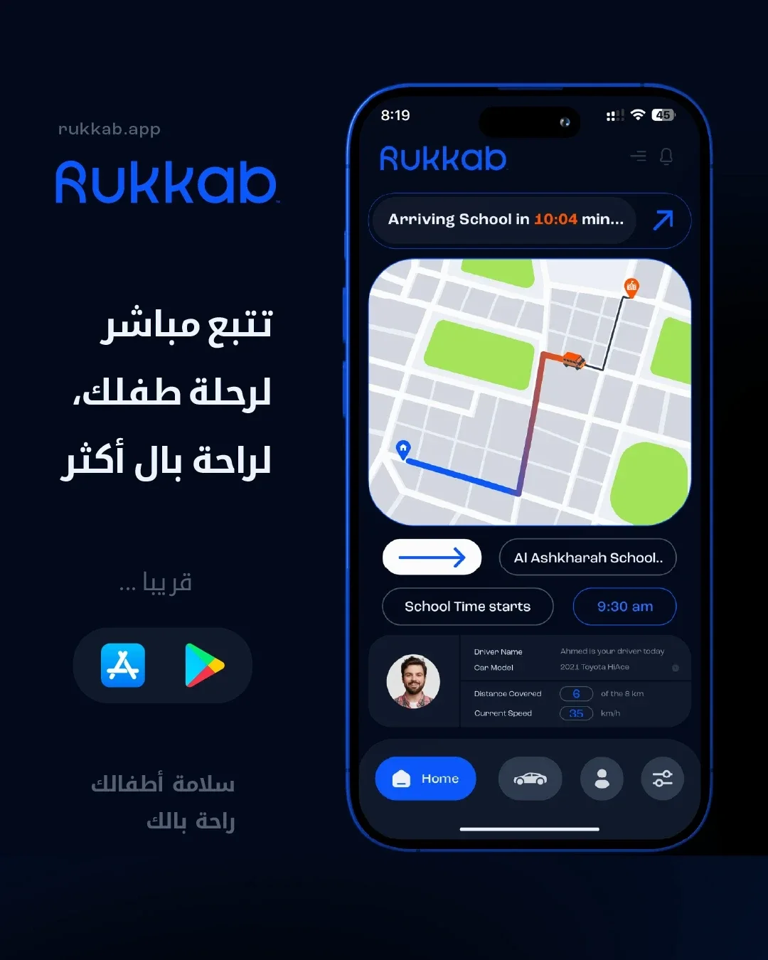
Light and dark interface treatments carry the same visual direction into the app, connecting the brand’s communications with its family-focused experience.
One identity, two languages
The Arabic wordmark follows the same visual direction as its English counterpart. Both signatures work within a shared system for the brand’s bilingual communications.
From identity to everyday journeys
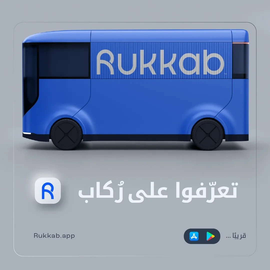
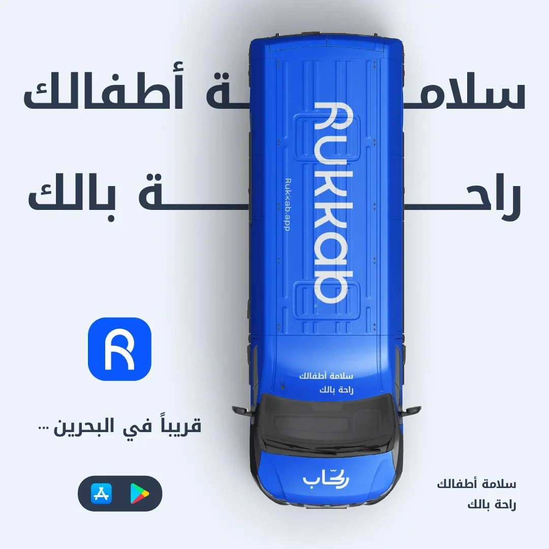
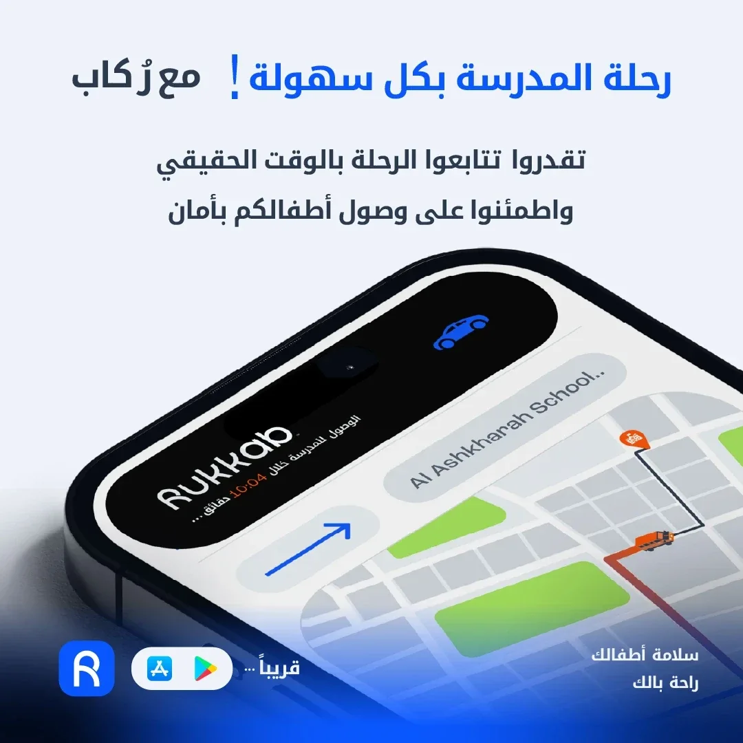
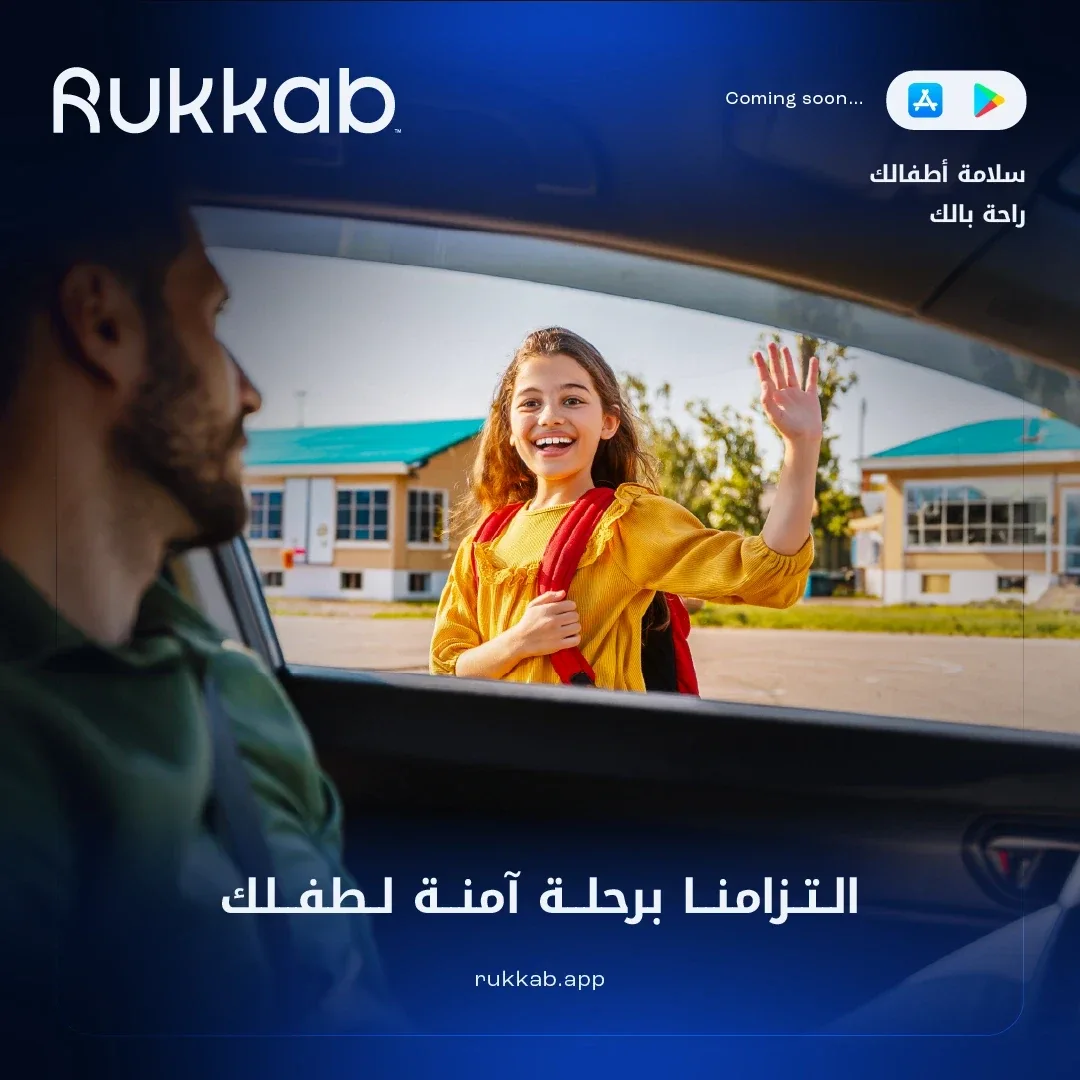
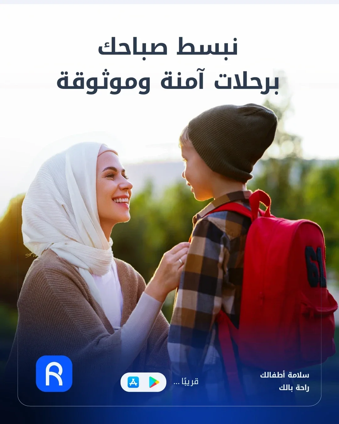
The launch campaign brings the identity into vehicle mockups, app demonstrations, and social communications focused on families and their daily journeys.
Thank you
Ready to build what’s next?
Tell us where you’re headed. We’ll build the brand that gets you there.