Dearly Sent
- Client
- Dearly Sent
- Location
- USA
- Scope
- Brand strategy, logo & visual identity, app icon, digital applications
About the project
Dearly Sent is an app designed to help people remember important moments and maintain meaningful connections. We shaped a warm, thoughtful identity around heartfelt correspondence, combining organic references with a clear visual system.

Keeping meaningful connections close
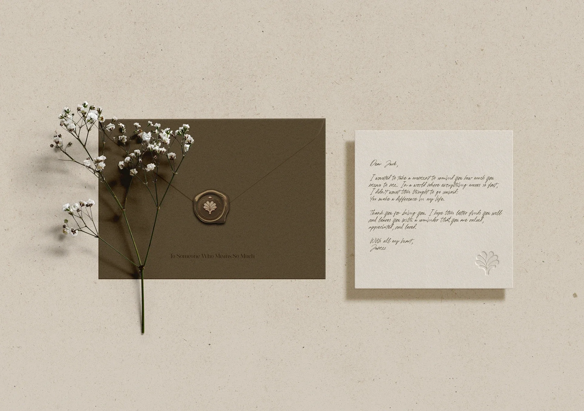
Dearly Sent helps people remember important moments and show others they matter. We built the identity around heartfelt correspondence, using natural forms, warm neutrals, and considered typography.

The brand foundations
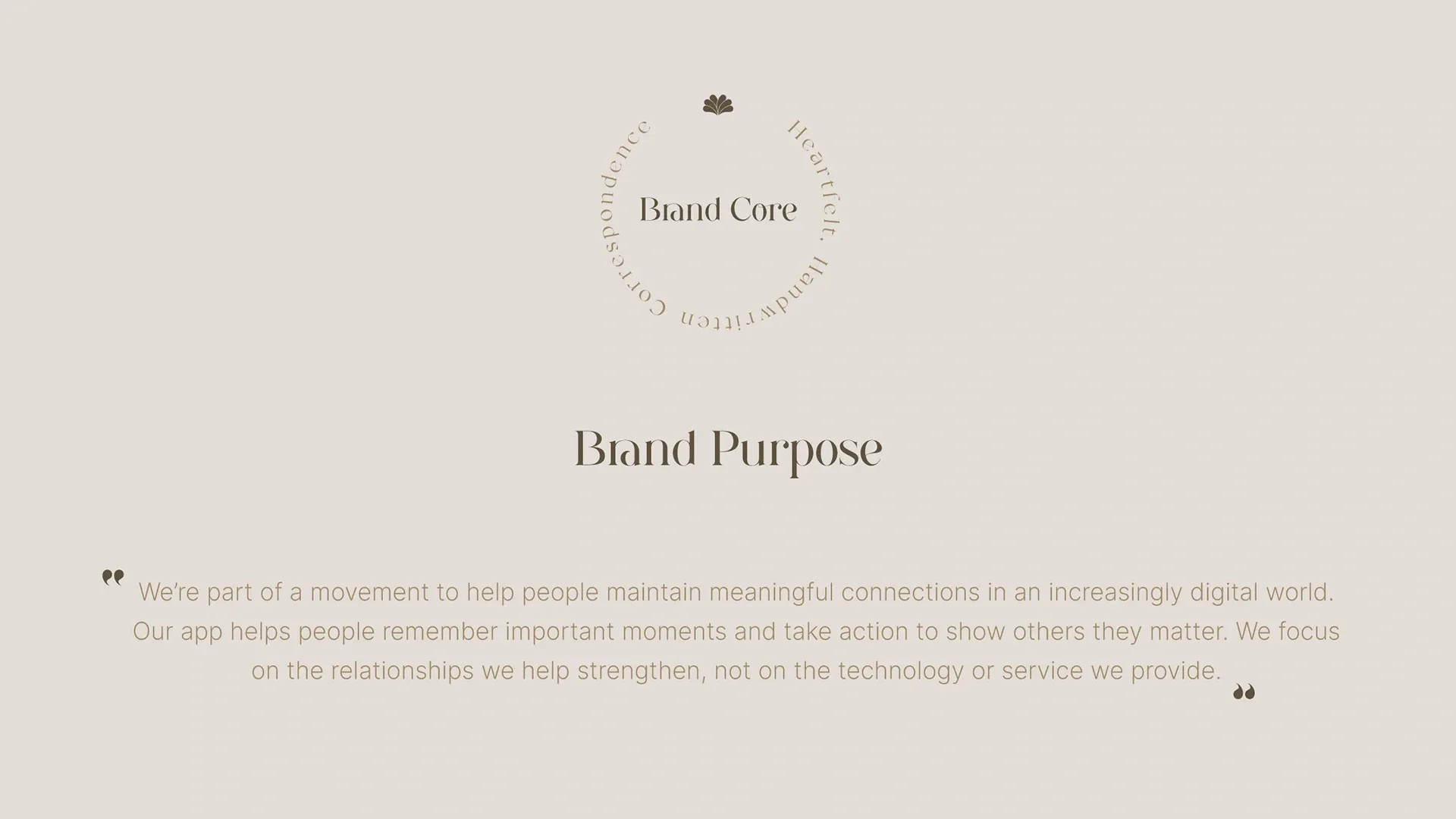
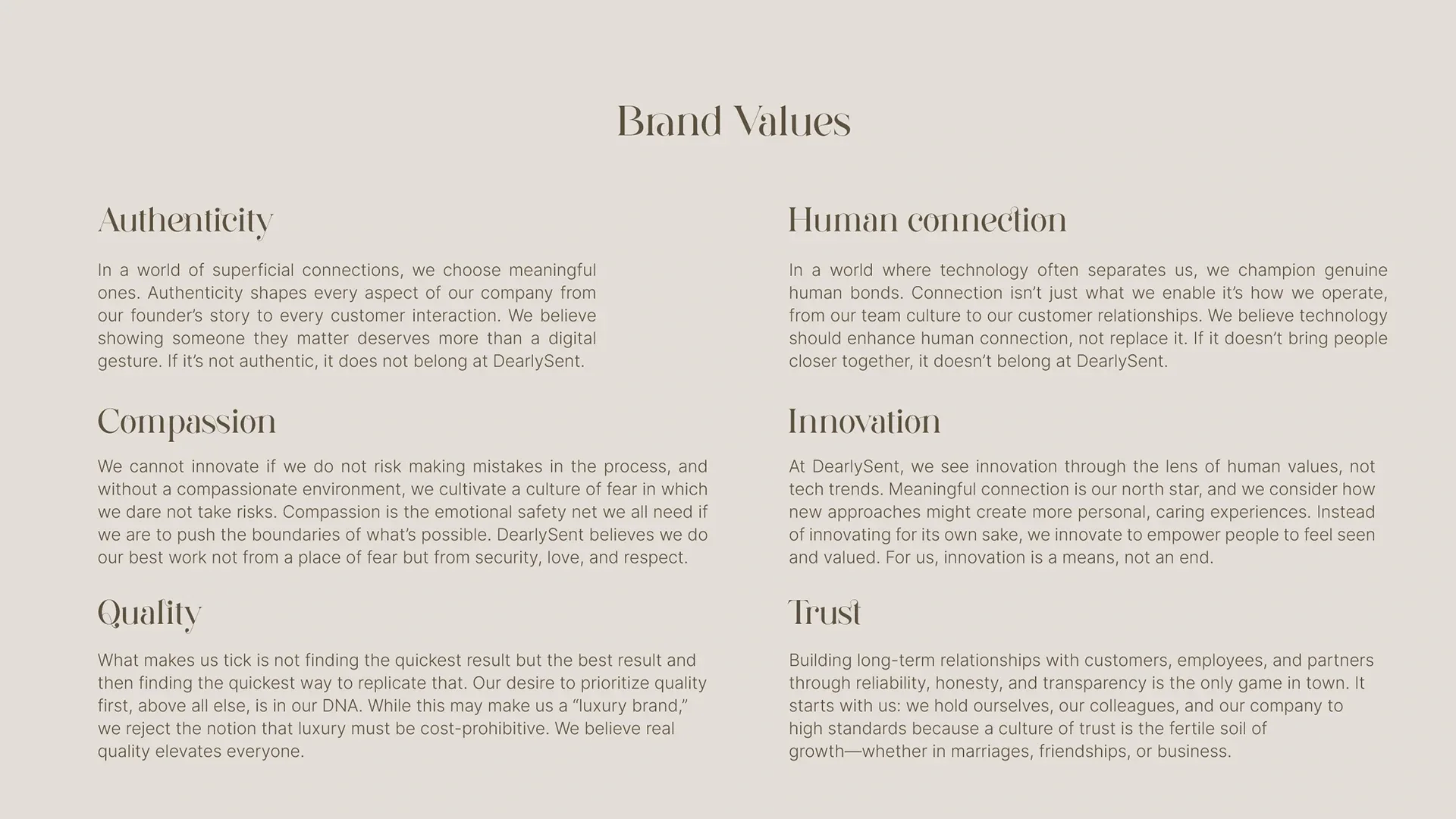
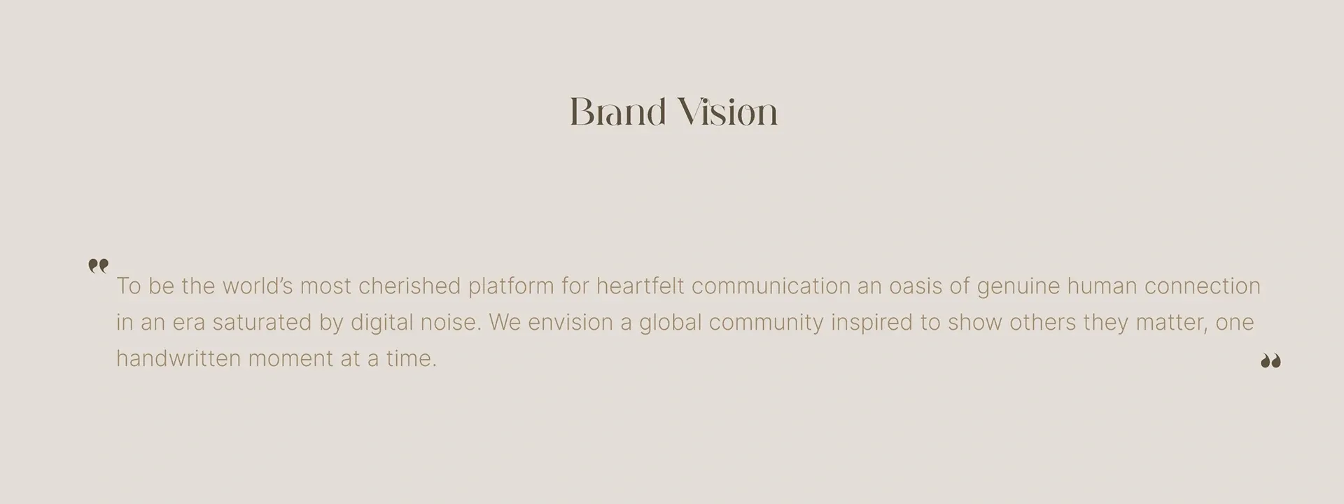
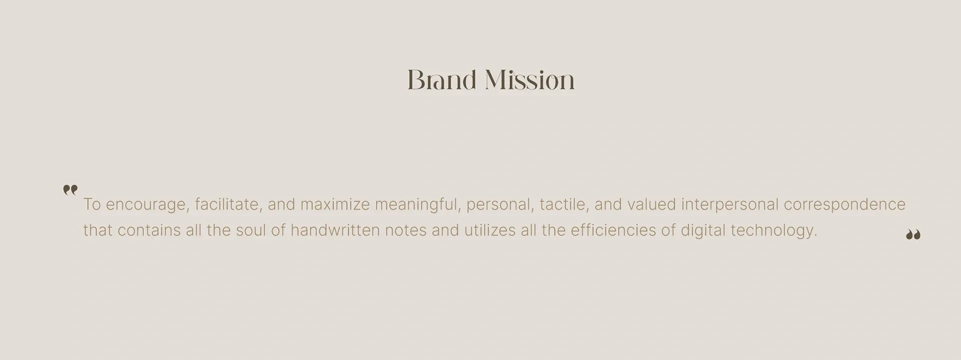
The purpose and values put human relationships at the center of the brand. The vision and mission carry that focus into the app’s direction.
A symbol shaped by nature
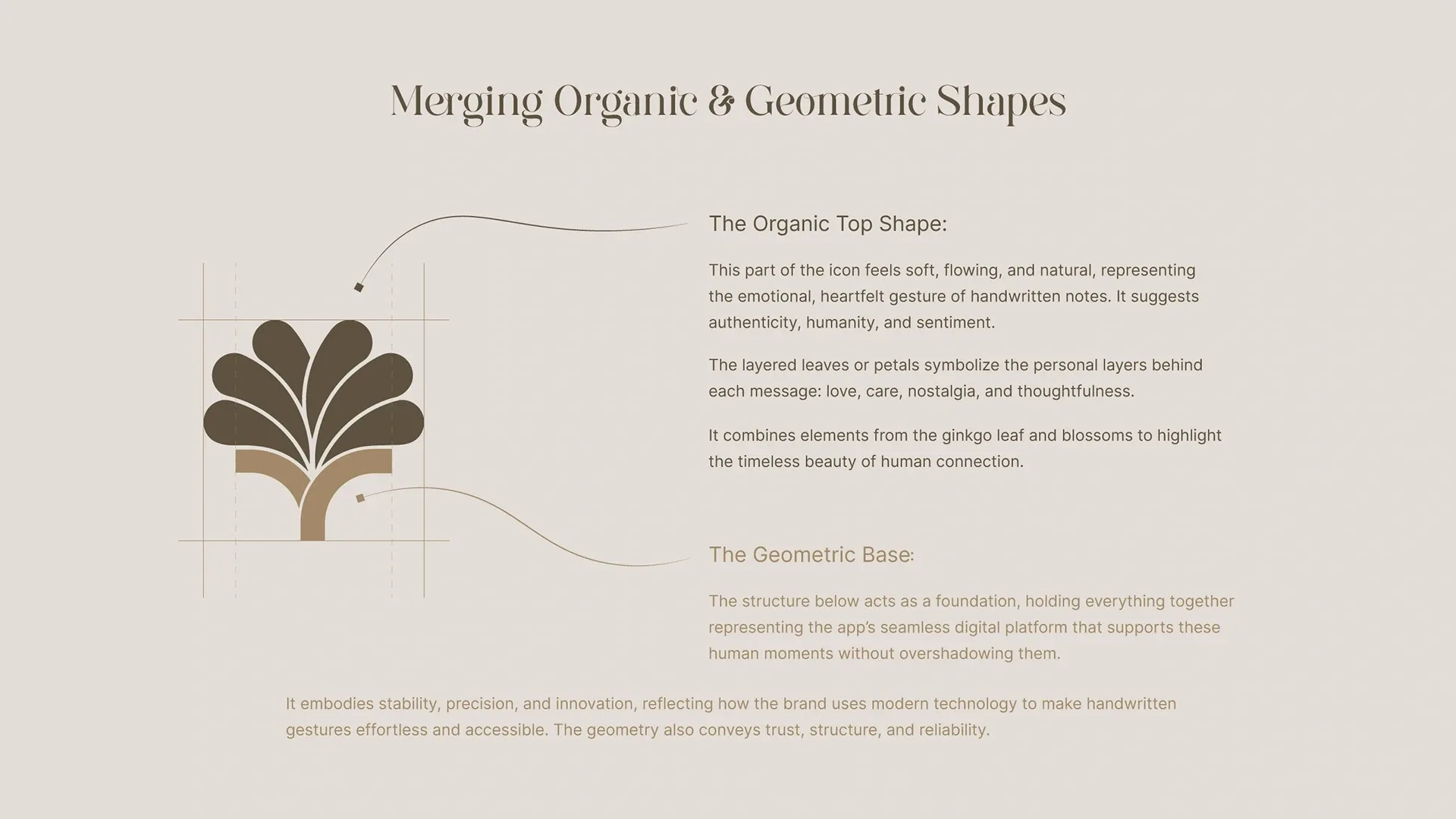
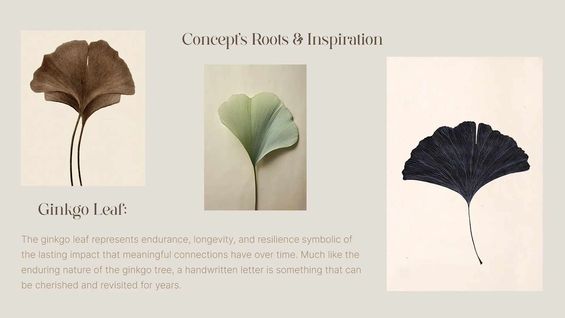
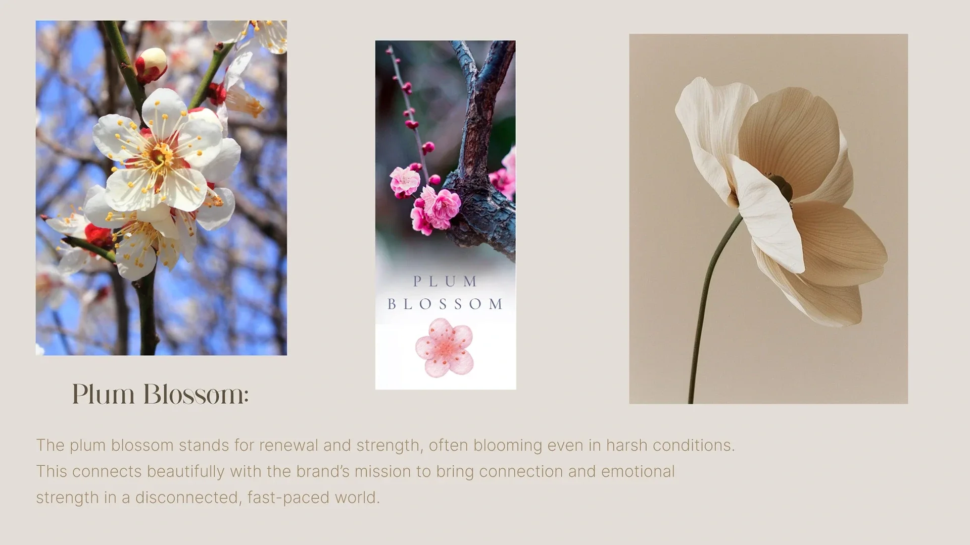
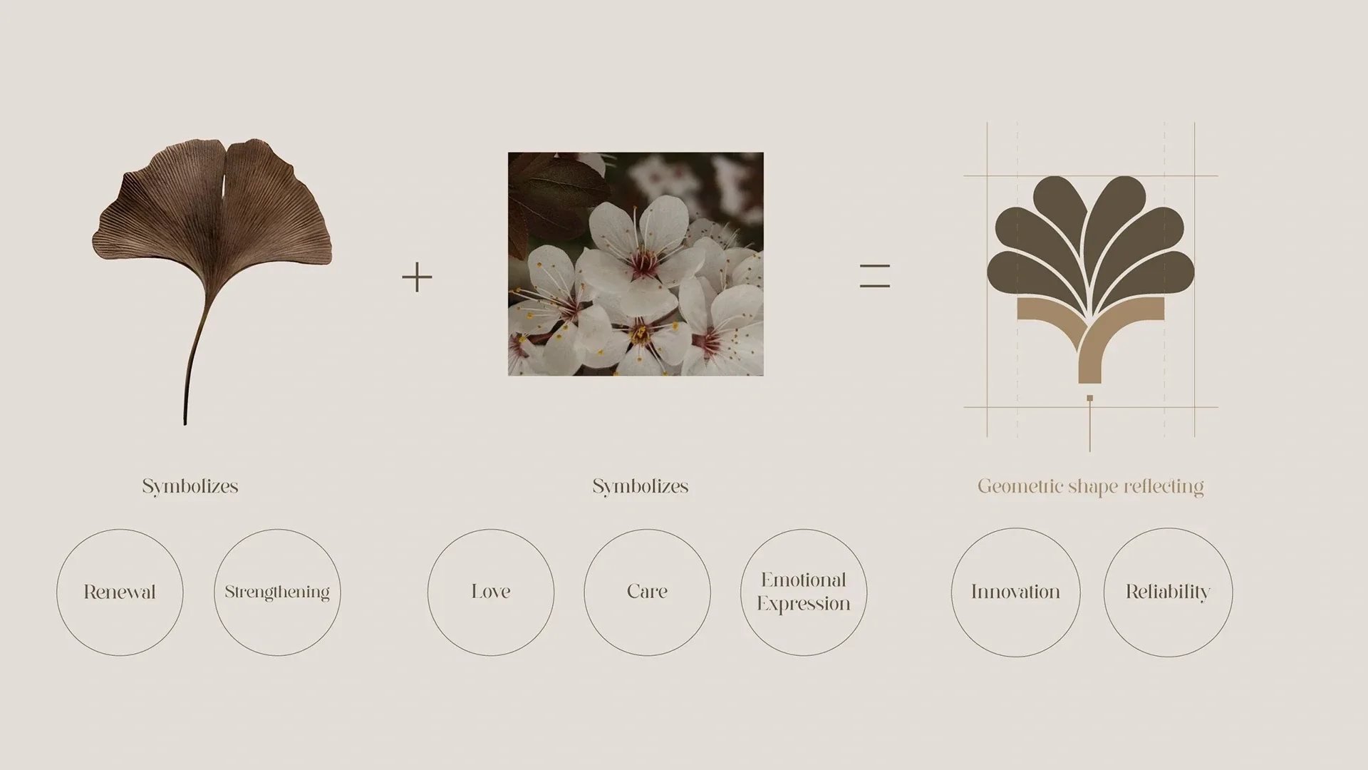
Ginkgo leaves and plum blossoms informed the symbol. The identity brings organic references into a precise construction, balancing warmth with clarity.

A warm, clear visual system
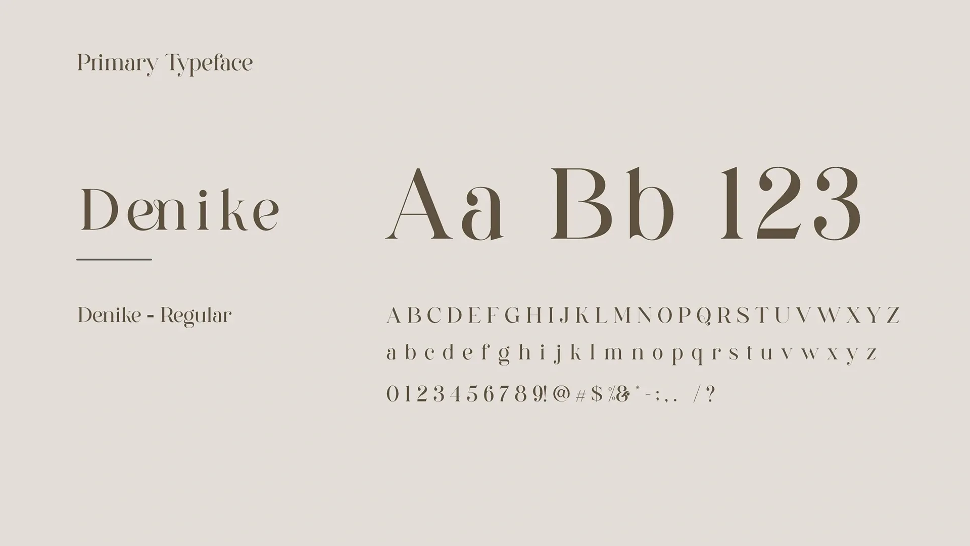
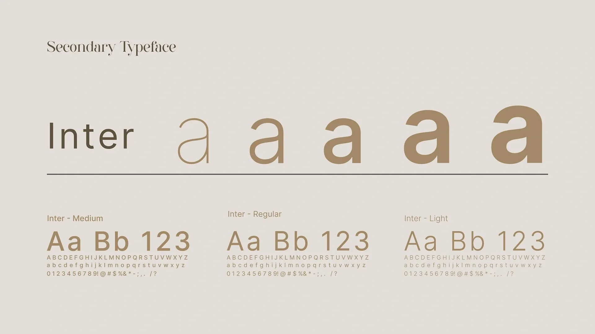
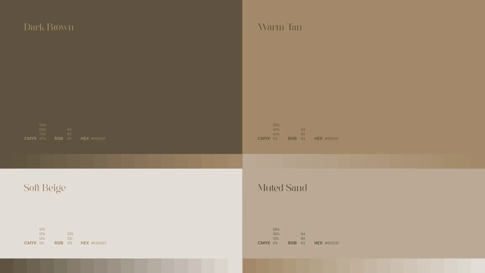
Denike and Inter work alongside the muted palette to give the brand a thoughtful, approachable character.
From the mark to the app
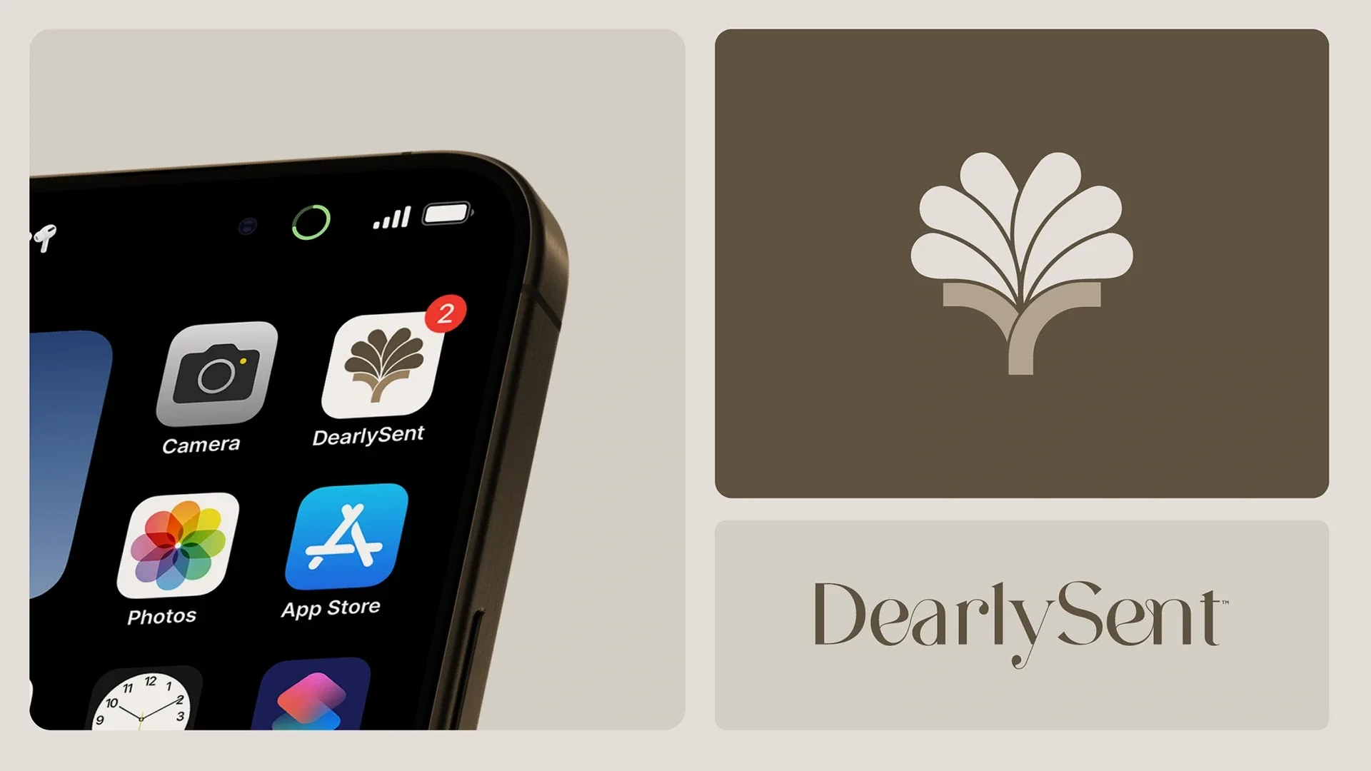
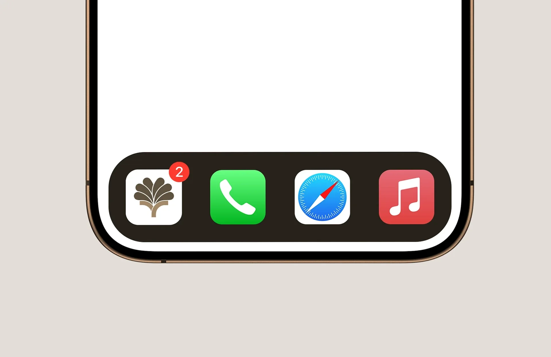
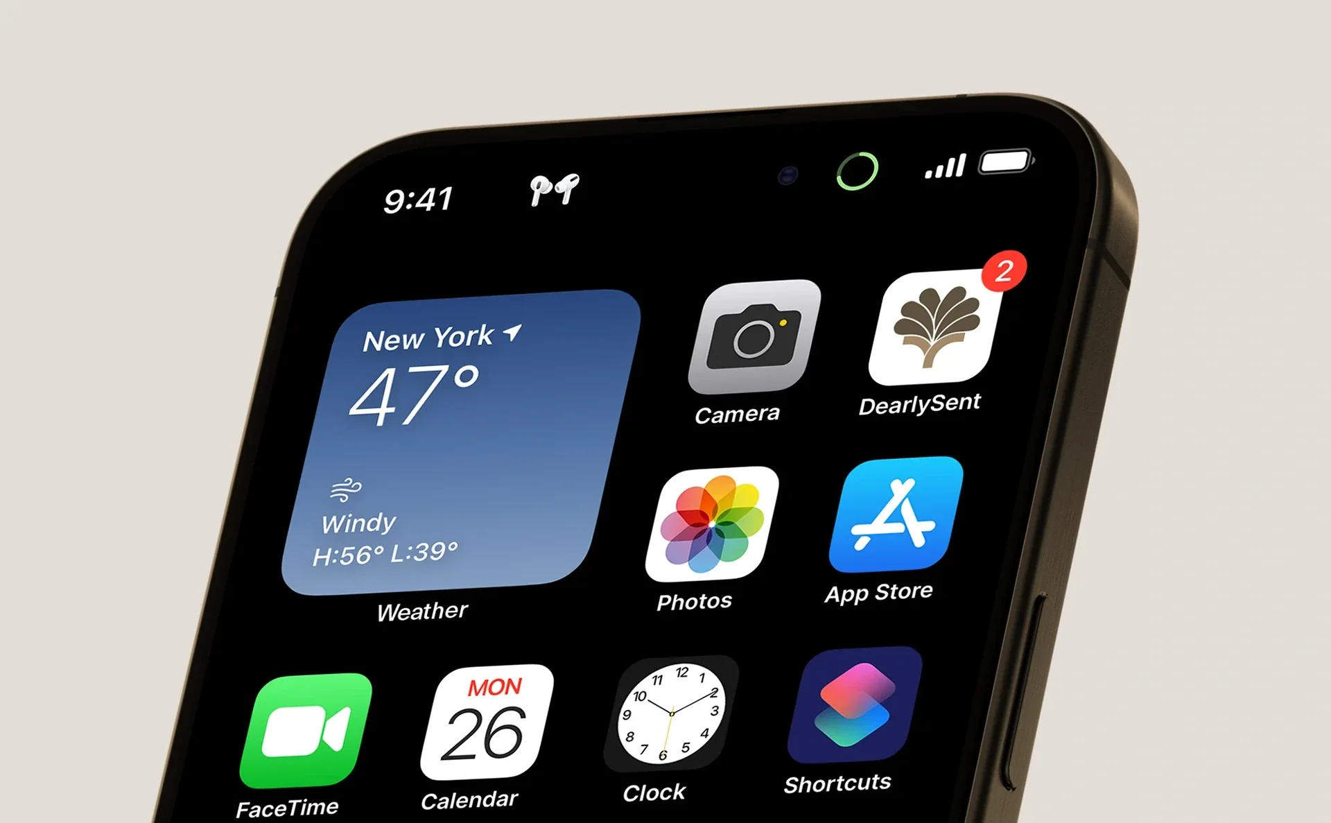
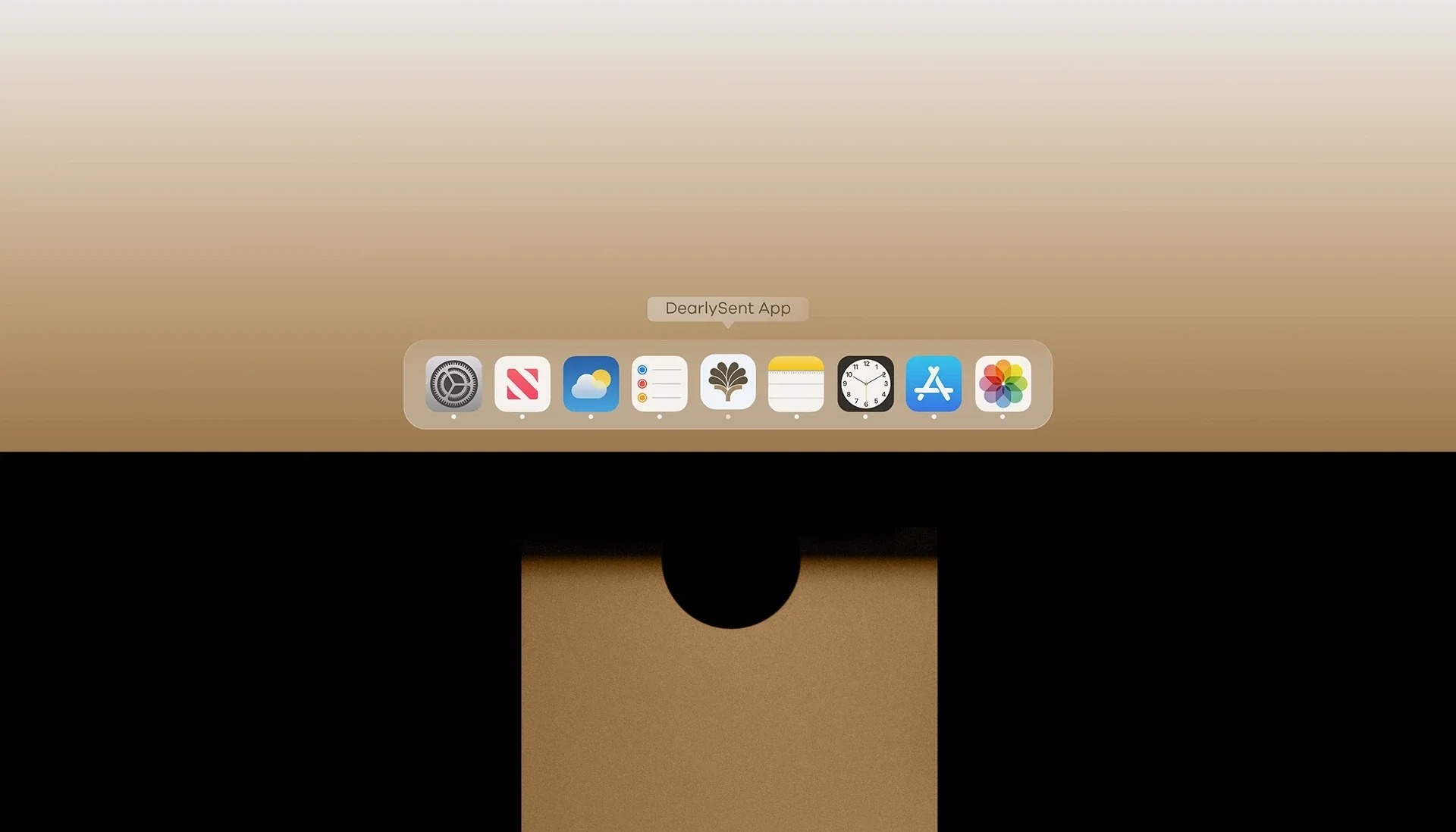
Light and dark icon treatments keep the symbol recognizable across digital settings. Phone and desktop applications connect that signature to everyday use.



Thank you
Ready to build what’s next?
Tell us where you’re headed. We’ll build the brand that gets you there.