Florevita
- Client
- Florevita
- Location
- Belgium
- Scope
- Brand strategy, positioning, logo & visual identity, packaging, art direction
About the project
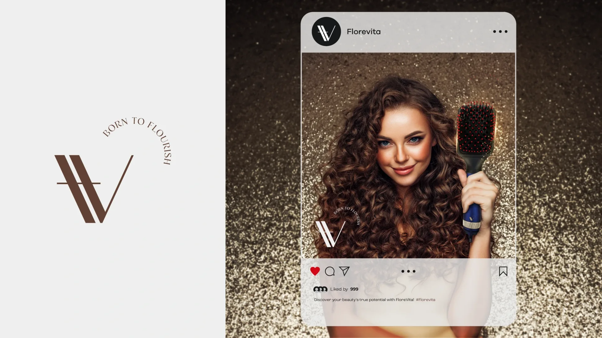
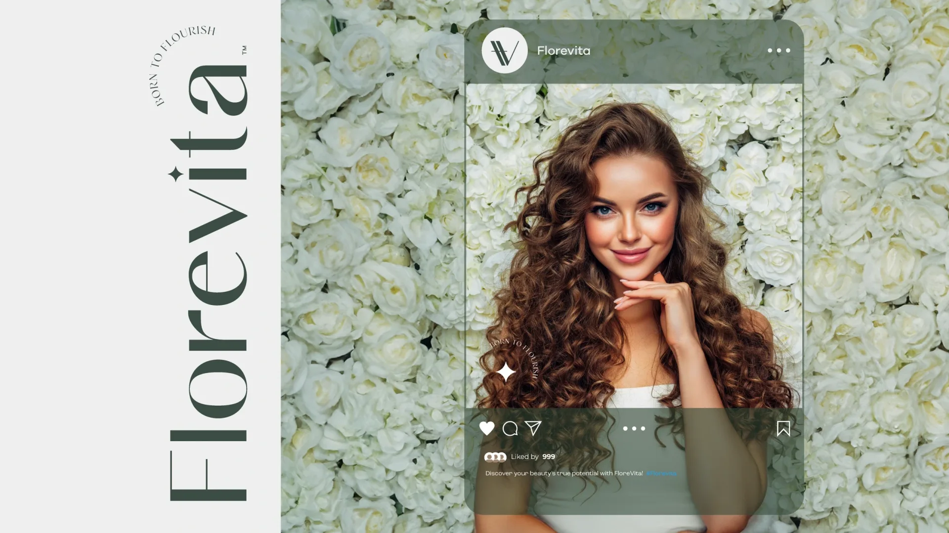
Florevita is a beauty brand built around “Born to Flourish”. We developed its brand direction and visual identity, translating that idea into a refined logo system, packaging, and campaign materials. Expressive beauty imagery, a warm palette, and marble details connect the brand across its touchpoints.
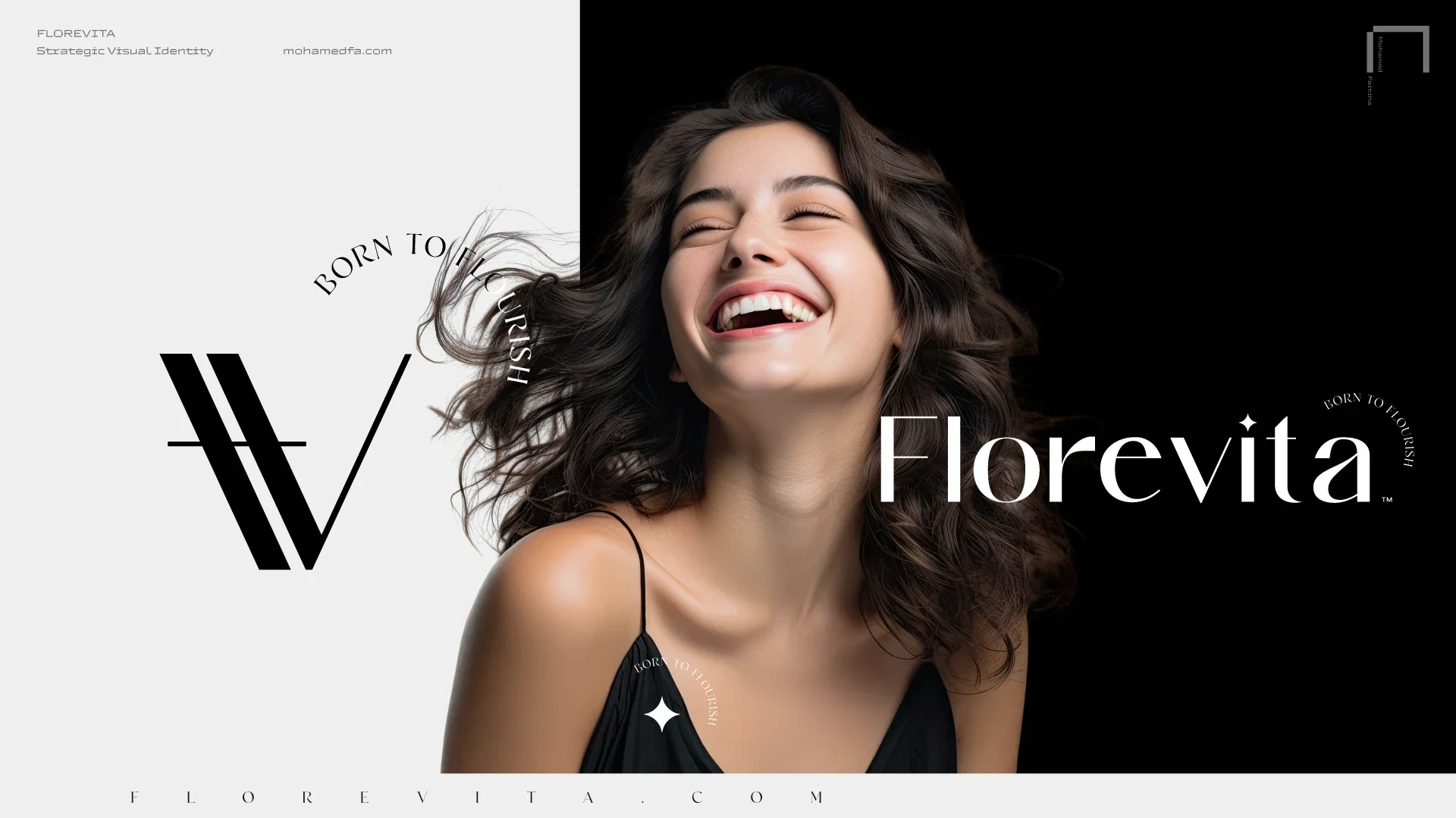
Born to Flourish
“Born to Flourish” gives Florevita’s identity a clear point of view. We brought that idea into an expressive visual system for the beauty brand, connecting its wordmark, monogram, imagery, and packaging.

The identity
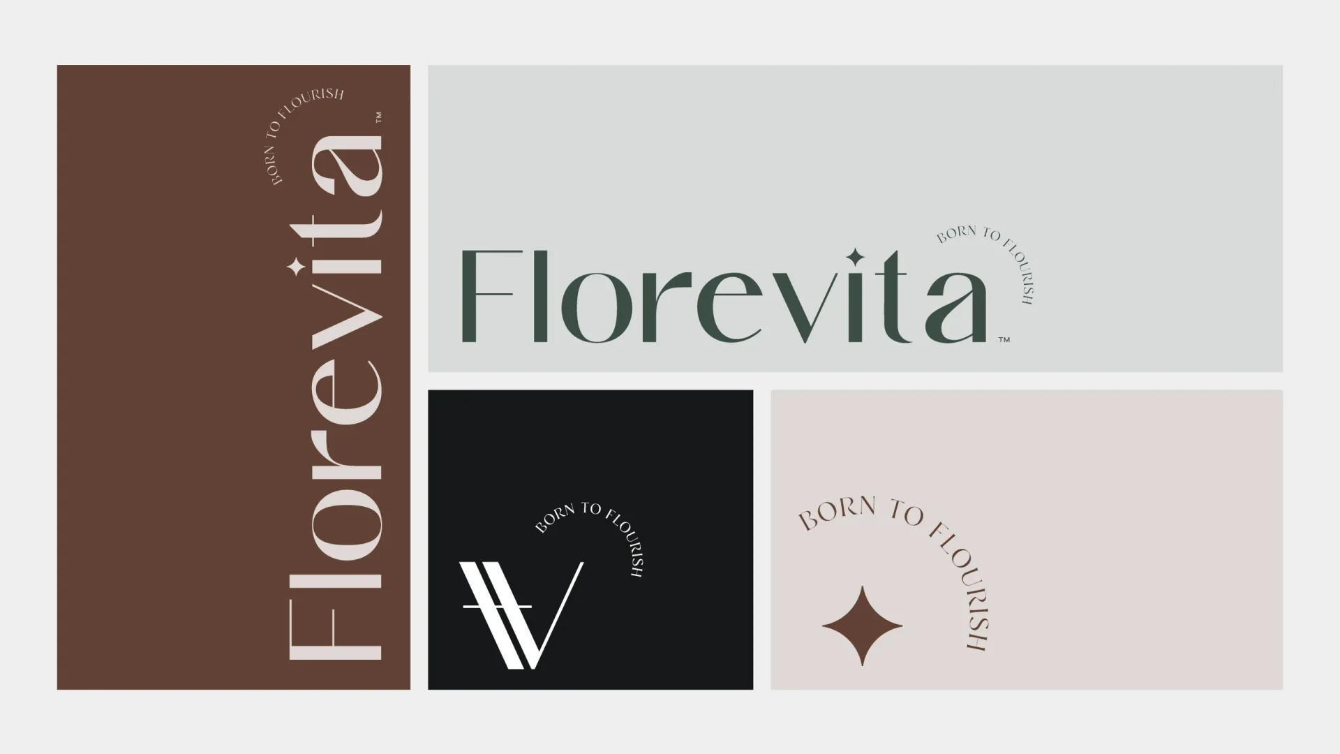
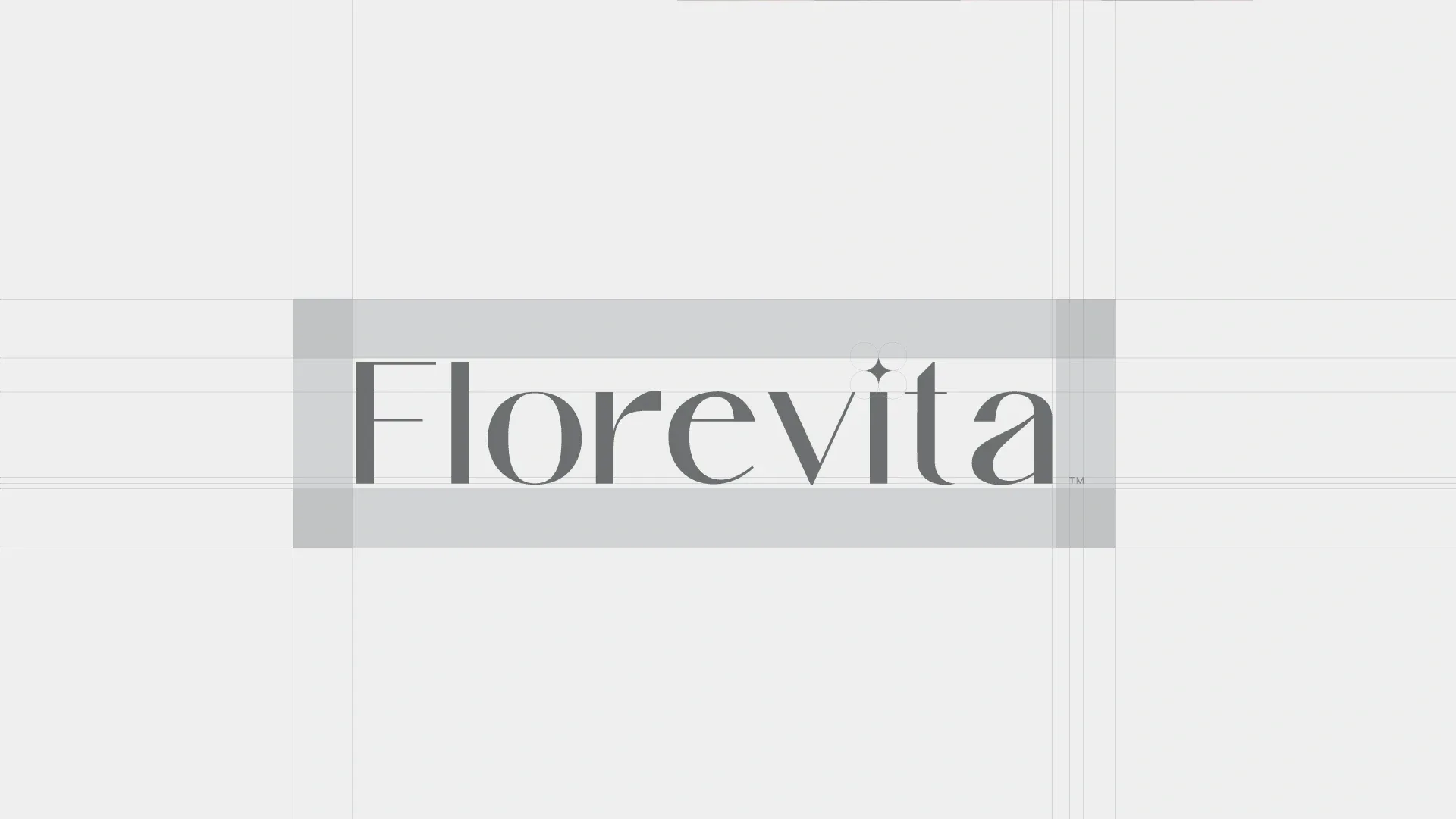
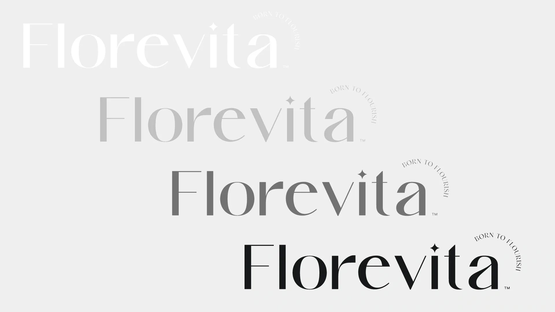
A refined wordmark sits alongside a distinctive monogram and star symbol. Carefully considered proportions keep the identity recognizable across packaging, digital content, and large campaign applications.
Color and material
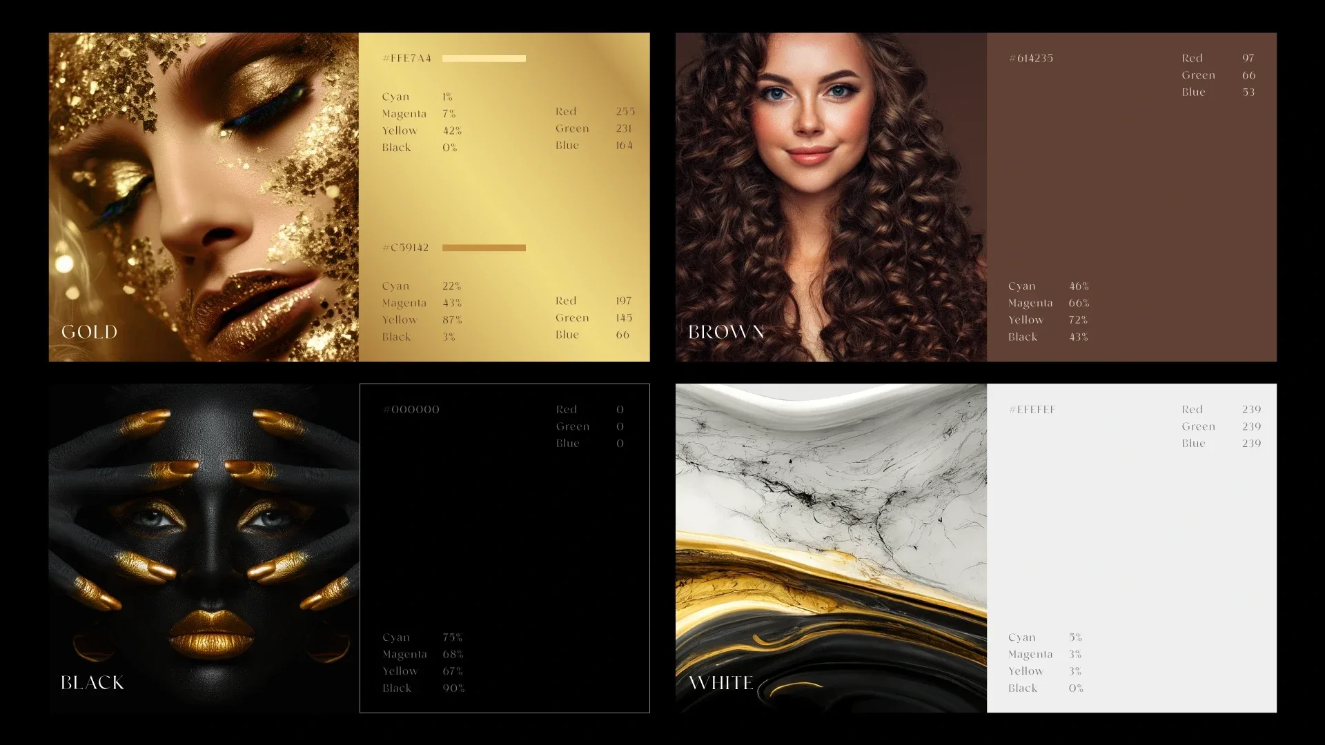
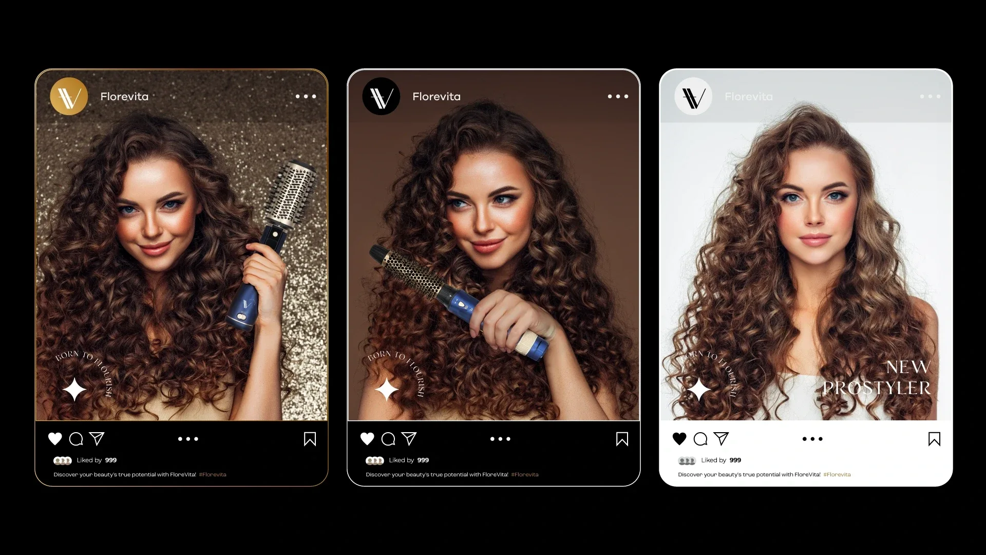
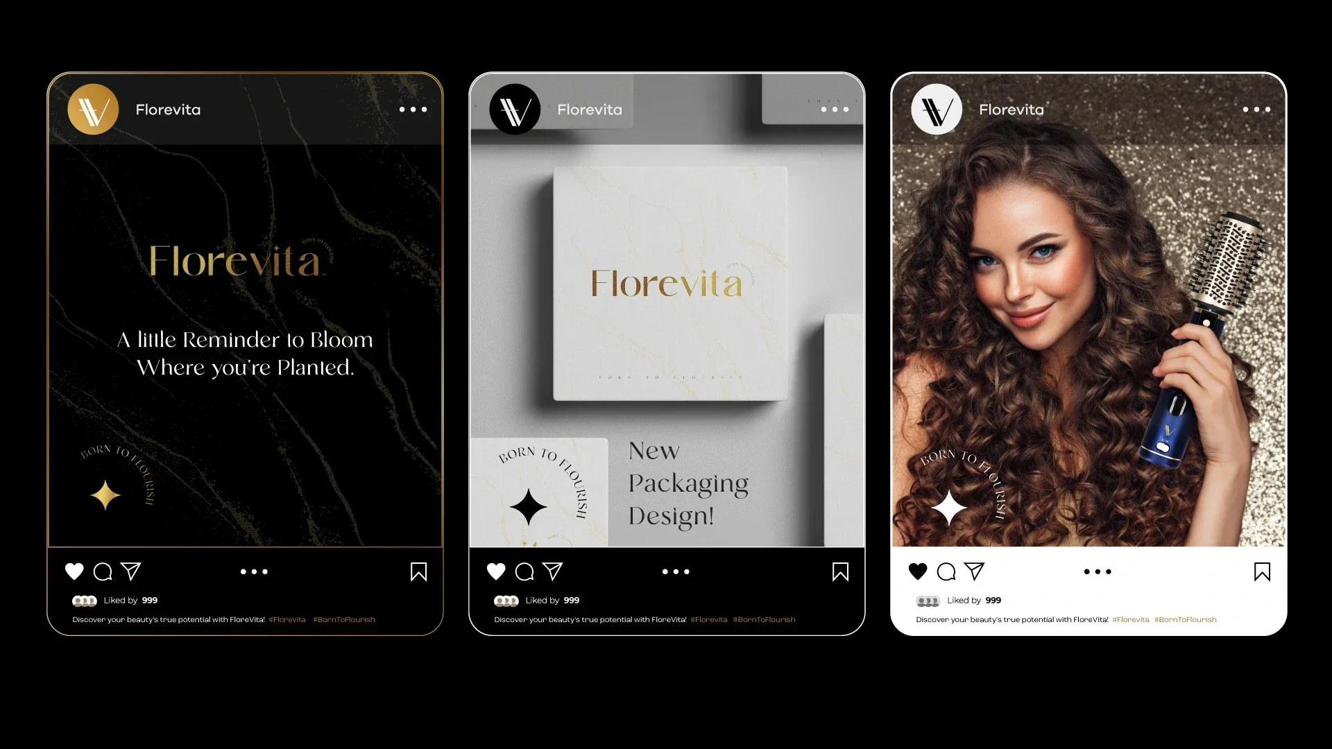
Gold, brown, black, and white set the core palette. Beauty photography and gold-veined marble textures carry that language into the brand’s imagery and packaging.

Packaging and print
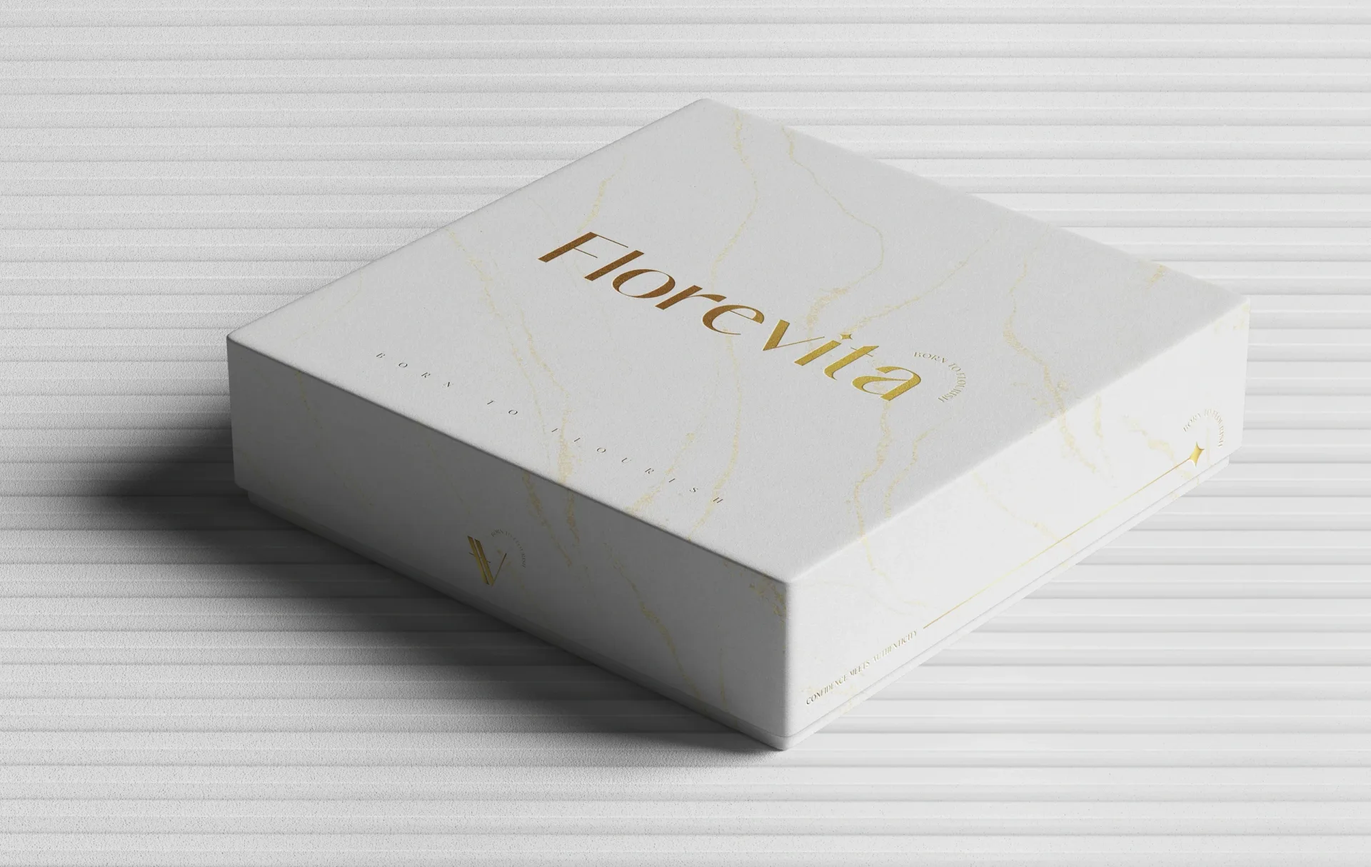
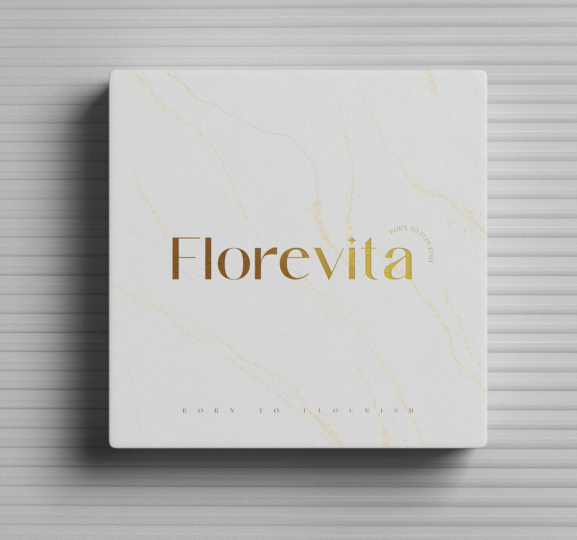
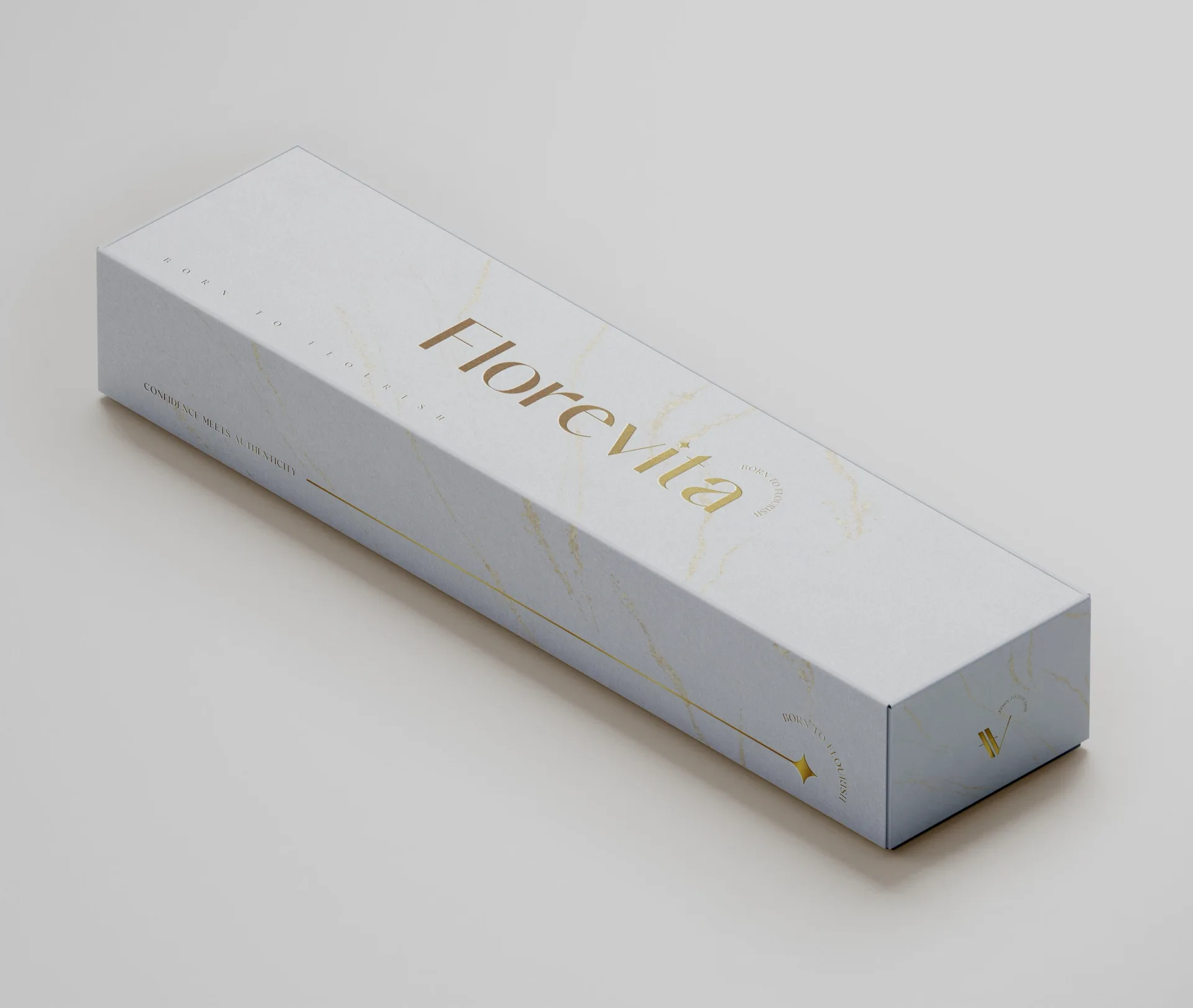
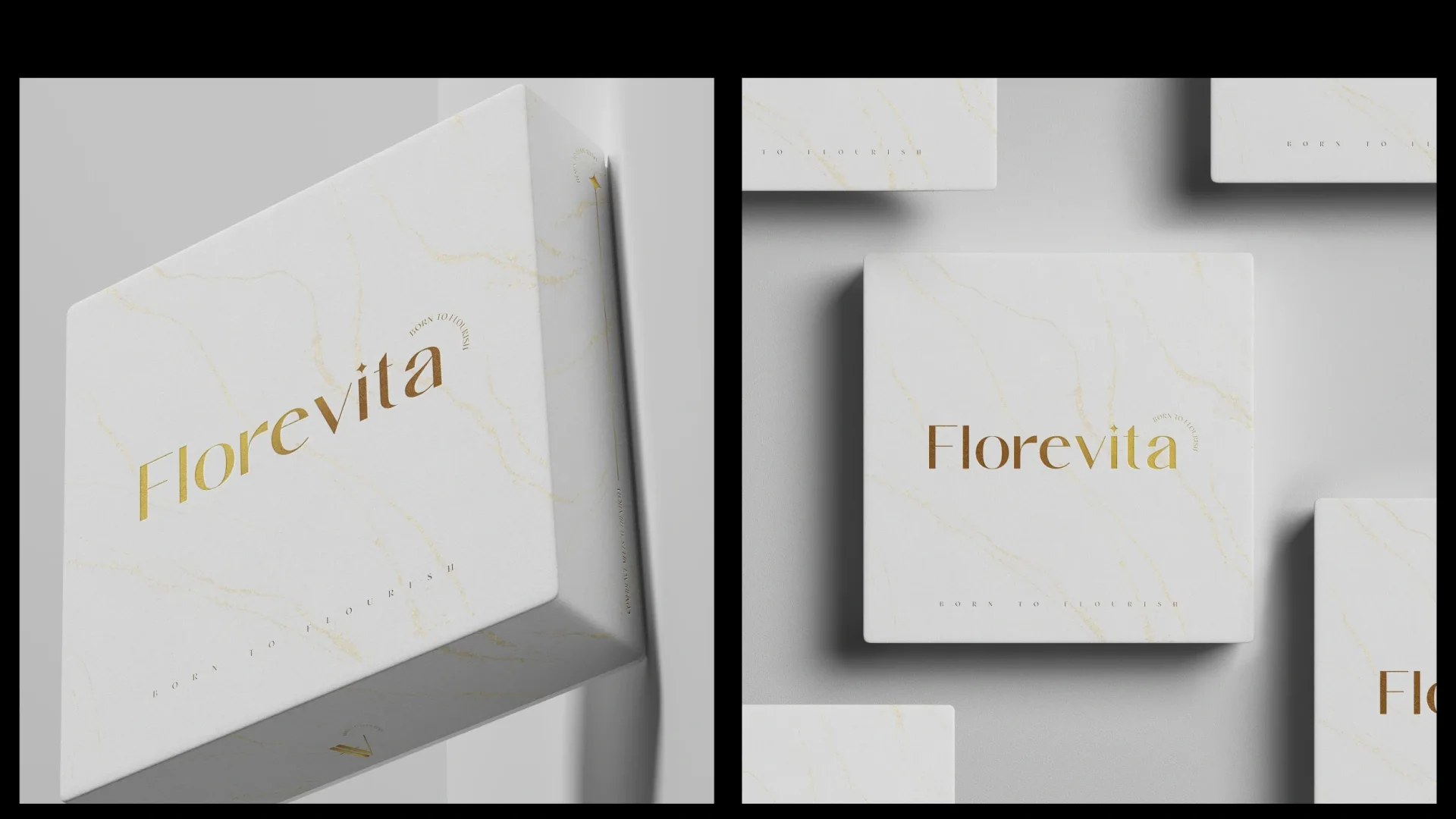
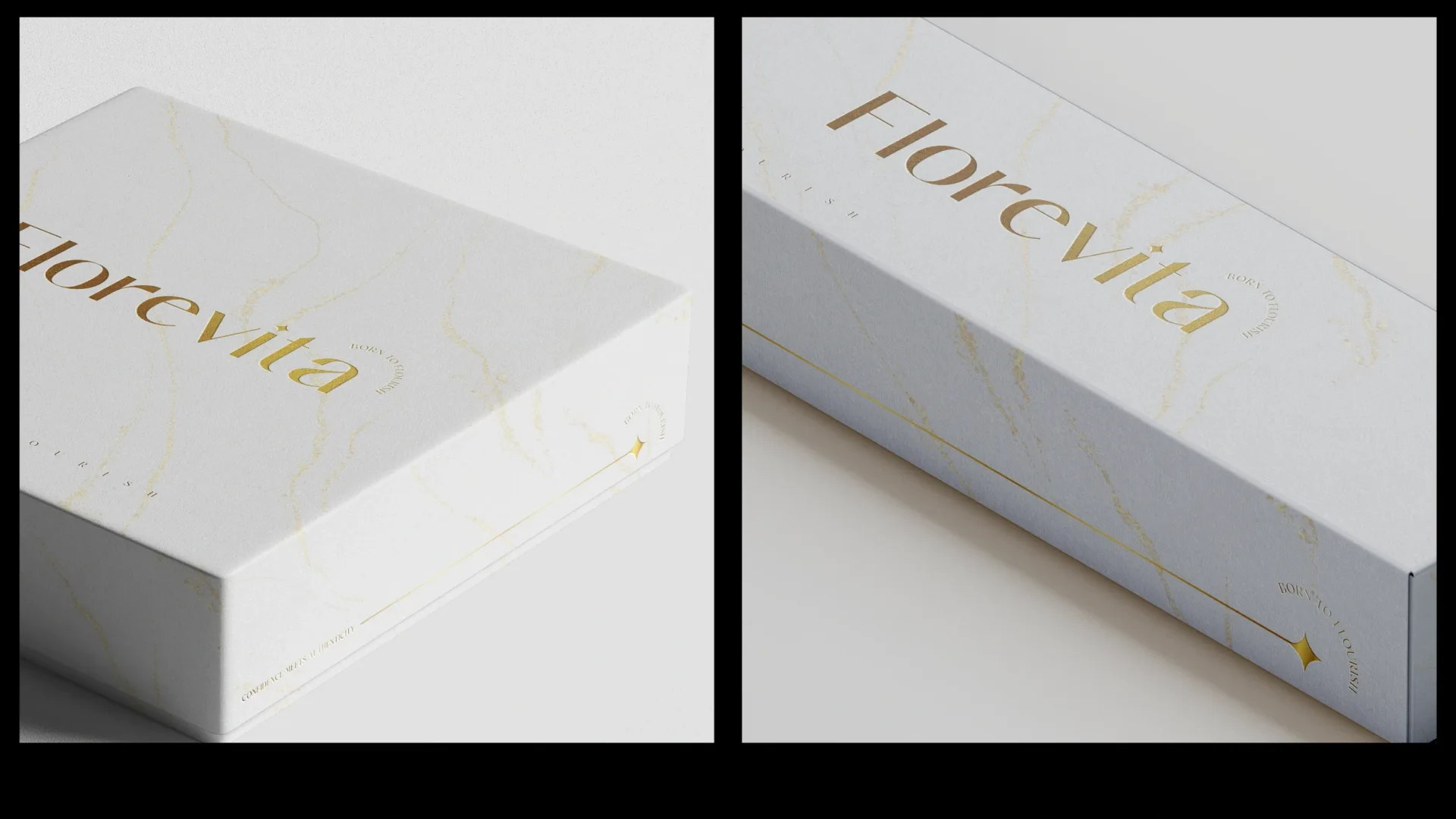
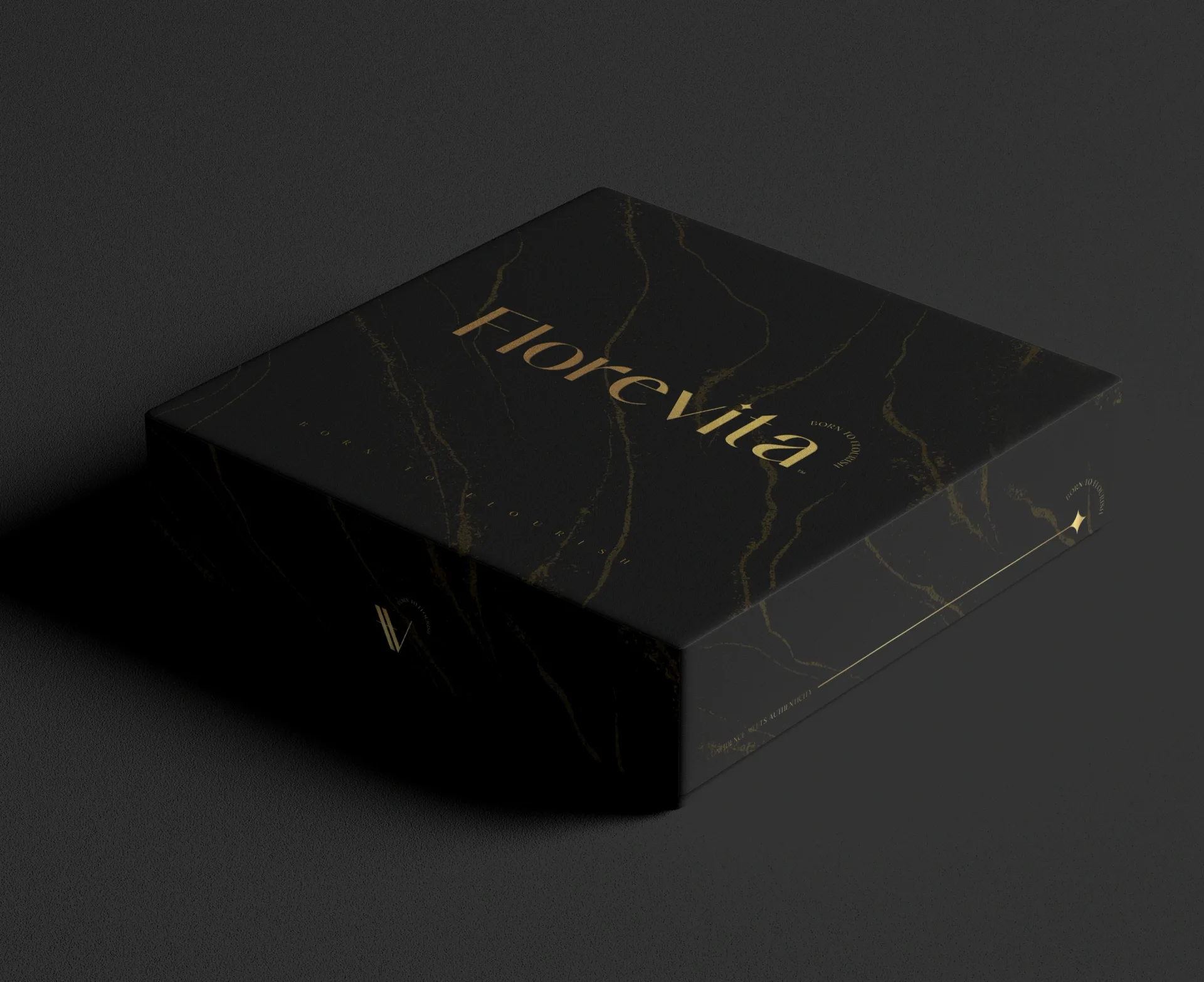
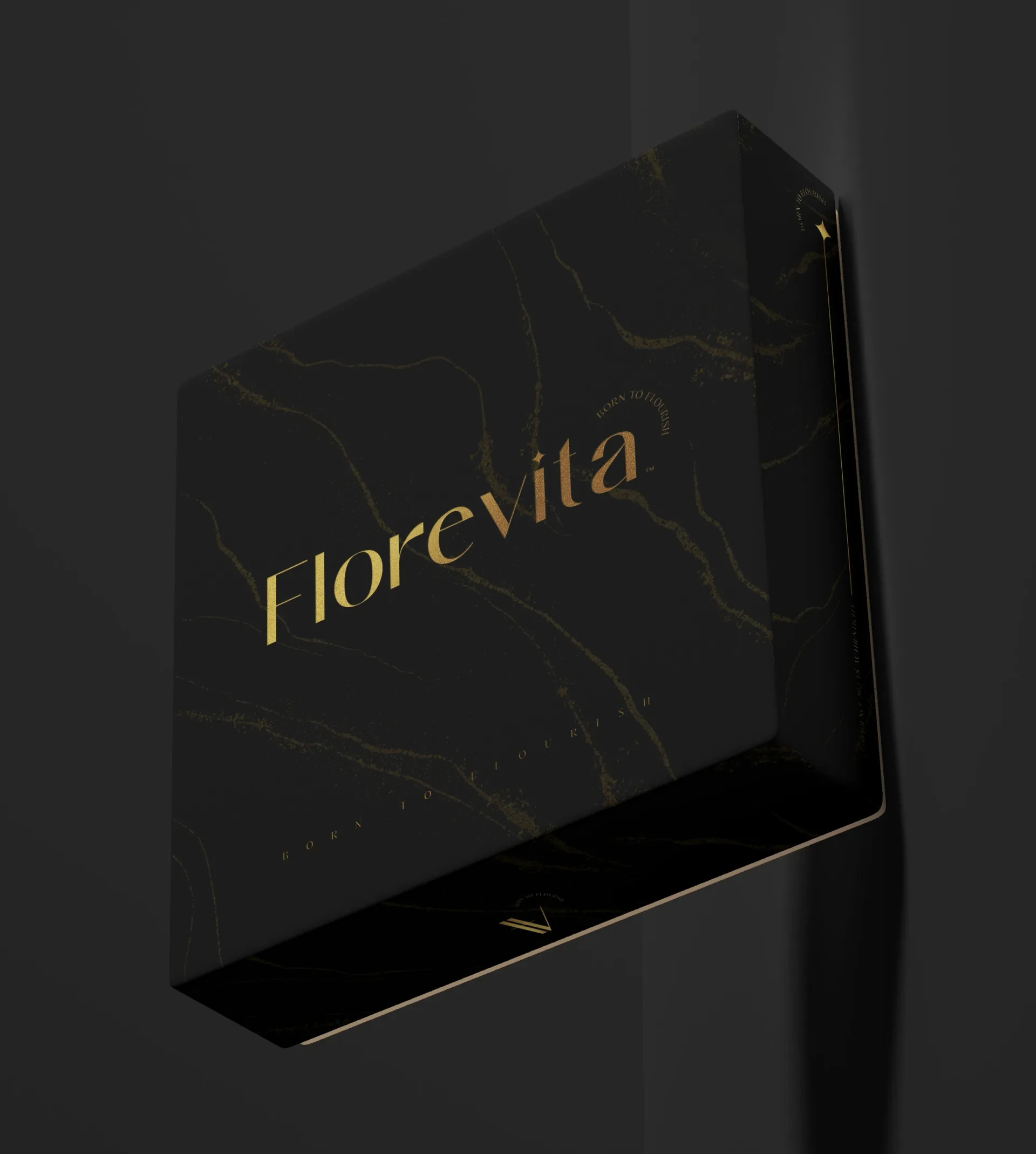
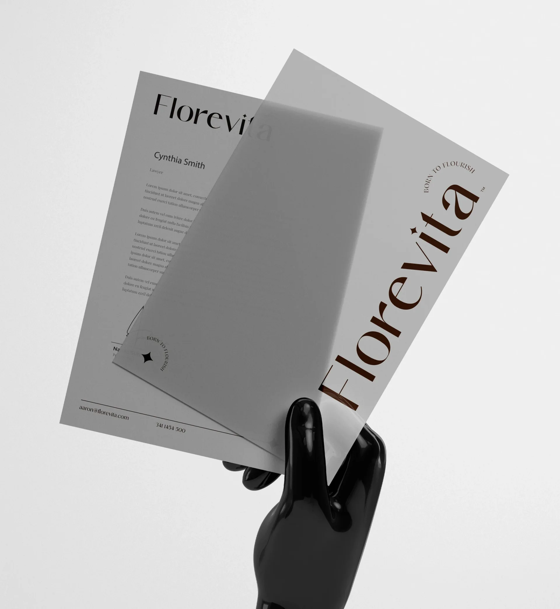
White and black packaging share the same visual language, with gold wordmarks and marble details creating a consistent family. The identity also extends into stationery, bringing the brand into everyday communication.
Across every touchpoint
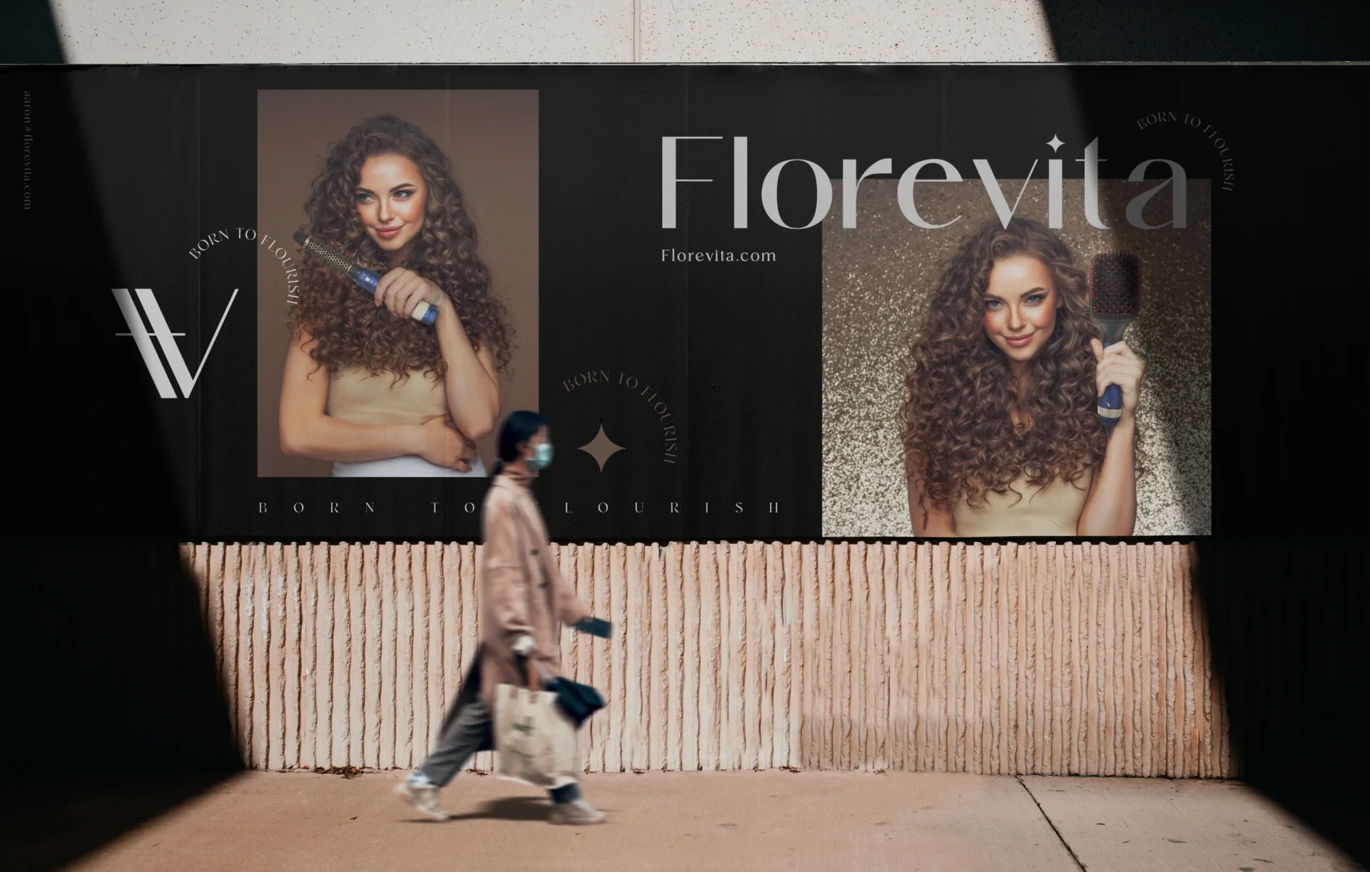
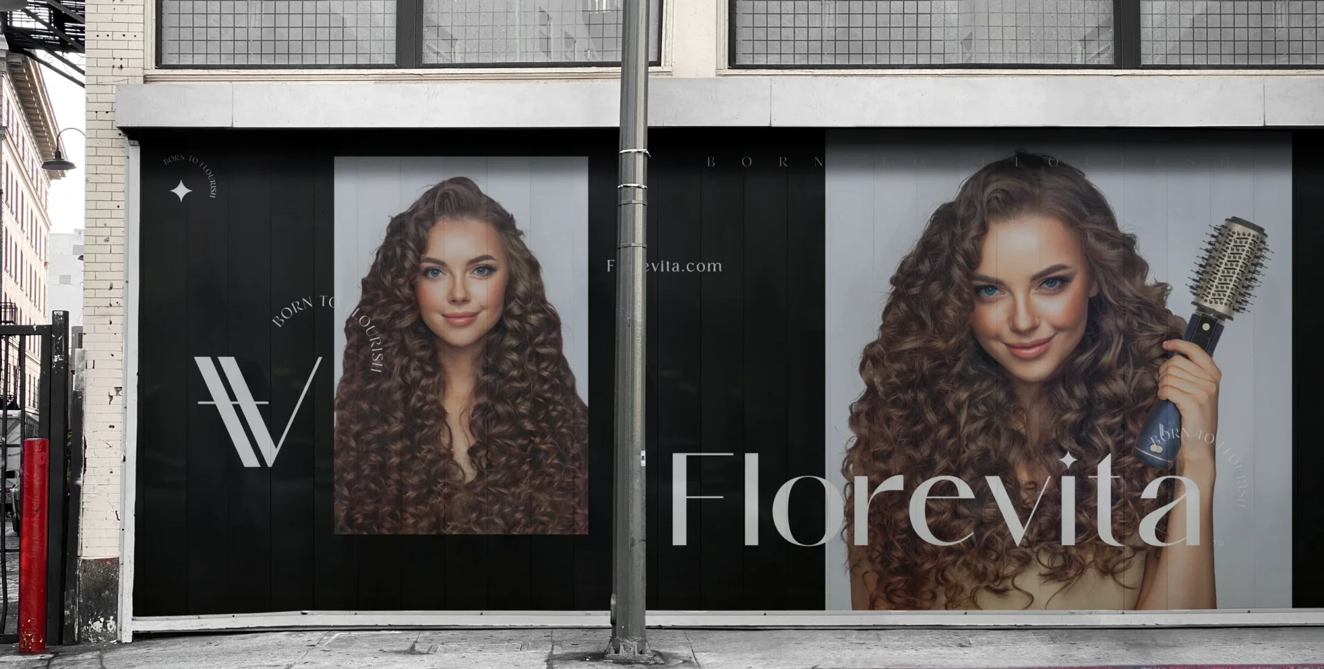
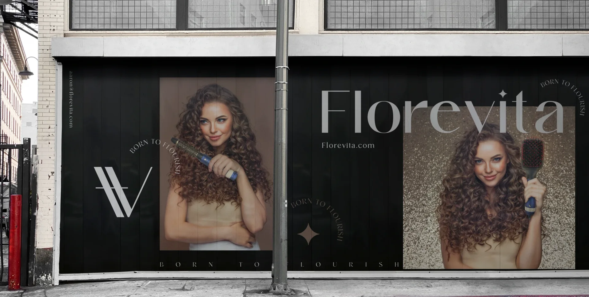
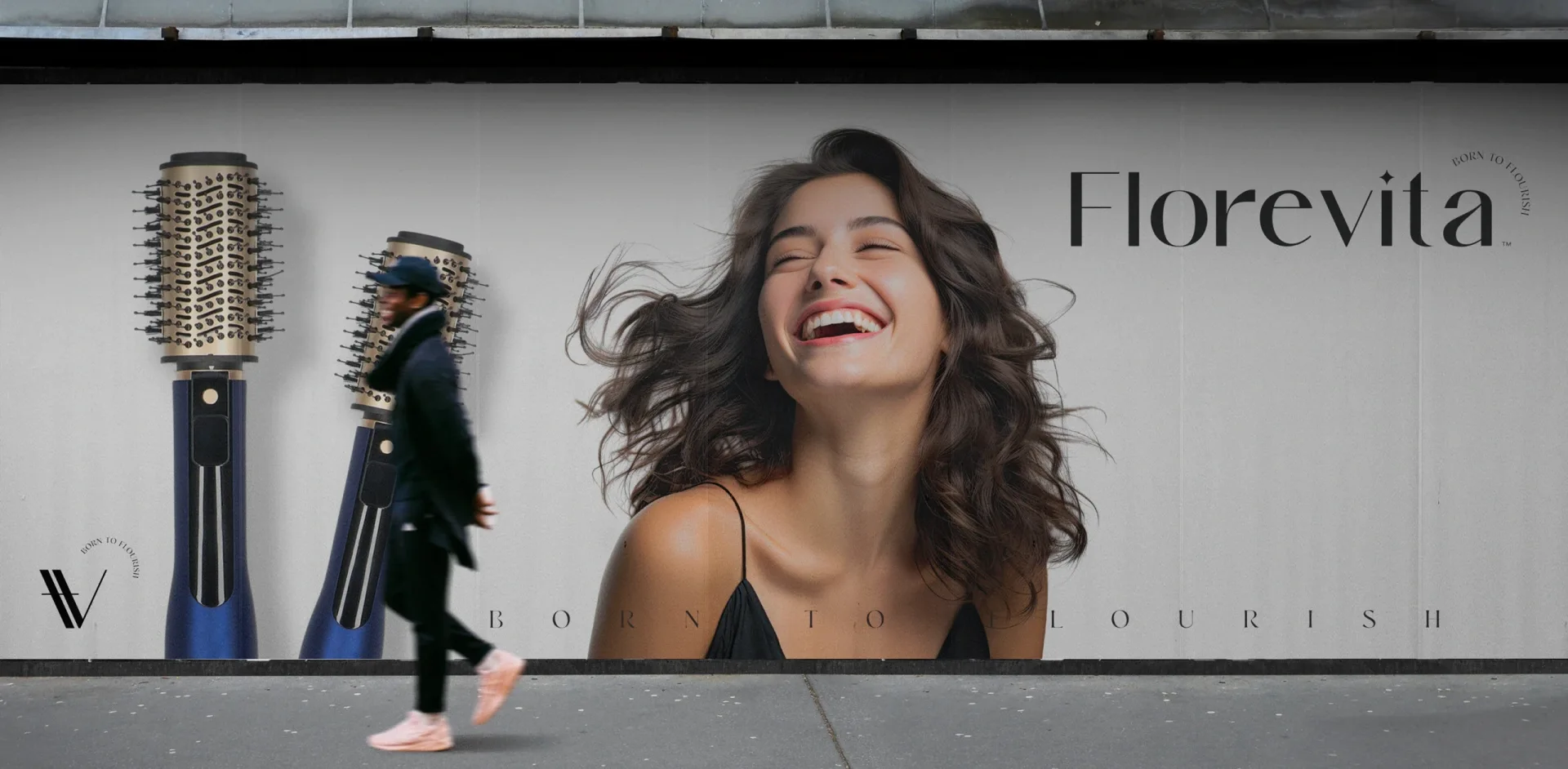
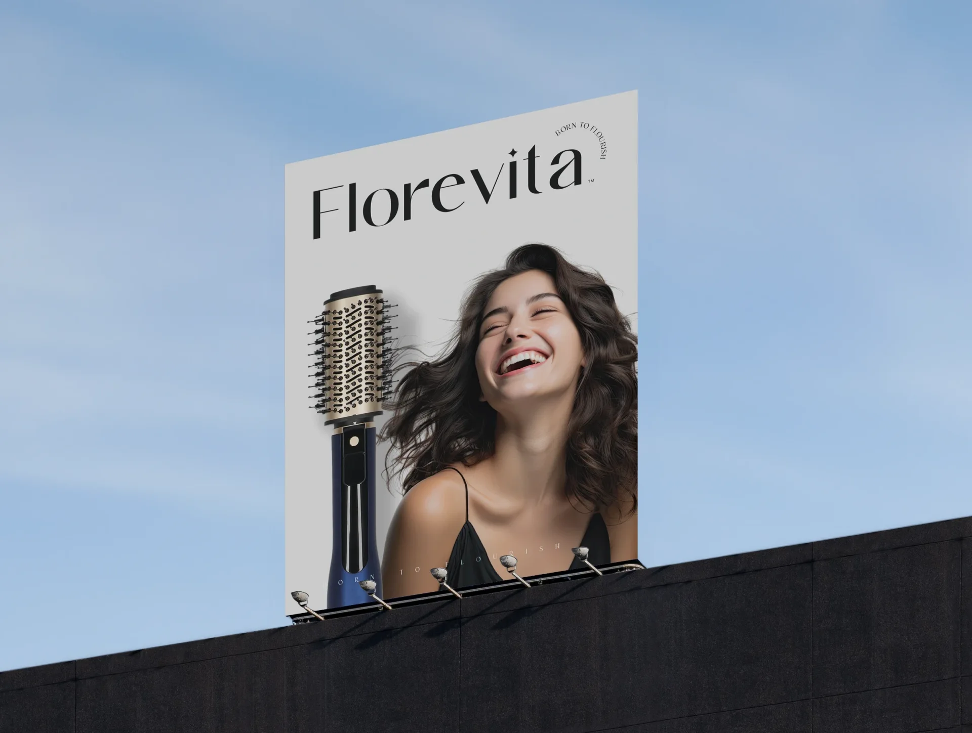
From social content to storefronts and outdoor campaigns, the same typography, symbols, palette, and imagery give Florevita a coherent presence. Each format adapts the identity while keeping the brand easy to recognize.
Thank you
Delivered great work. The process of branding was really what we were looking for. We had a vision and for once we could explain this in detail and they did put it in our designs.


See the Florevita ProStyler on bol
Ready to build what’s next?
Tell us where you’re headed. We’ll build the brand that gets you there.