HMS
- Client
- HMS
- Location
- Saudi Arabia
- Scope
- Brand strategy, bilingual logo & visual identity, iconography
About the project
HMS is a digital health and wearable technology brand focused on accessible, reliable health monitoring. We developed a pulse-inspired visual identity with English and Arabic wordmarks, then extended it across app icons, stationery, and brand applications.
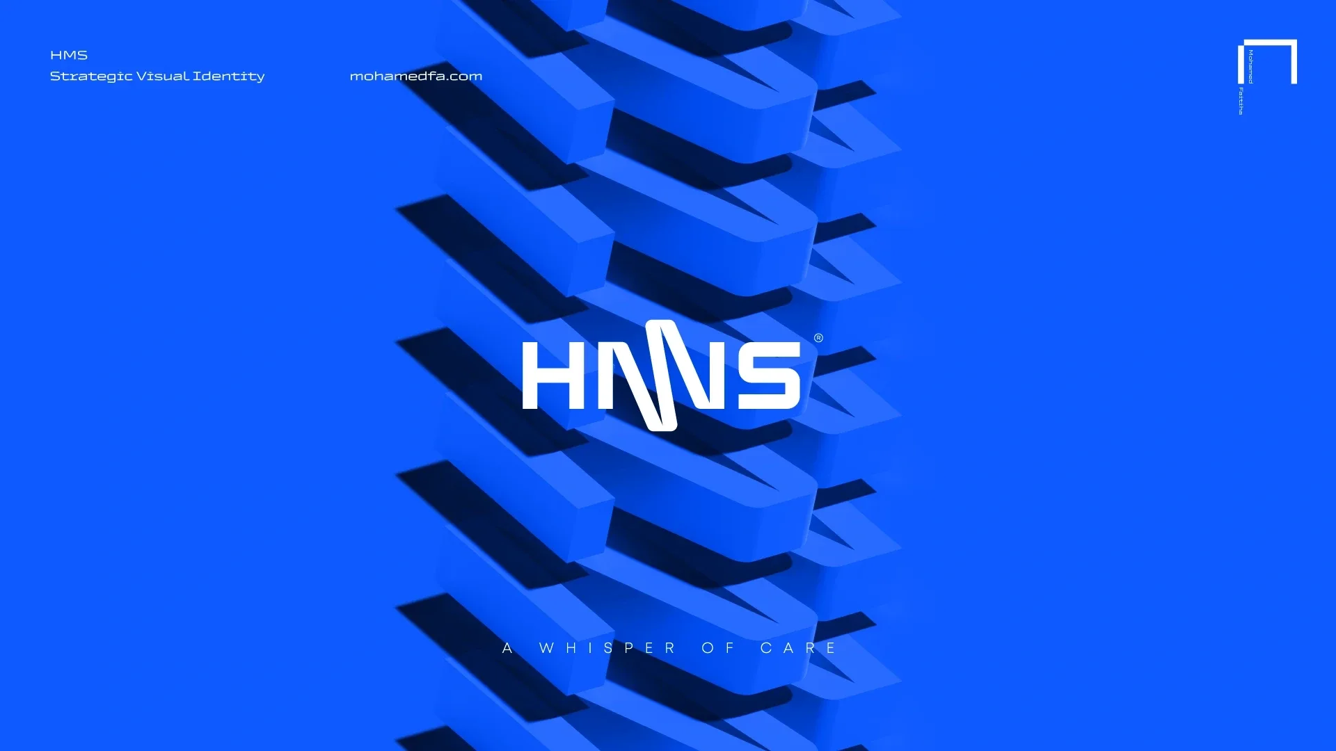
A whisper of care
HMS develops digital health and wearable technology. We shaped an identity that balances a clear, technical character with the care and accessibility at the heart of the brand.

The brand foundations
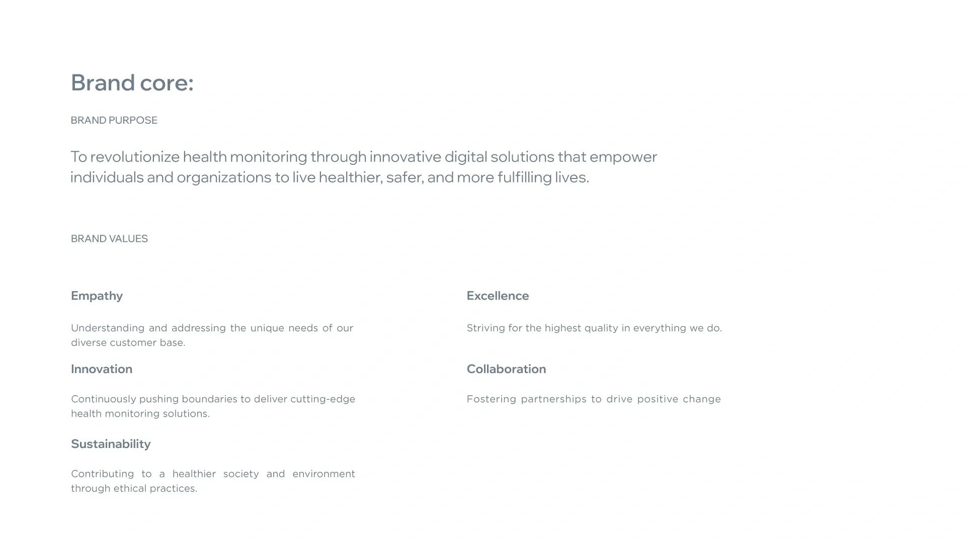
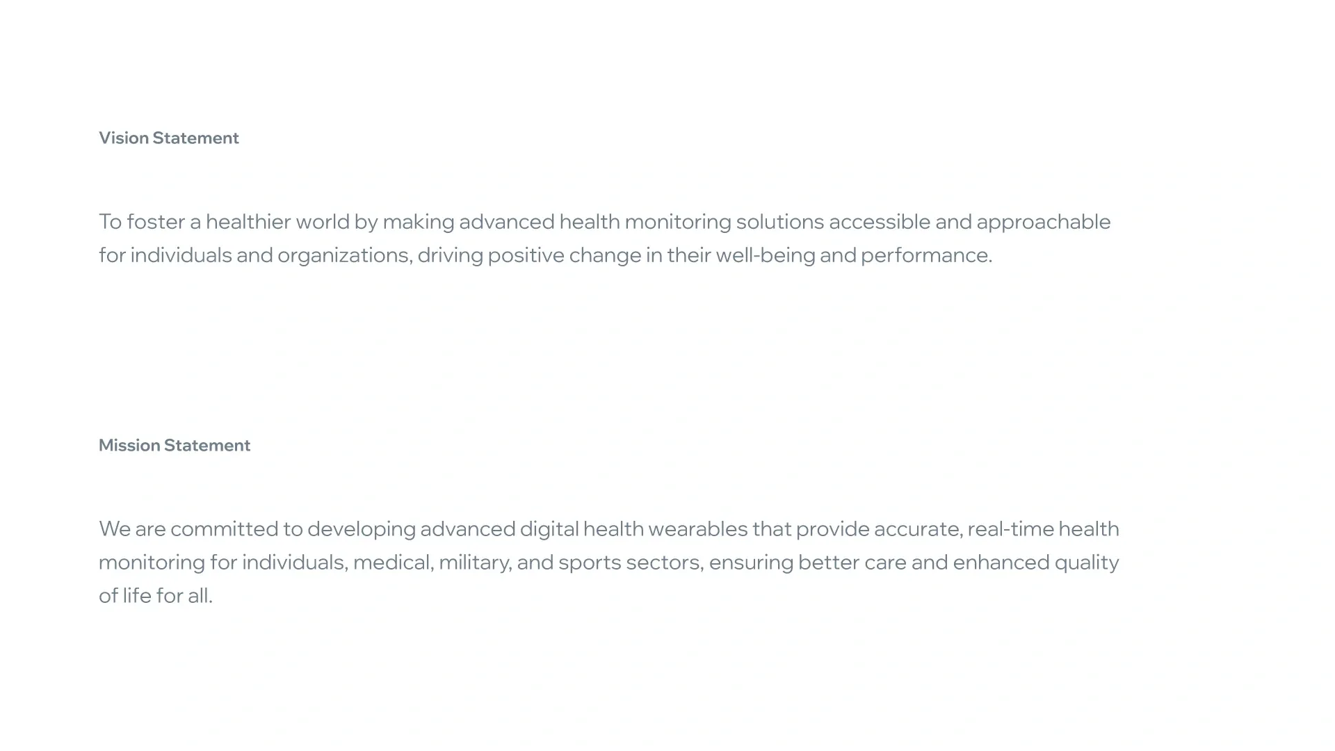
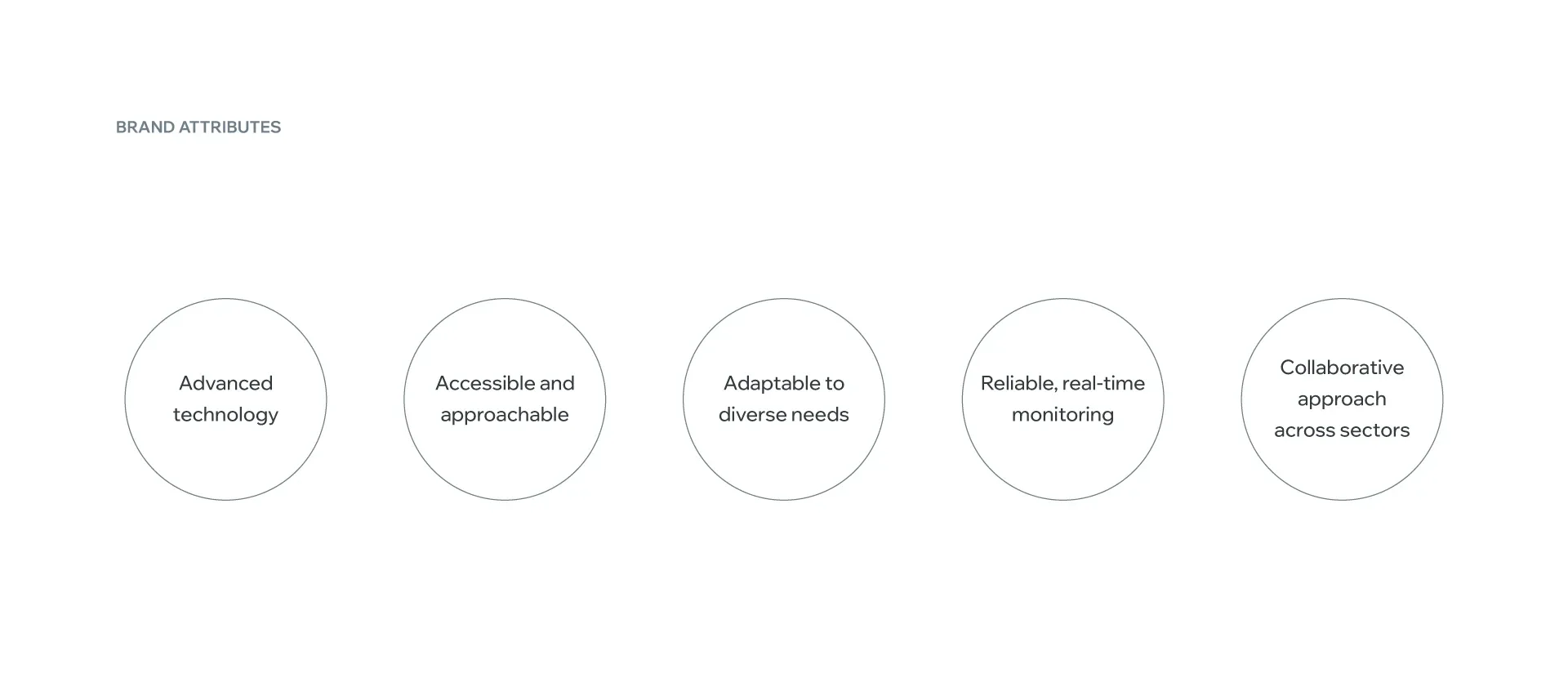
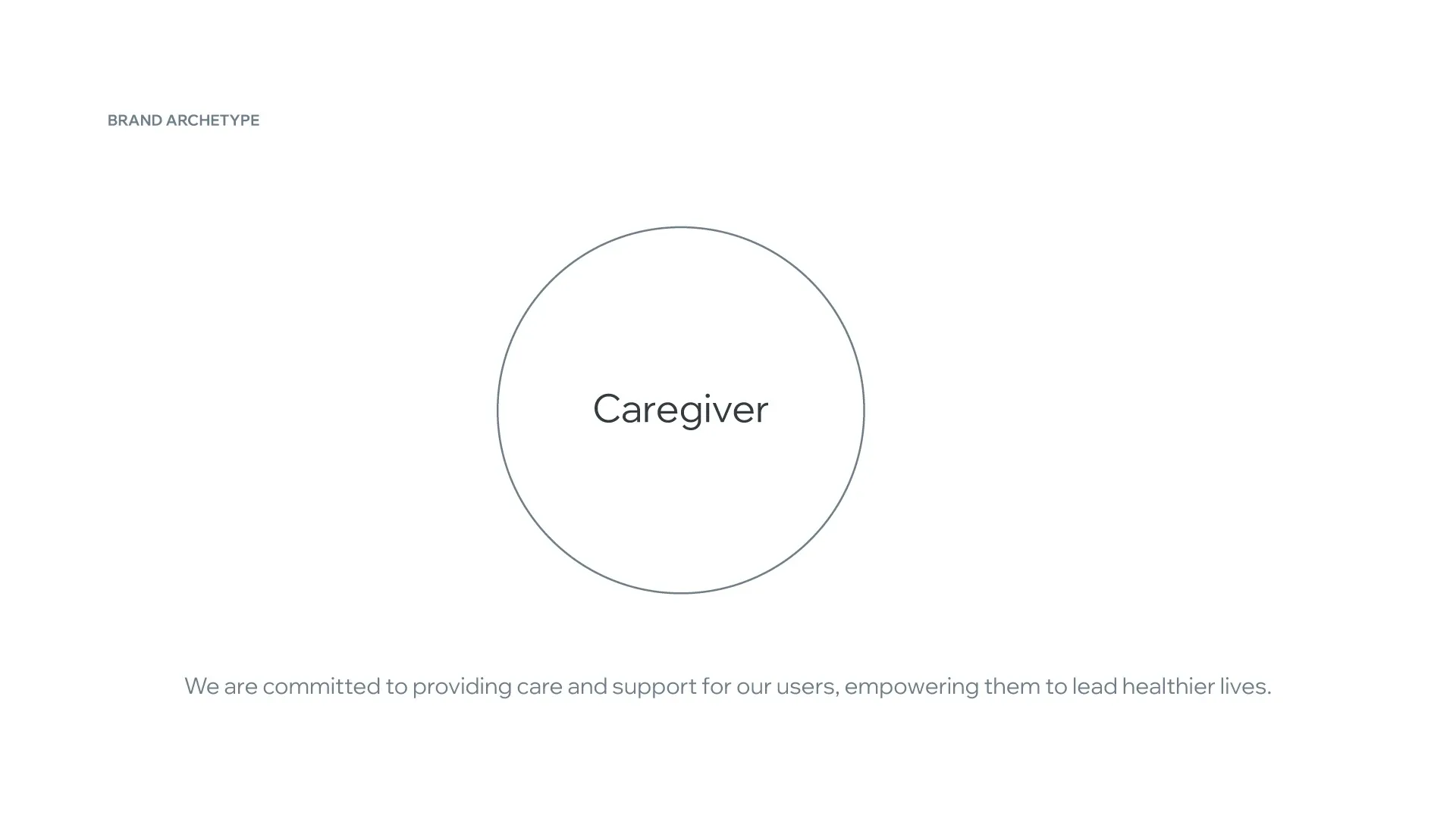
The strategy brings empathy, innovation, and reliability into a shared direction. HMS’s purpose, vision, mission, attributes, and caregiver archetype establish the principles behind the identity.
A pulse at the heart of the identity
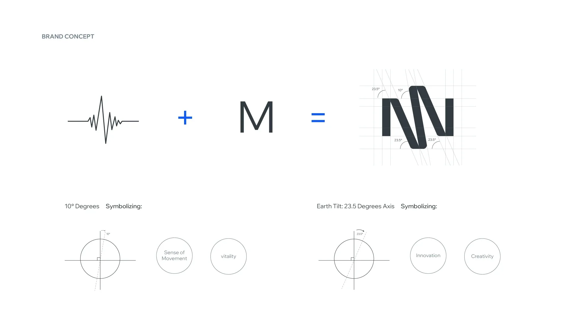
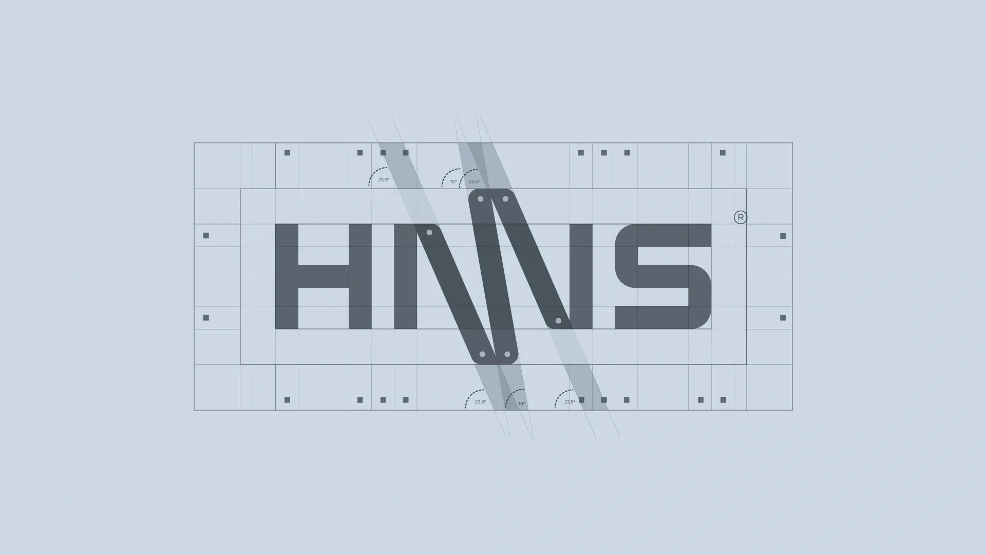
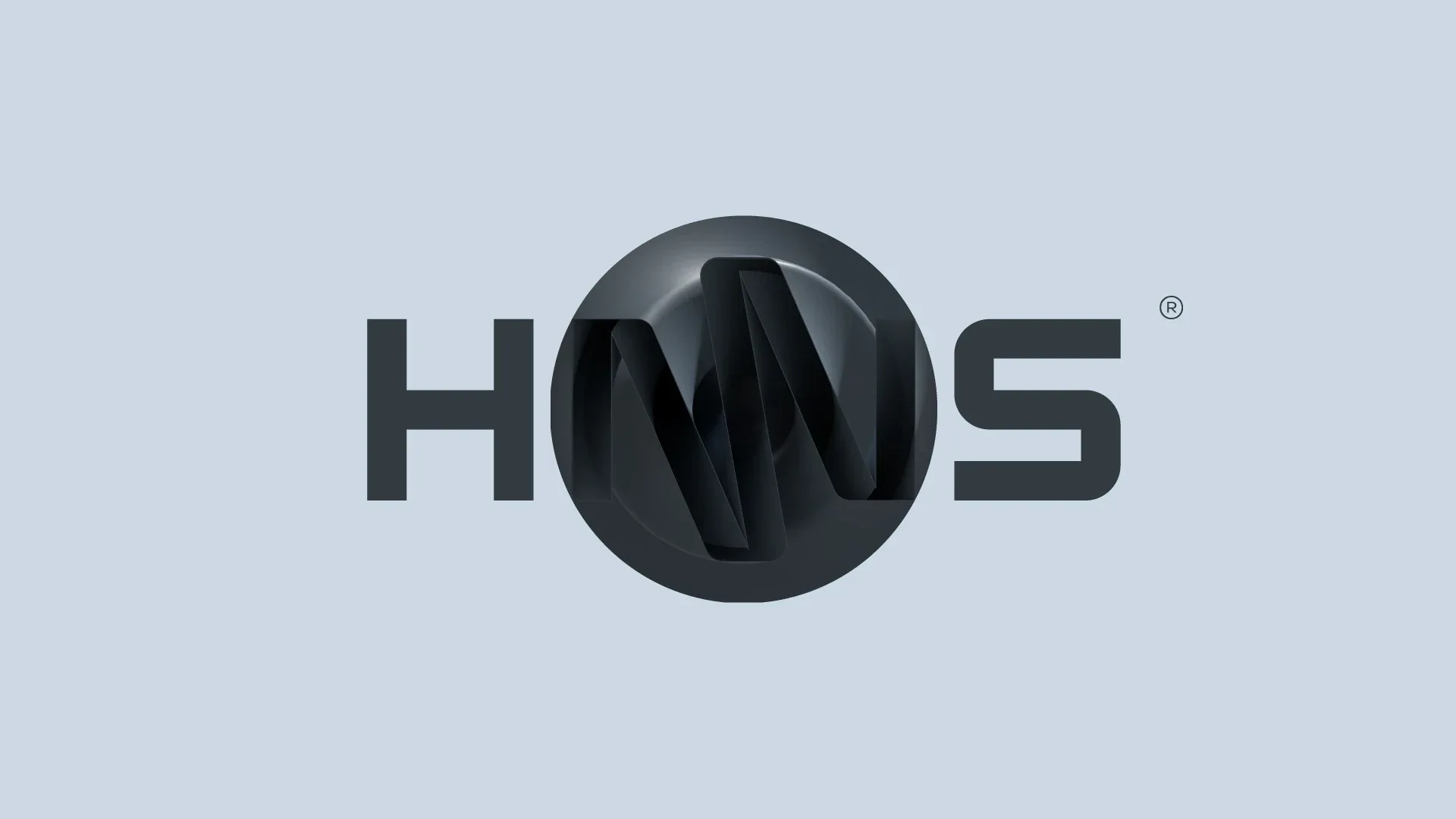
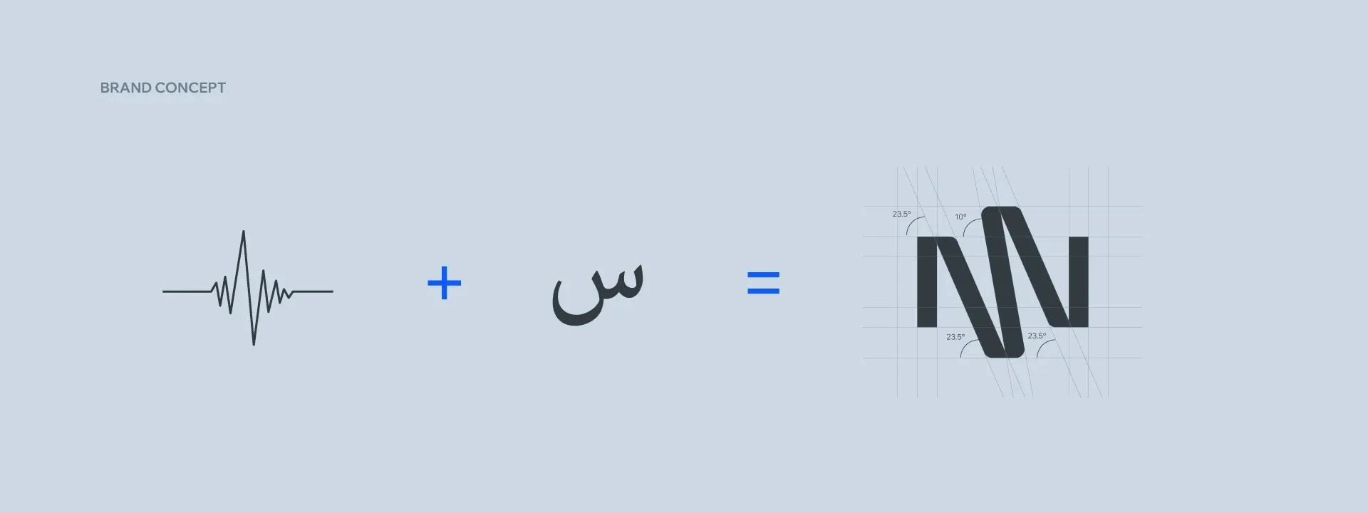
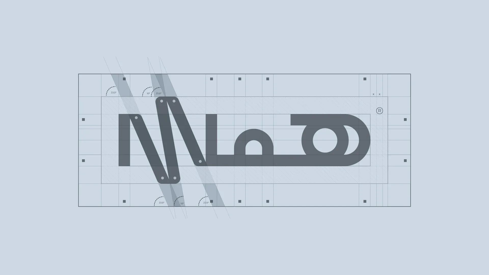
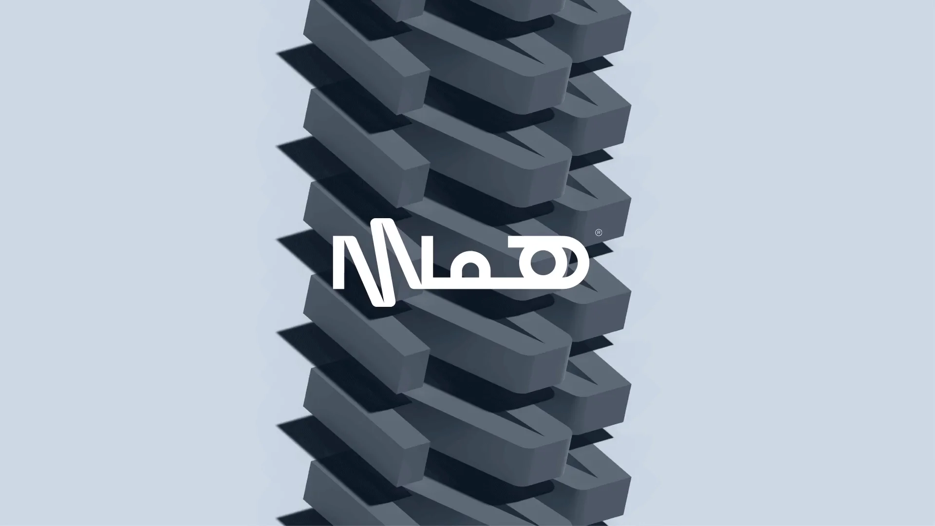
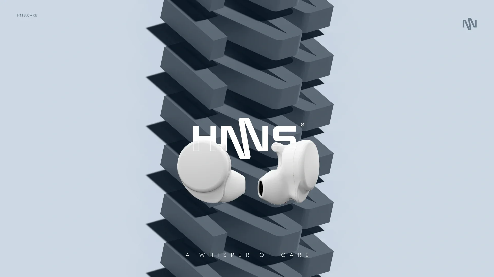
The symbol combines a heartbeat with the letter M. Its rhythm gives HMS a recognizable signature across the English and Arabic wordmarks, with a shared structure connecting both languages.
Designed for digital use
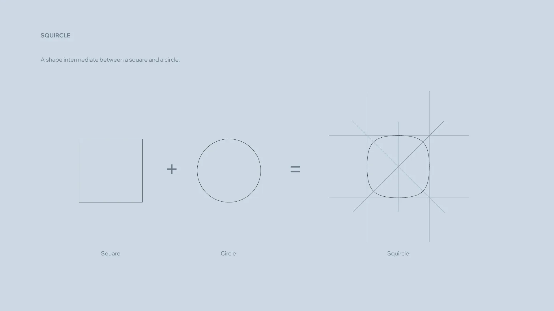
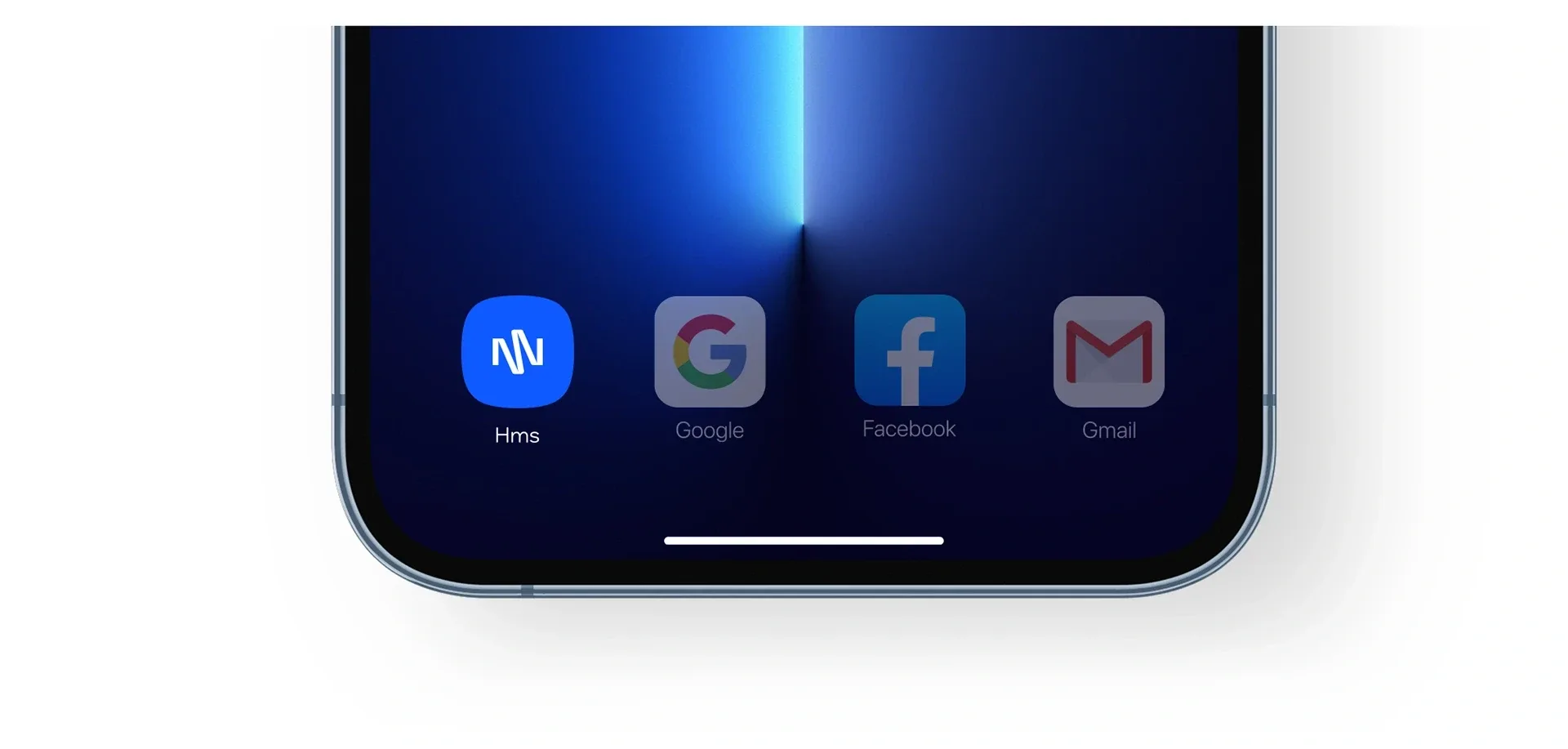
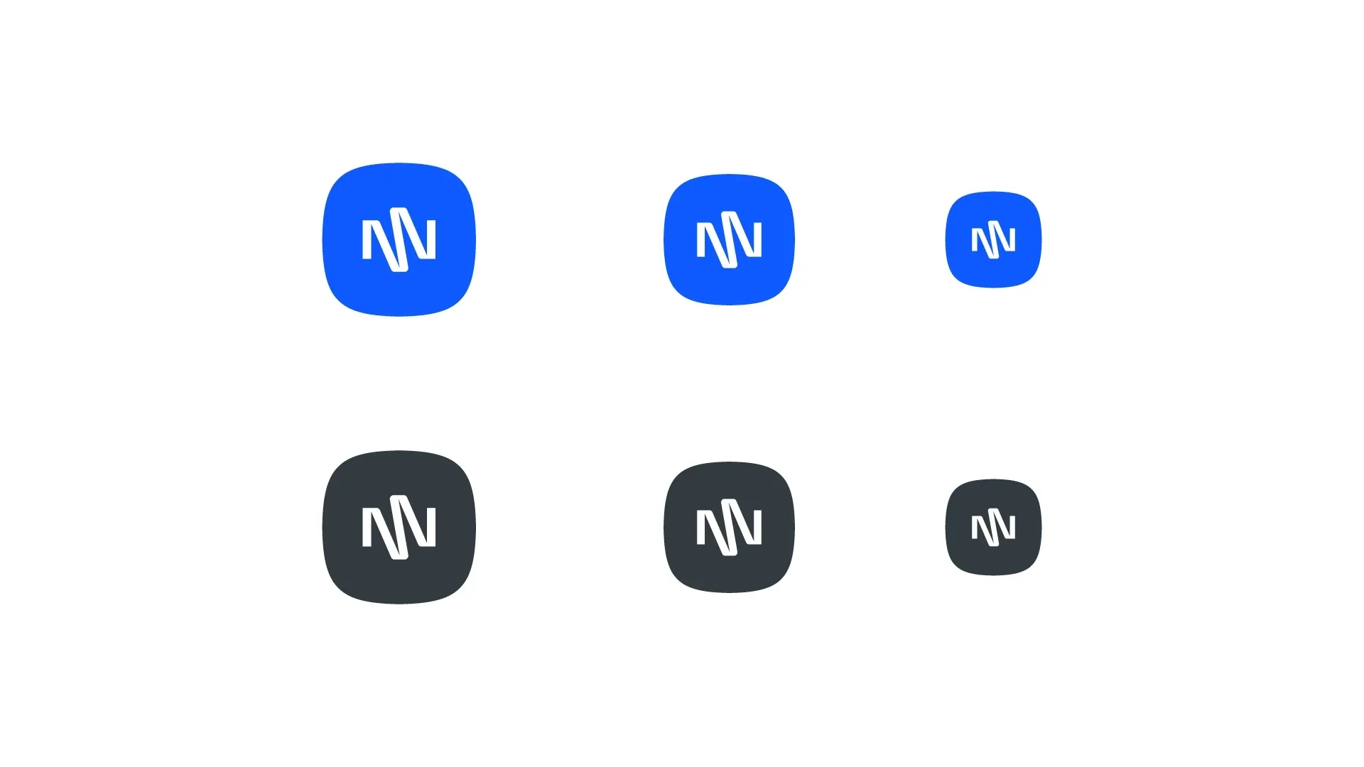
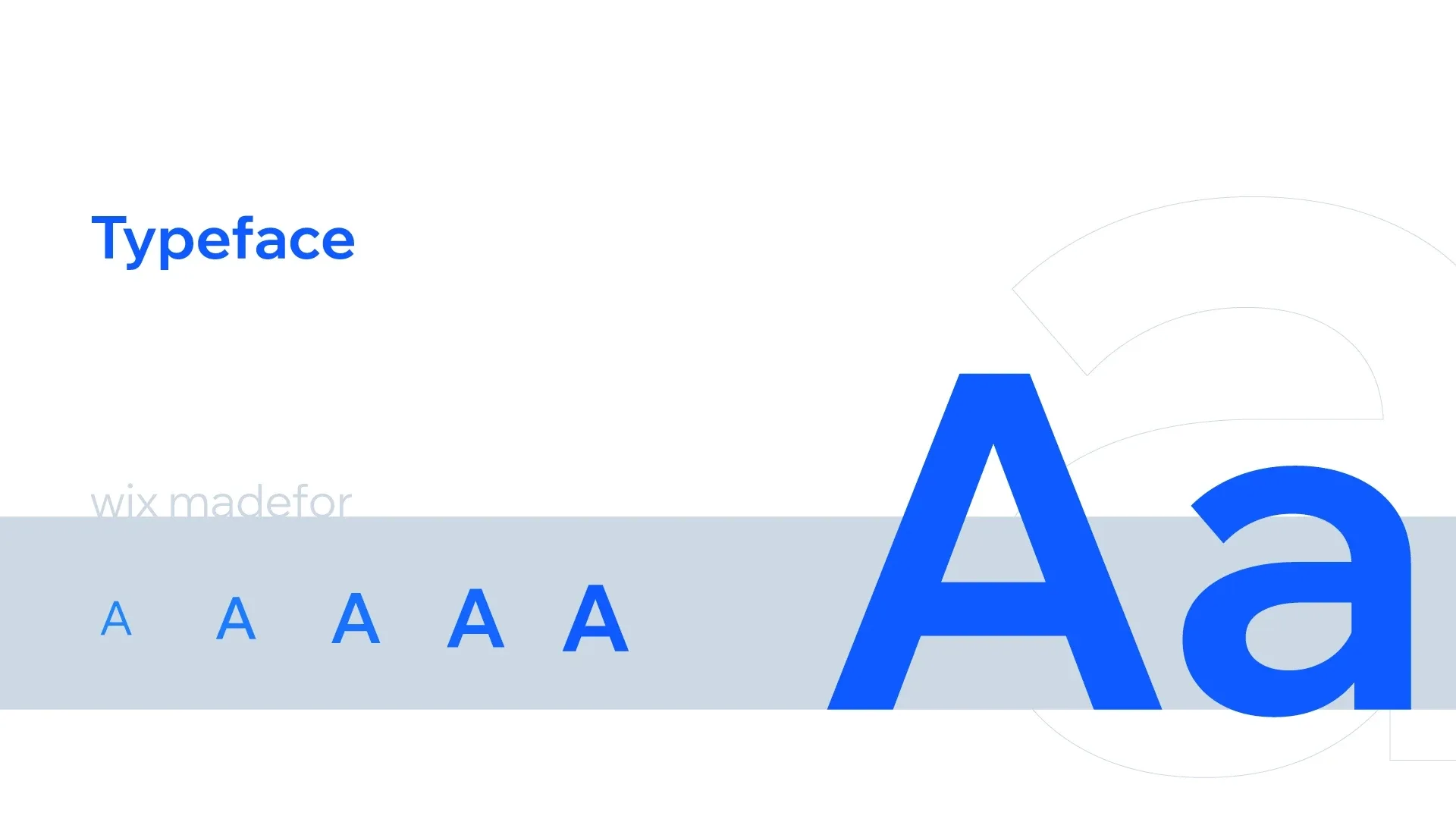
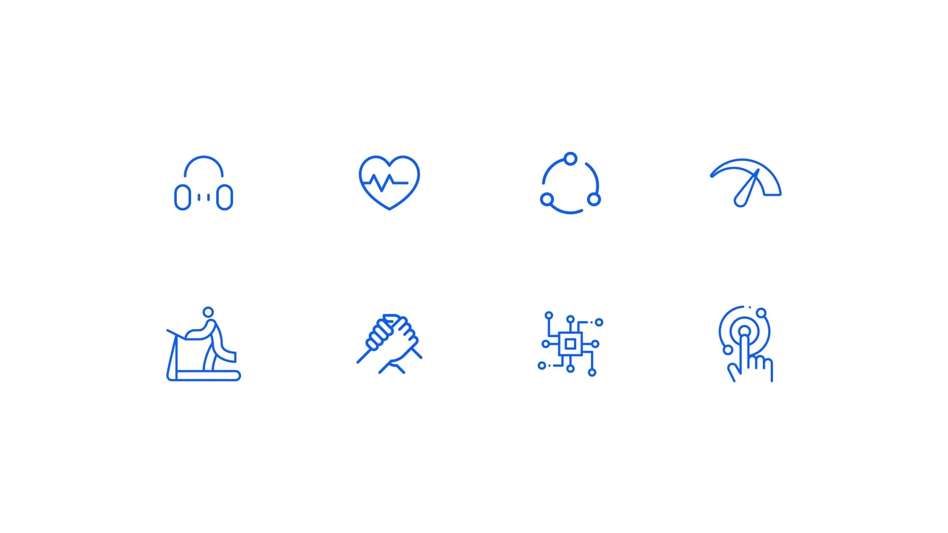
A rounded app icon gives the symbol a clear home on screen. Typography and line icons extend the system into a practical visual language for health technology.
From screen to everyday touchpoints
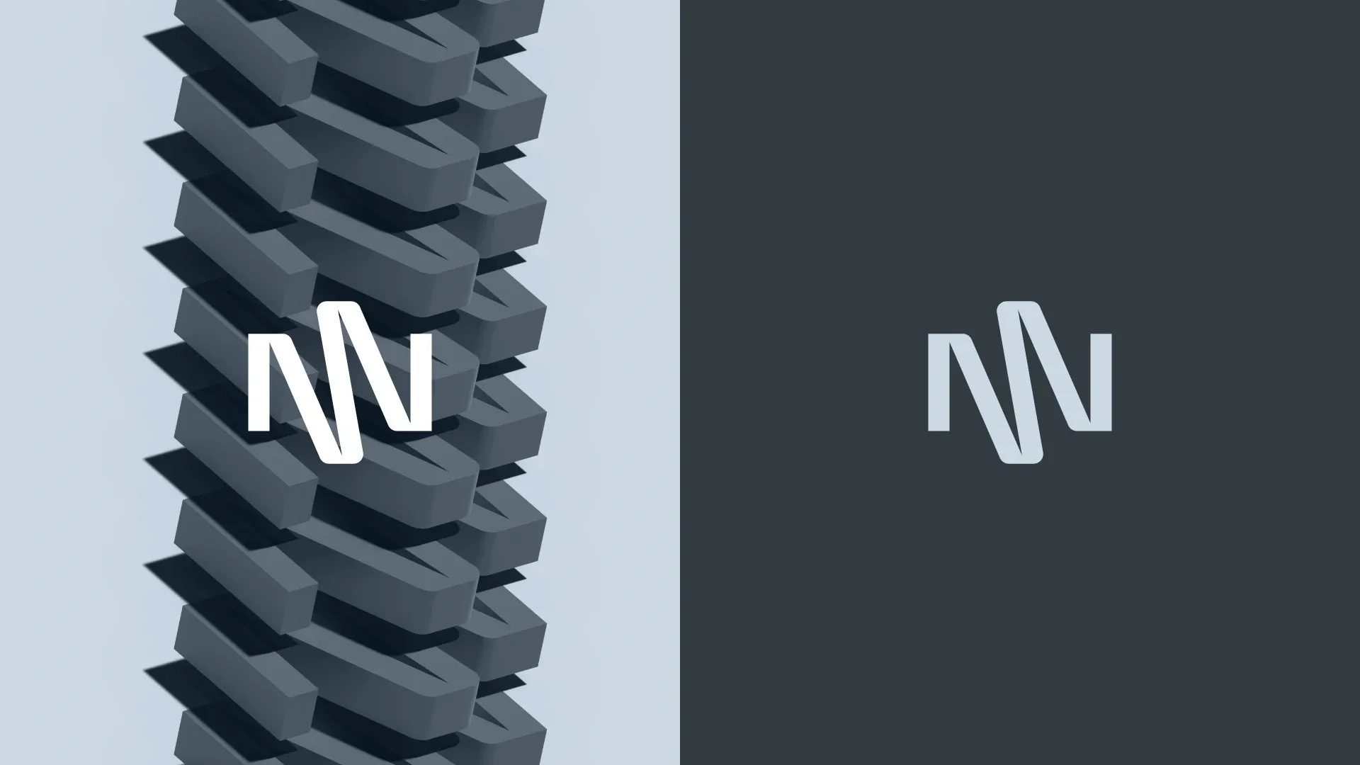
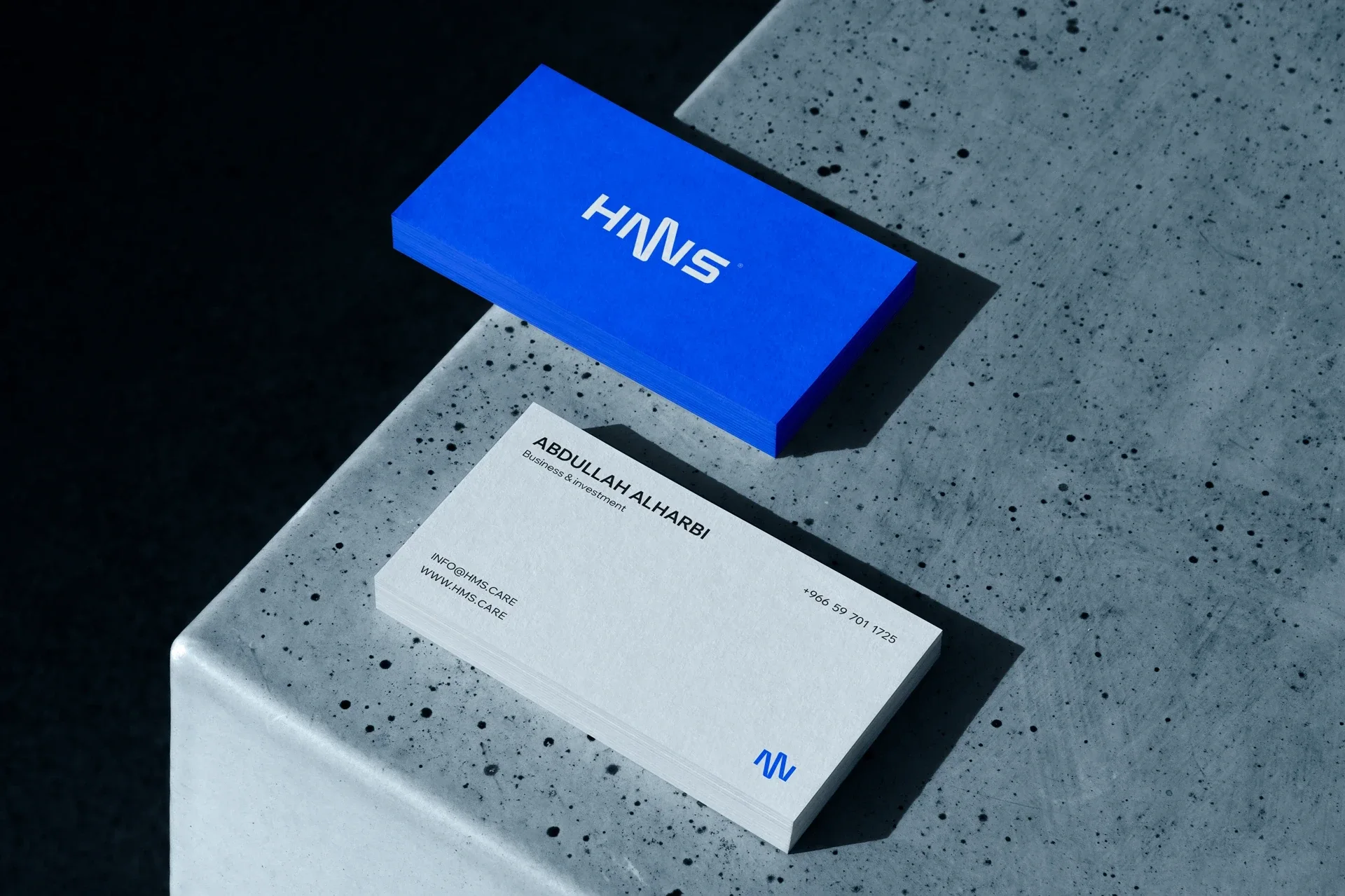
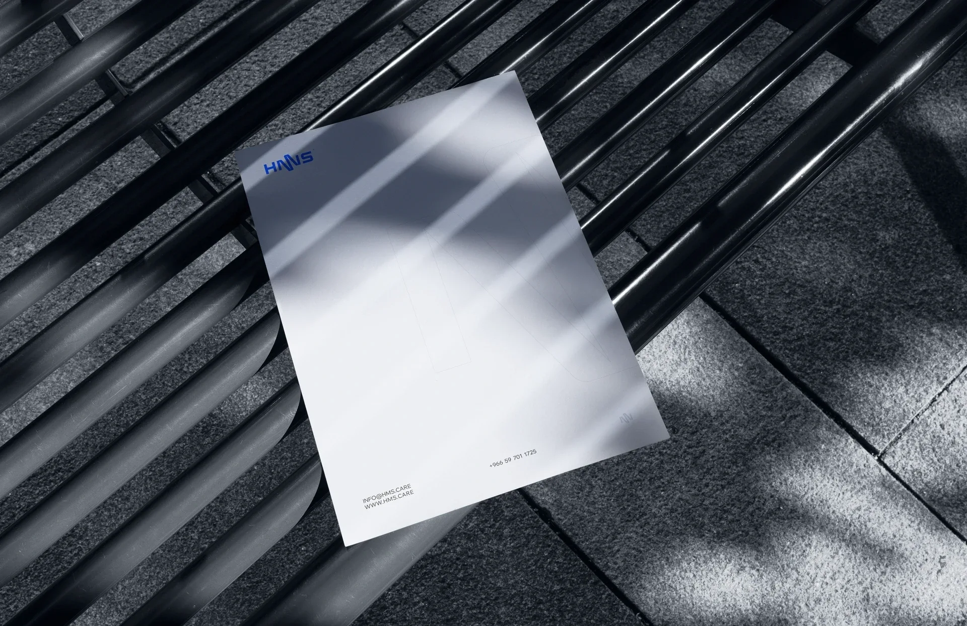
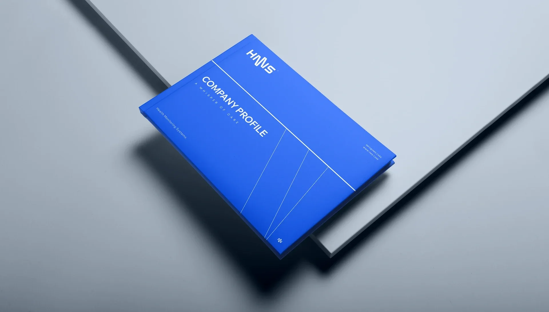
The same identity connects stationery, company materials, and product applications. Blue, pale neutrals, and dimensional forms give the brand a consistent presence across these touchpoints.
Thank you
Ready to build what’s next?
Tell us where you’re headed. We’ll build the brand that gets you there.