White looks bigger on black because bright shapes appear to spread into a dark background. This effect, known as the irradiation illusion, means a white logo on black looks heavier than the same logo in black on white. A similar effect changes how we see color: the same shade looks different depending on what surrounds it.
These two squares are the same color
Both squares below are exactly the same gray, #7F7F7F. On the black side, the square looks lighter. On the white side, it looks darker. Your eye doesn’t read a color on its own. It reads the color against its background.
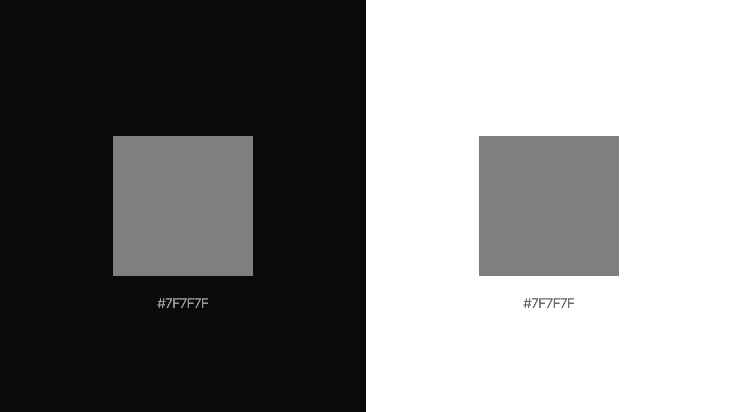
This is called simultaneous contrast. It was studied in the 19th century by the French chemist Michel Eugène Chevreul, who noticed that the colors in tapestries seemed to change depending on the colors next to them.
Which circle is bigger?
These two circles are exactly the same size. Most people see the white circle on black as slightly bigger than the black circle on white.
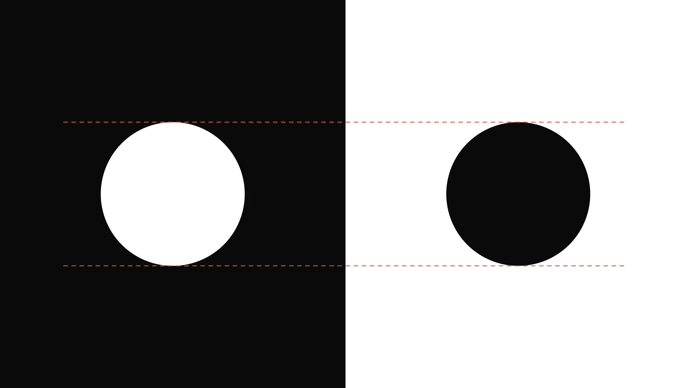
Bright areas seem to spill over their edges into darker surroundings, while dark shapes on a light background seem to shrink a little. The difference is small, but in a logo that’s seen constantly, it’s enough to make the reversed version look bolder.
What designers do about it
Careful identity systems don’t always use the exact same artwork everywhere. For a white logo on a dark background, designers often make the strokes slightly thinner, so it looks the same weight as the dark version on white.

Here’s our own studio mark. The white version on black has been thinned slightly, so both versions look the same weight. The shape and proportions don’t change, including the small open corner at the top left.
Is a black and white logo good?
Yes. A logo that works in plain black and plain white is a strong logo. It means the shape works without relying on color, and it will reproduce well in print, on dark websites, in engraving and on small screens. Just remember that the white version may need small adjustments to look as balanced as the black one.
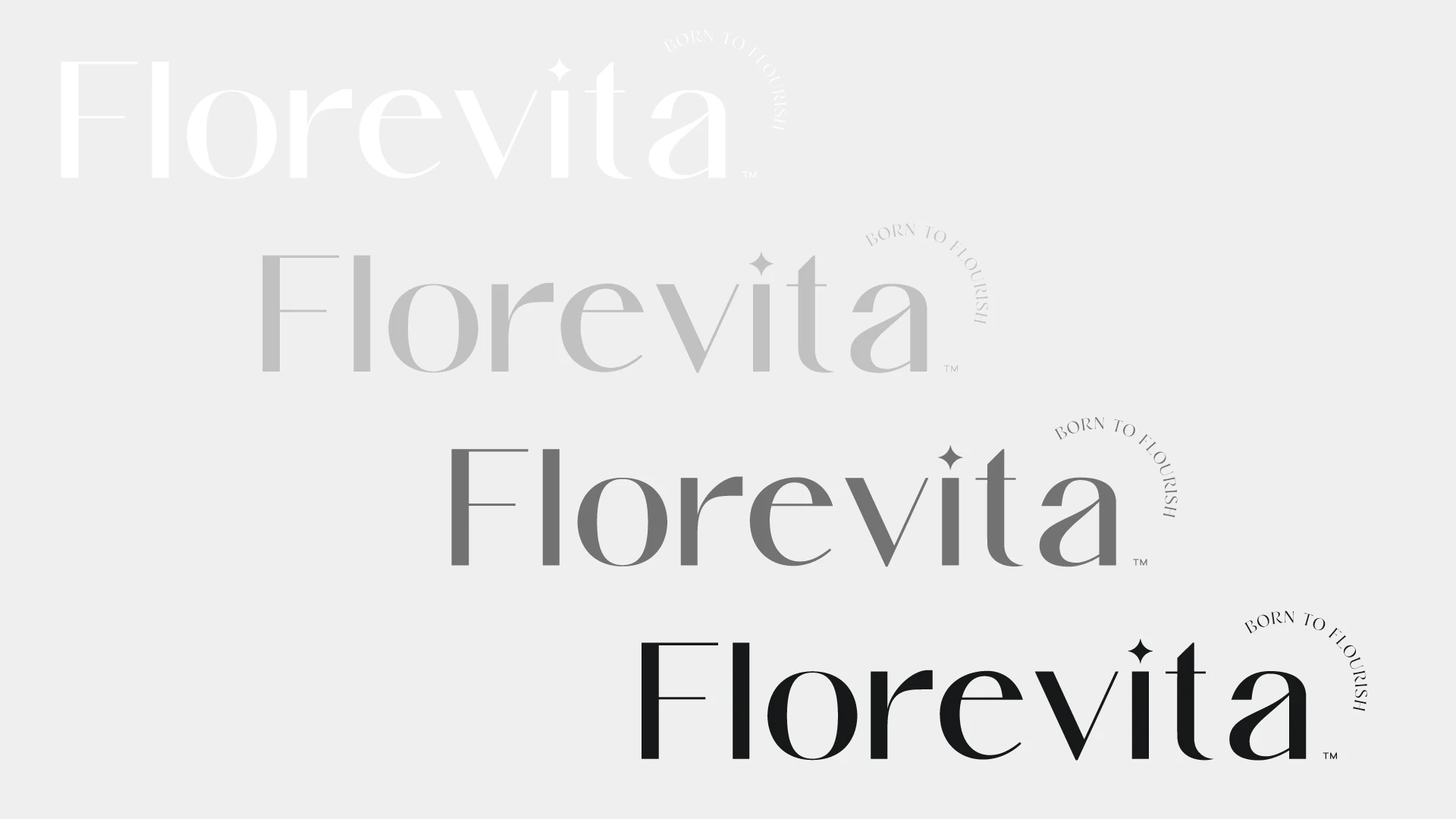
Florevita’s wordmark, for example, was prepared in white, light gray, dark gray and black, so it works on every background in the identity. See the full Florevita case study.
How to check your own logo
Place it on black and on white. Compare the two versions side by side at the same size.
Ask which one looks heavier. If the white version looks bolder, it may need slightly thinner strokes.
Check your colors on every background. A brand color can look brighter, darker or warmer depending on what’s behind it, so test it on your real website, packaging and photos.
Color is never just color
Every color and shape in your brand is seen in context. Designing for that context, not just for the artwork file, is what makes an identity look consistent everywhere. See what a complete brand identity includes.