Choose brand colors by starting with how your brand should make people feel, not with your favorite shade. Define your brand personality in three words, decide which emotion each color must carry, then choose the hue, saturation and lightness that express it. We record every decision in a color emotion guide, so the palette stays connected to the strategy.
Why your favorite color is the wrong starting point
Many founders arrive with a color already in mind, usually one they like. But customers don’t see your taste. They see what the color says about you. A palette chosen by taste can look good and still send the wrong message: a calm brand in loud colors, or a premium brand that looks cheap.
Your brand colors should reflect your brand’s personality, not your personal preference. That’s the idea behind the color emotion guide.
What is a color emotion guide?
A color emotion guide explains, color by color, which emotion each brand color carries and why it was chosen. It connects the palette to the brand personality, the audience and the positioning. In our brand guidelines, it comes right after the brand colors.
It does two jobs. It helps the founder understand why the palette looks the way it does, and it stops future designers from swapping a color simply because they prefer another one.
Step 1: Define your personality in three words
Go back to your strategy. If your brand were a person, how would you describe it? Choose three words, for example warm, authentic and sophisticated. These words become the brief for your colors. Here’s how personality fits into a brand strategy.
Step 2: Turn each word into an emotion
For each word, ask what people should feel when they meet the brand. “Authentic” might need to feel rooted and honest. “Sophisticated” might need to feel calm and refined. Write the emotion next to each word. Now you know what each color has to do.
Step 3: Match the emotion with hue, saturation and lightness
Hue is only part of the answer. The same red can feel urgent or calm depending on how bright and how saturated it is. Marketing research points the same way: in a 2012 study, Lauren Labrecque and George Milne linked different hues with different brand personality traits and found that saturation changes how strongly a color is felt, with more saturated colors seen as more exciting.
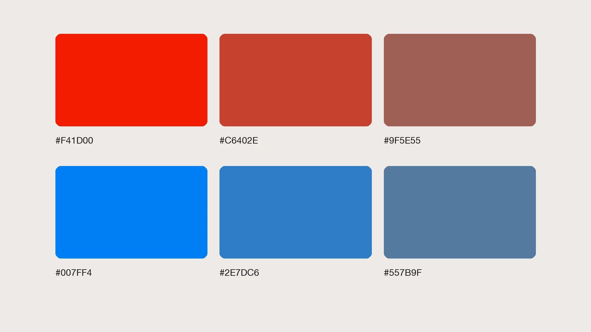
In the top row, the vivid red feels loud and urgent. The muted version feels warmer and more grounded. It’s the same hue with a different emotion. That’s why a color emotion guide records exact values, not just “red.”
Step 4: Check your category and your culture
Colors also take meaning from the market around them. If every competitor uses the same color, another version of it will make you harder to remember. Meanings also change between cultures, so a brand that sells across the Gulf, Europe and the US needs a palette that feels right in each market.
A real example: The Black Lumi
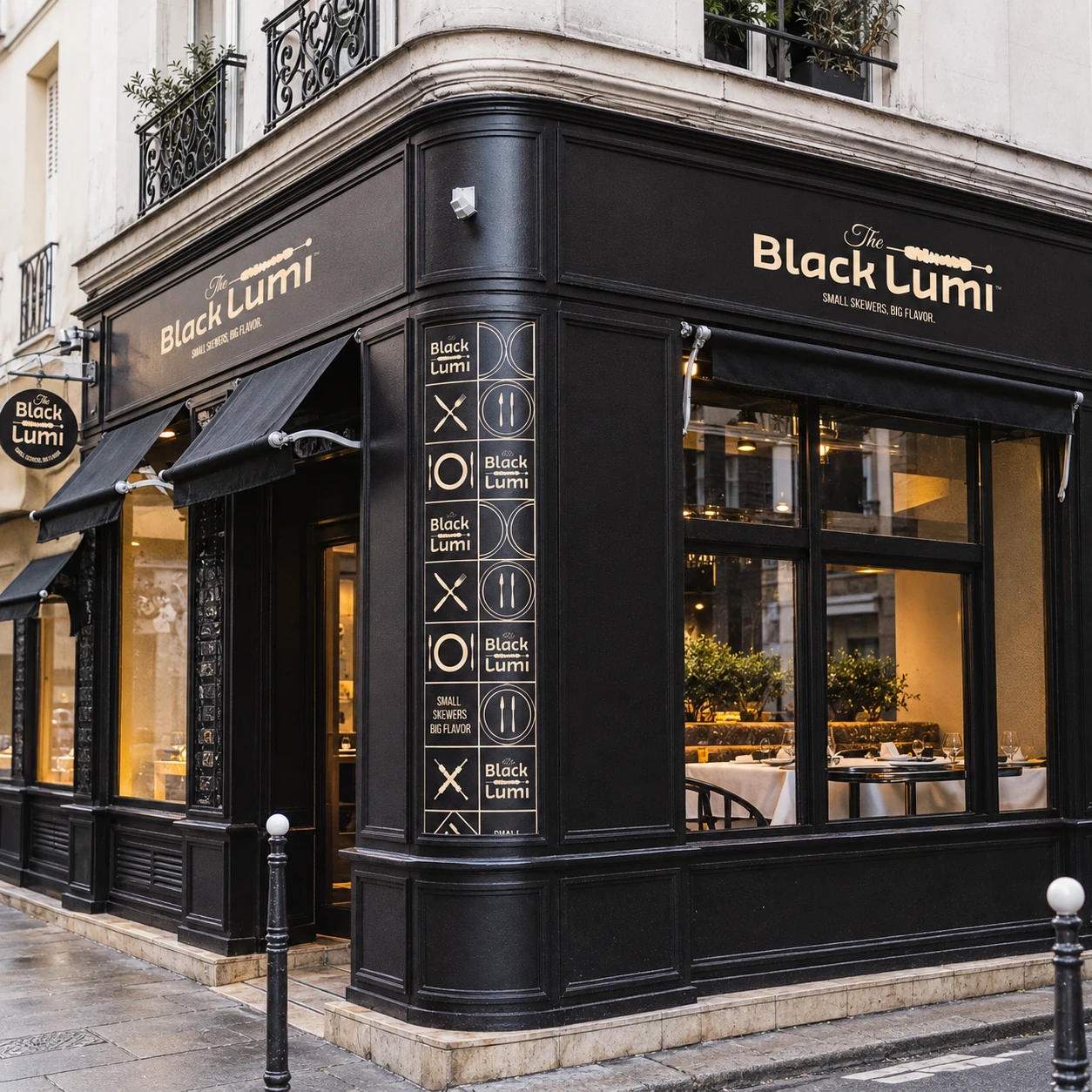
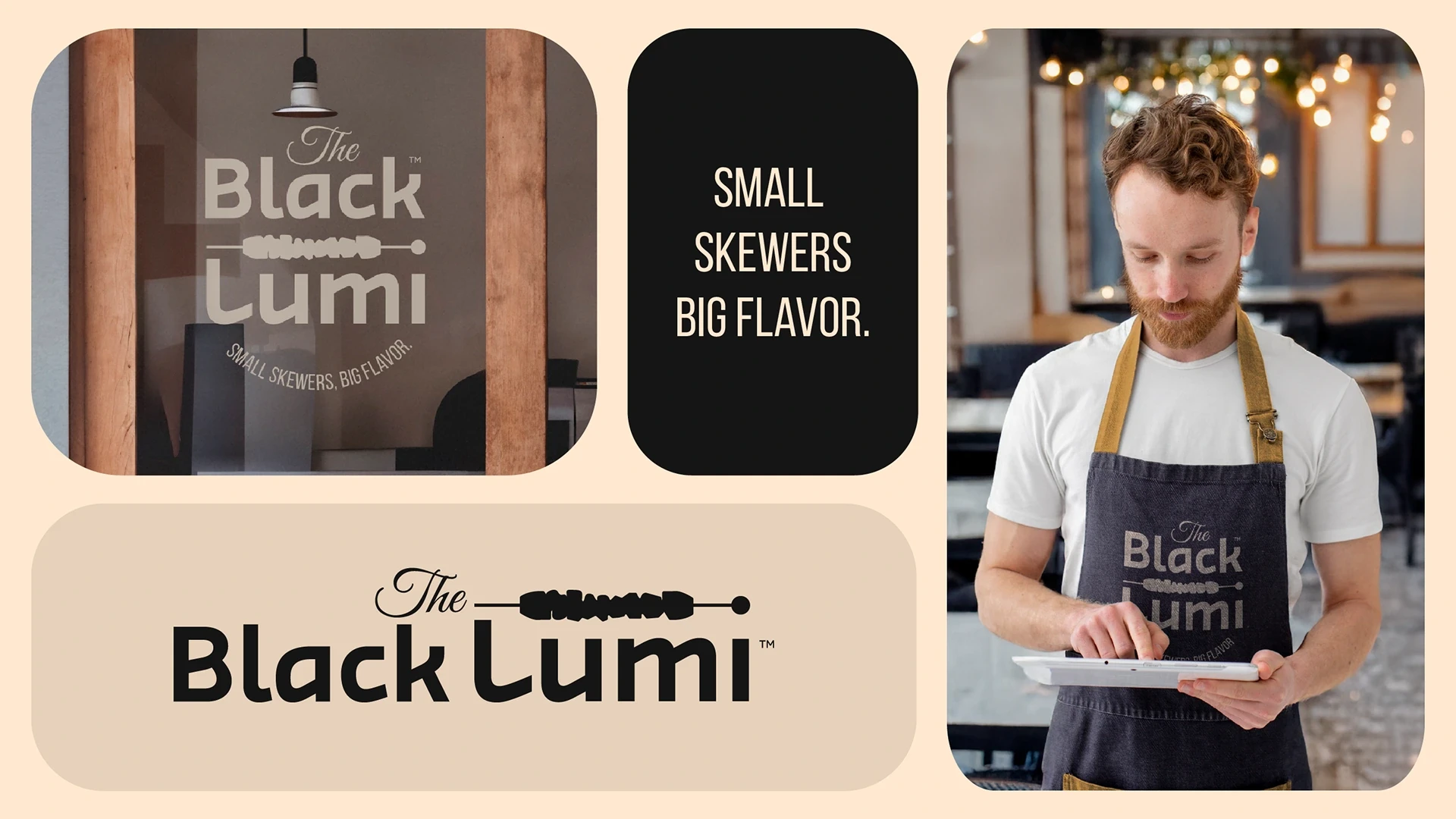
The Black Lumi brings Bahraini suwaihat to Soho, London. Its personality is authentic, welcoming, vibrant and sophisticated yet accessible. Its color emotion guide explains how each color supports that personality.
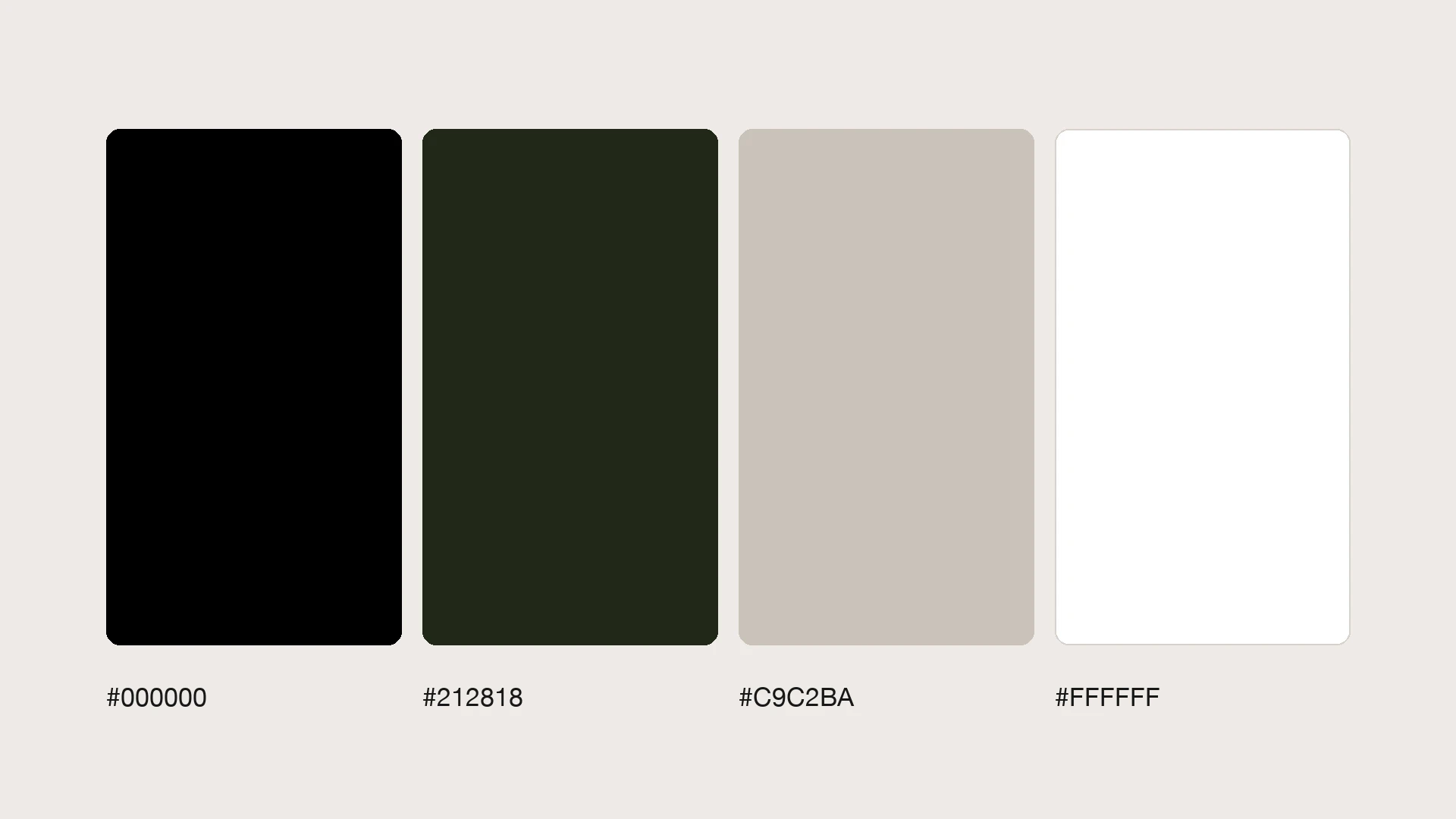
Black: boldness, depth and authenticity. It reflects the smoky flavors of the grill and the character of black lime, the ingredient behind the name.
Dark green: freshness and trust. It’s inspired by natural ingredients and Middle Eastern landscapes, and it supports the brand’s commitment to quality.
Quill gray: softness and warmth. It keeps the dark palette approachable, so guests feel comfortable rather than intimidated.
White: clarity and openness. It keeps text readable and gives the identity a clean, modern feel.
Together, the palette feels authentic, warm and sophisticated: rooted in Bahrain and at home in London. See the full Black Lumi case study.
Step 5: Test it on real applications
Before you approve a palette, test every color on screen and in print, on light and dark backgrounds, and with text on top. The Black Lumi guidelines include a text visibility test for every color pairing, so the palette stays readable on menus, packaging and signage.
Common mistakes
Choosing colors before the strategy. Using too many colors, so nothing is recognizable. Describing colors in words instead of exact values. And treating color psychology as a rule book. No color has one fixed meaning: the emotion comes from the hue, saturation and lightness together, the context, and the rest of the identity.
For the practical side of building a palette, from competitors to print values: Read how to choose brand colors for your business.
Want colors that say something about your business? Tell us about your brand, and we’ll build a palette with a reason behind every color.