The quickest way to tell if a logo is good is to shrink it. A logo that stays clear and recognizable from a billboard down to a 16-pixel browser tab is usually well designed. A logo that turns into a blur at small sizes fails people exactly where they see it most.
Why size matters more than you think
Most people now meet a brand on a phone: as a profile picture, an app icon, a browser tab or a tiny logo in a search result. These are the places where your logo is smallest, and they’re also where it’s seen most often.
A logo is usually designed large on a big screen, where every detail looks good. The real test is what happens when those details have only a few pixels to work with.
How to run the size test
Place your logo next to a simple mark and shrink both step by step: billboard size, business card size, app icon size, and finally 16 pixels, the size of a browser tab.
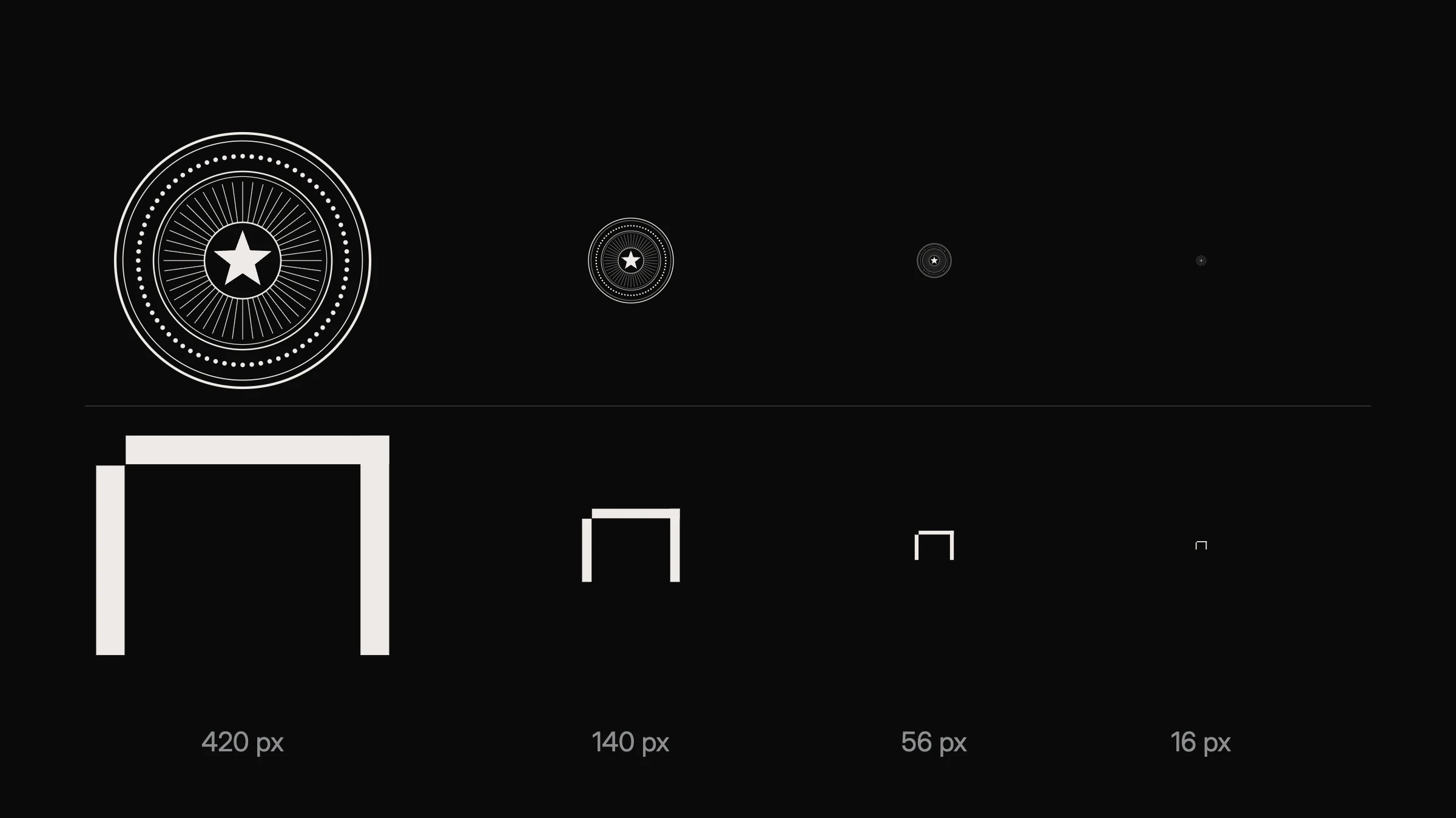
At large sizes, both look fine. On a business card, the detailed emblem starts to lose its fine lines. As an app icon, its rings and center blur together. In a browser tab, it becomes a gray dot, while the simple mark is still a recognizable shape.
Zoom in: detail dies first
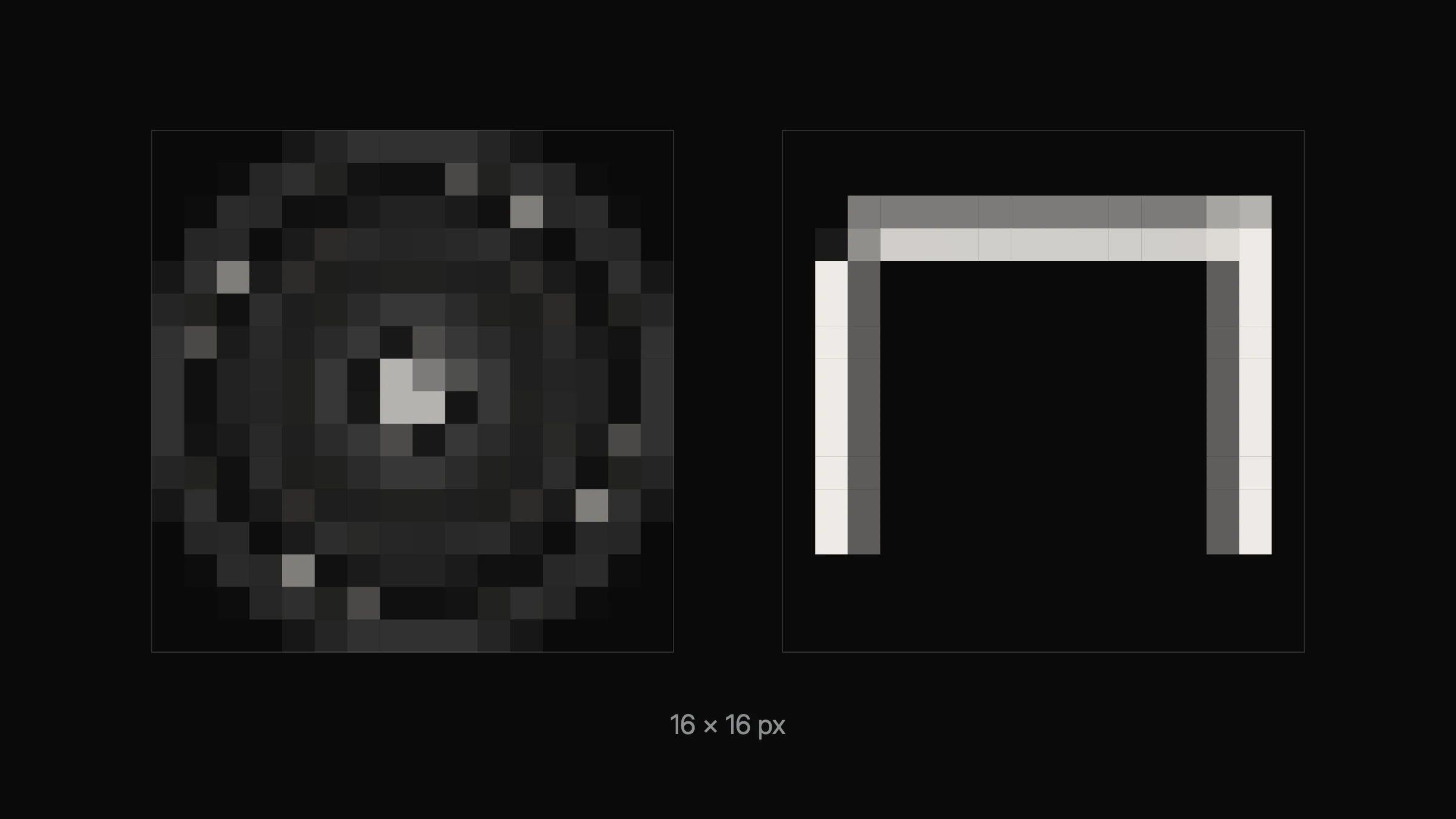
If you enlarge the 16-pixel versions, you can see why. Fine lines and small details are thinner than a single pixel, so the screen averages them into gray. Simple shapes with thick, clear strokes keep their silhouette.
What is the smallest size a logo should work at?
Your logo should work at the smallest size it will actually appear. For most brands, that’s a browser tab icon, which is often shown at 16 or 32 pixels, and a social media profile picture, which is often cropped into a small circle.
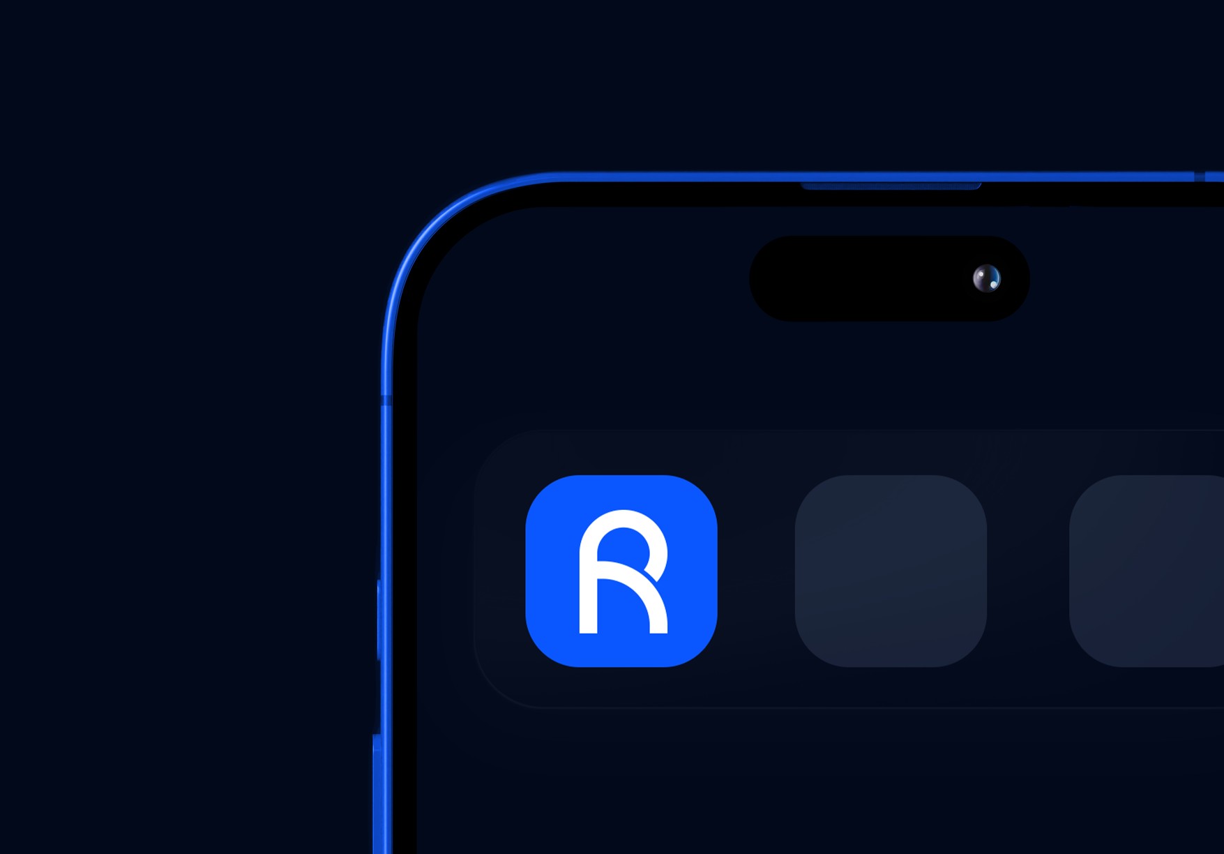
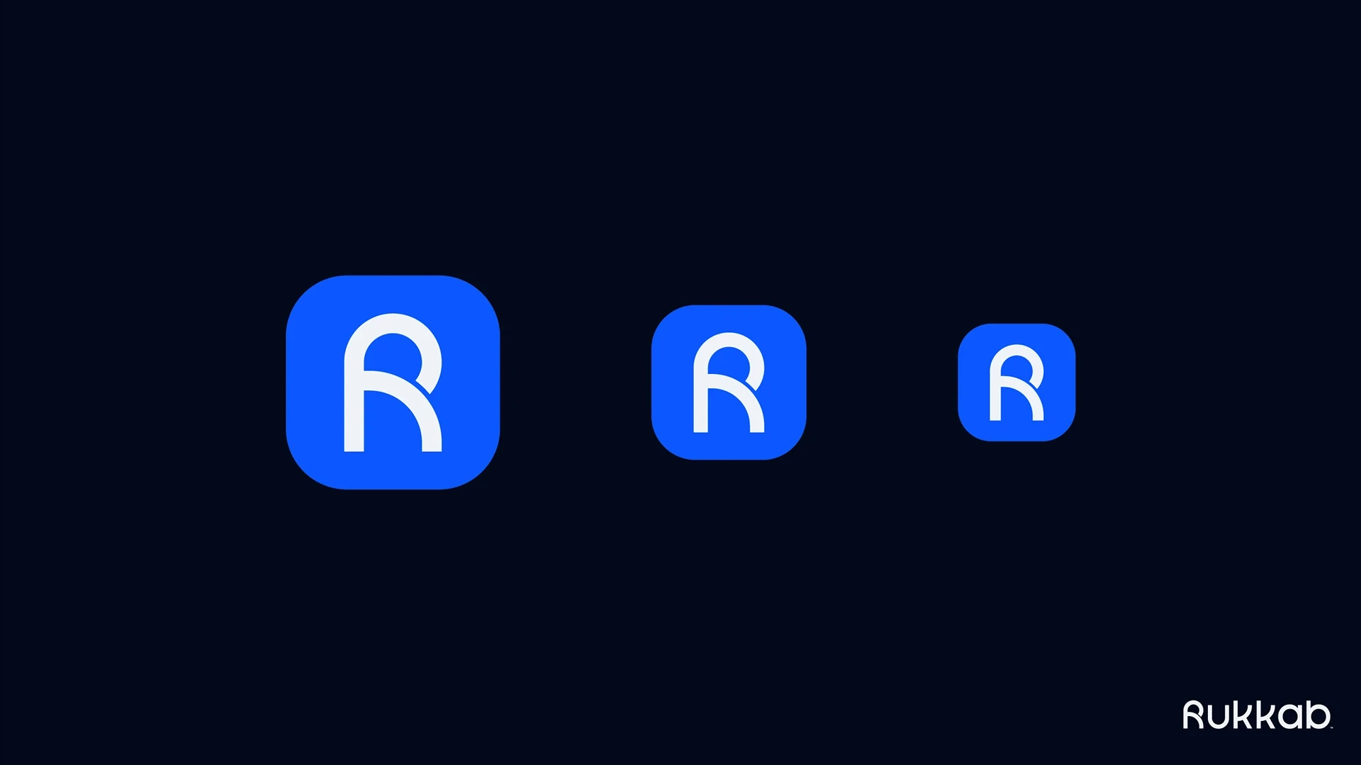
If your full logo can’t work that small, that’s normal. Most brand identities include a simplified icon or monogram for small sizes and a full logo for large ones. Rukkab’s identity, for example, includes an app icon built from its R symbol and tested at three sizes. See the full Rukkab case study.
Signs your logo is too complicated
Fine lines disappear. Thin details break up or vanish below business card size.
Text becomes unreadable. A tagline or small lettering inside the logo can’t be read on a phone.
It relies on color or gradients. The shape can’t be recognized in one flat color.
It needs to be explained. People can’t describe or remember it after a quick look.
How to fix a logo that fails
You don’t always need a new logo. Often, the solution is a simplified version for small sizes: remove the fine details, thicken the strokes, drop the tagline and keep only the most recognizable shape.
If even the simplest version doesn’t hold together, the problem is usually the idea rather than the execution. That’s when a redesign built on a clear strategy is worth it. Read the seven tests every logo should pass.
Simple survives
Simplicity isn’t a style. It’s what allows a logo to do its job everywhere your brand appears, from a billboard to a browser tab.