A good logo is simple enough to remember, distinctive enough to own, meaningful to the business and practical at every size. Whether you like it matters less than whether it passes these seven tests.
1. The small-size test
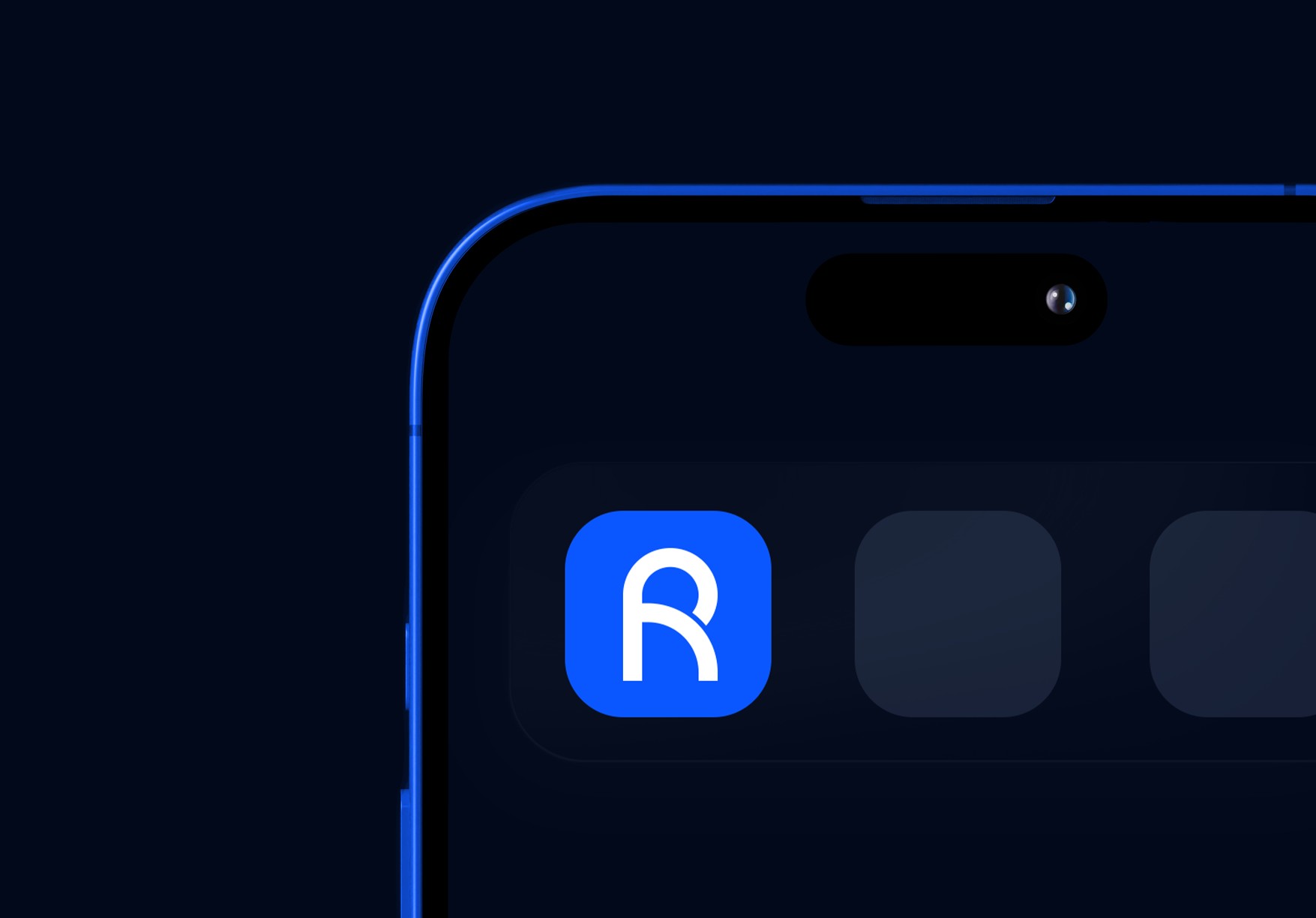
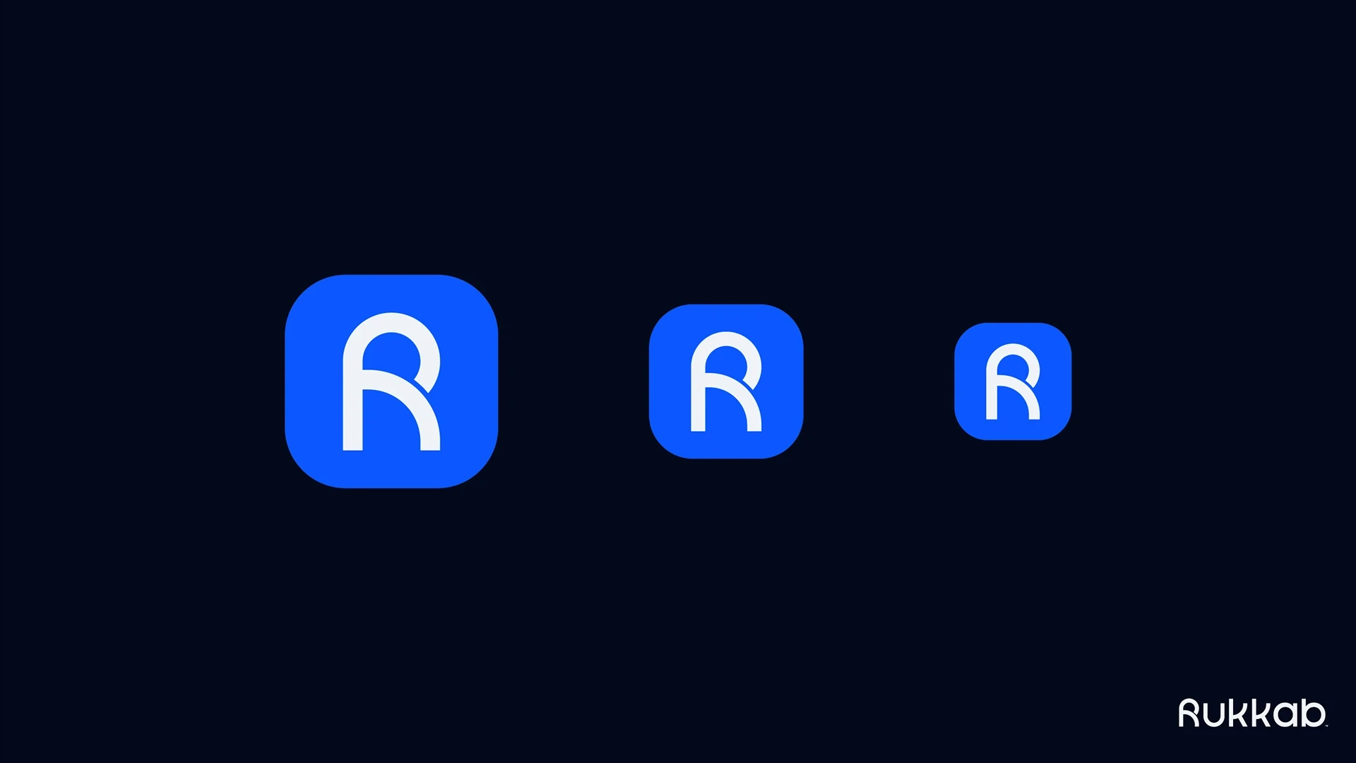
Shrink it to the size of an app icon or a social media profile picture. If the details disappear or it turns into a blur, it’s too complex. Rukkab’s R symbol was built to stay clear at three app icon sizes. See the full Rukkab case study. Here’s how to run the size test step by step.
2. The one-color test
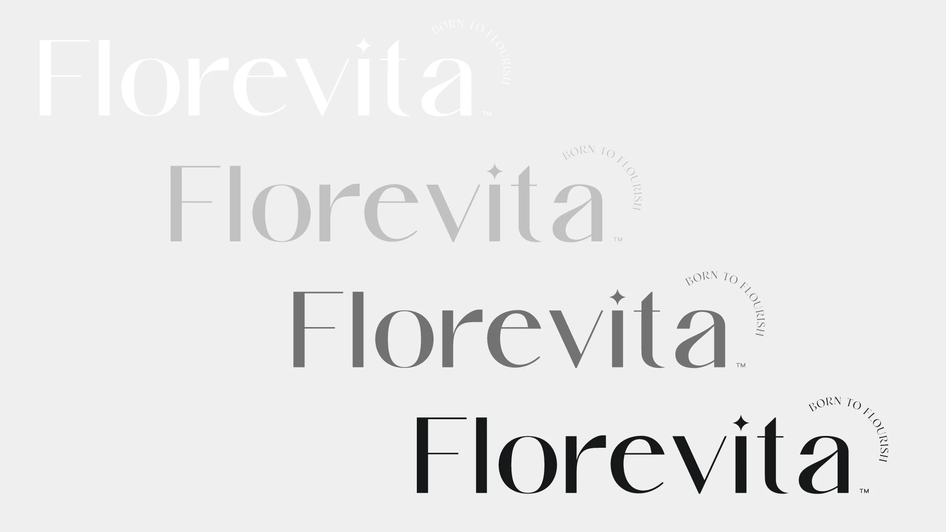
Print it in black only, then in white on a dark background. A strong logo doesn’t depend on gradients, shadows or a specific color to be recognized. Florevita’s wordmark works in white, light gray, dark gray and black. See the full Florevita case study.
3. The squint test
Look at it from across the room, or squint. You should still see its overall shape. That silhouette is what people remember after a quick glance.
4. The meaning test
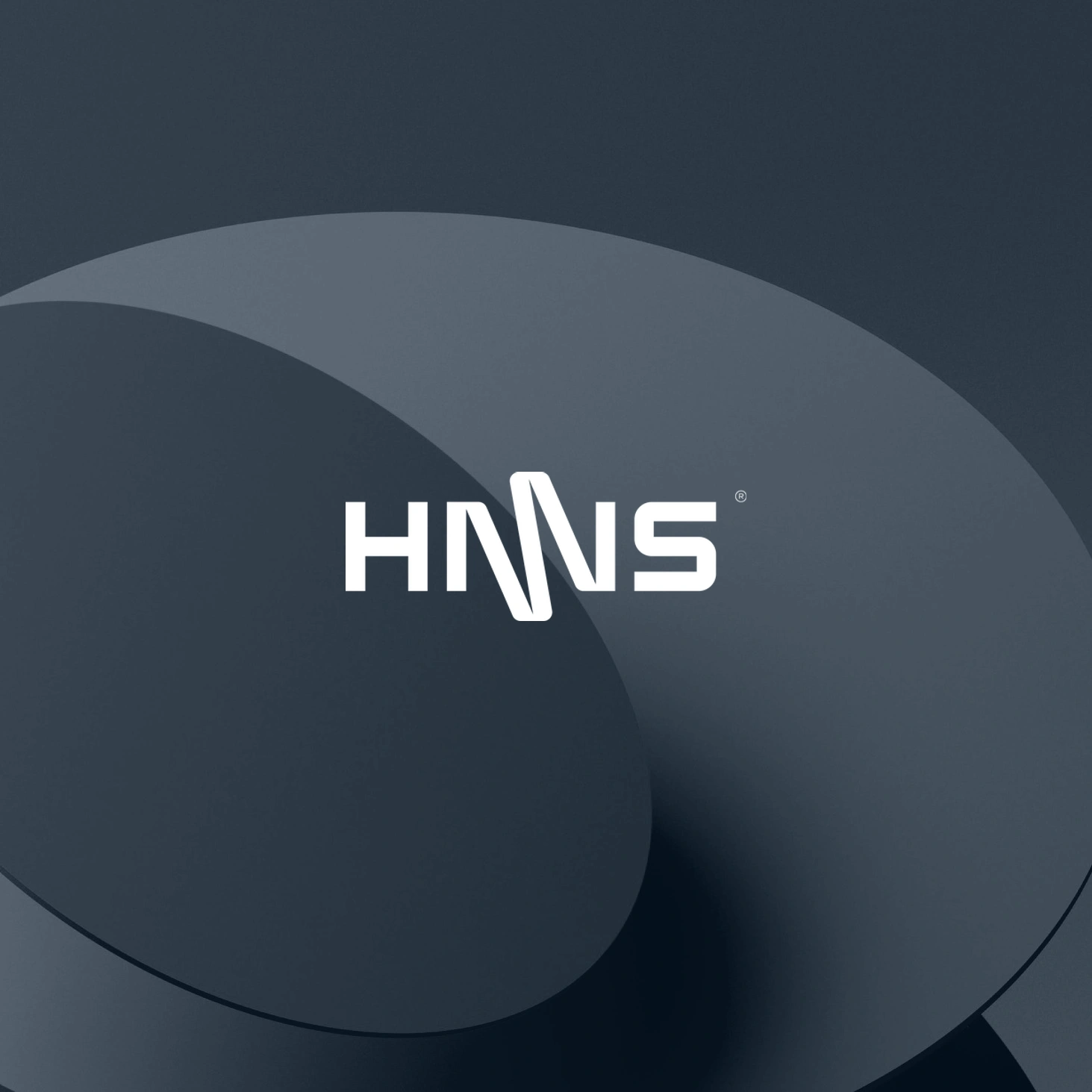
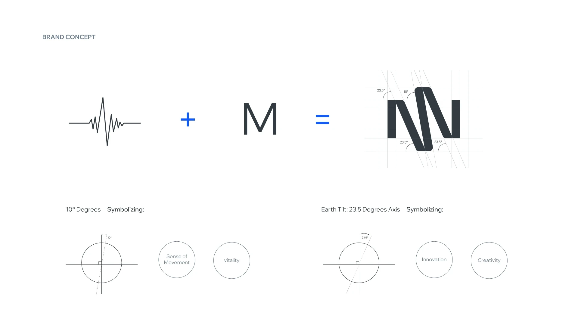
Ask why it looks the way it does. A good logo has a reason behind its form that connects to the business, even if customers never hear the story. HMS, a digital health brand, combines a heartbeat line with the letter M. See the full HMS case study.
5. The competitor test
Place it next to the logos of your five closest competitors. If it blends in, it won’t help people remember you. Distinctive doesn’t mean loud; it means different from what surrounds it.
6. The time test
Avoid effects that date quickly. Trendy gradients, fashionable fonts and complex illustrations often look old within a few years. Simple geometry and careful proportions last much longer.
7. The system test
A logo rarely works alone. Check that it has the versions you need, such as a full logo, a wordmark and an icon, and that it fits with your colors, typography and patterns. Here’s what a complete brand identity includes.
What about the “rules” you read online?
You’ll find lists of the “5 elements” or the “golden rule” of logo design. They’re useful reminders, but none of them replaces a clear brand idea. A logo can pass every test and still be wrong if it expresses the wrong thing, which is why strategy comes first.