Equal letter spacing looks wrong because our eyes don’t judge the distance between letters. They judge the area of empty space between them. Letters like A, V, T and L have open or angled sides, so an equal gap next to them looks much larger than the same gap between two straight letters.
See the hole?
In the top version of the word below, every gap between the letters is exactly the same. But the space between A and V looks like a hole, and the word seems to split in two. In the bottom version, the gaps are all different, and yet the word looks evenly spaced.
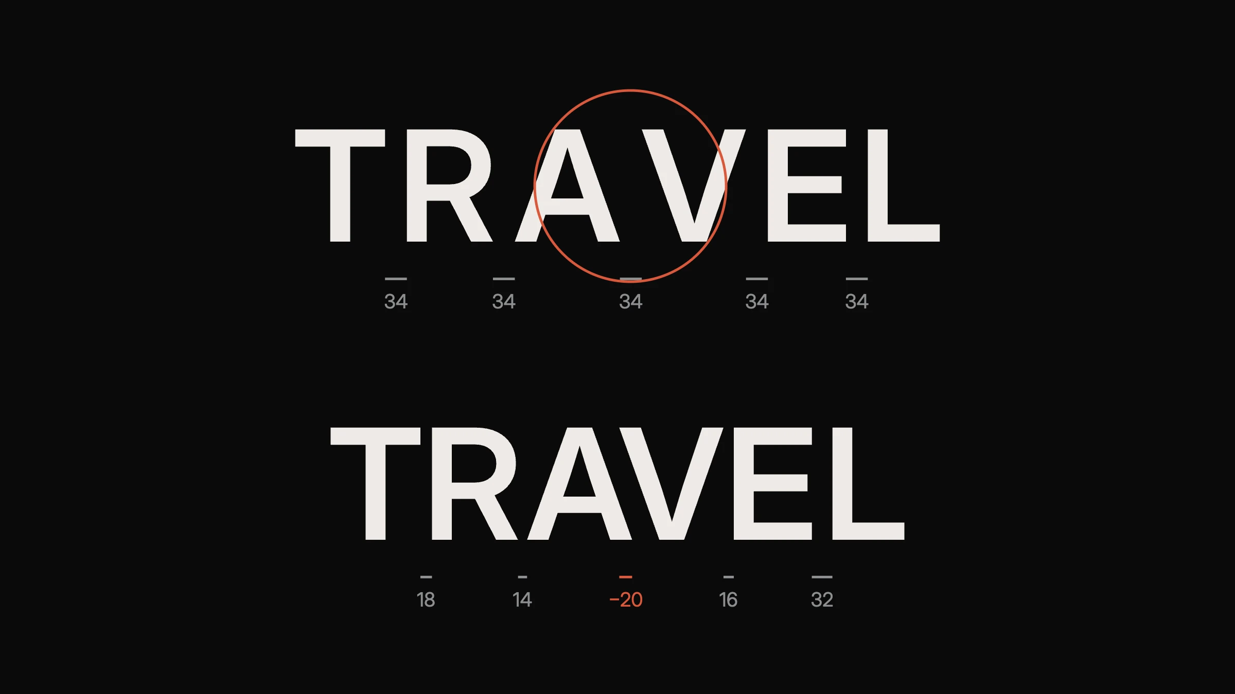
In the corrected version, the A and V even overlap slightly, shown by the negative number. Nobody notices, because the eye reads the word as balanced.
Is kerning the same as letter spacing?
No. Letter spacing, also called tracking, changes the space between all the letters in a word or line by the same amount. Kerning adjusts the space between one specific pair of letters, such as A and V, to fix how they look together.
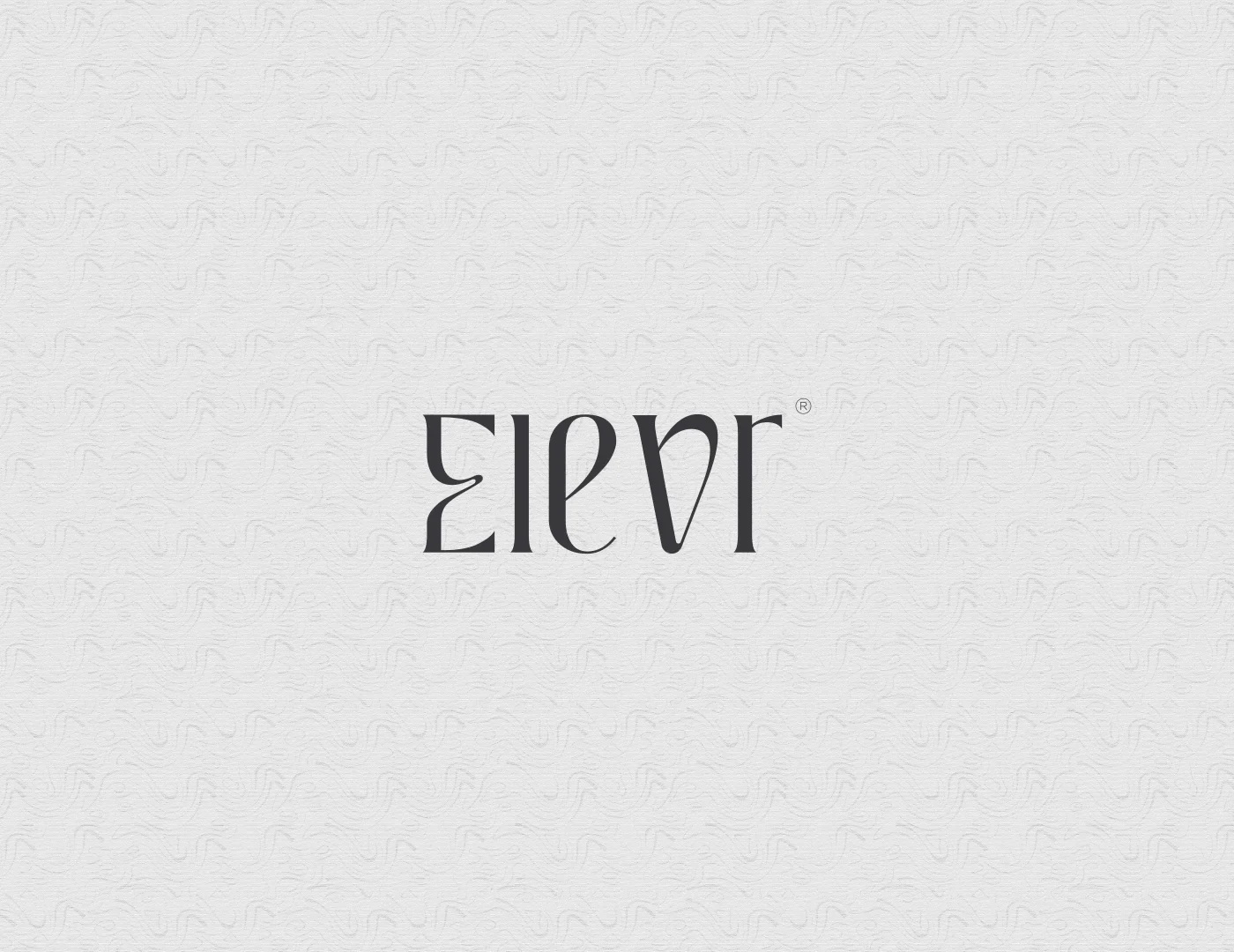
Fonts come with built-in kerning for common pairs, and that’s usually enough for body text. A logo is different. It’s seen large, it’s seen constantly, and its letters are often customized, so every pair is adjusted by hand.
The rules designers use to kern a logo
Space by area, not distance. Aim for roughly the same amount of empty space between each pair of letters, not the same measurement.
Start with the hardest pairs. Combinations like AV, LT, TA and VA create the biggest gaps, so fix them first and space the rest around them.
Use straight letters as your reference. The space between two straight letters, like H and I, sets the rhythm the other pairs should match.
Turn it upside down. Flipping the logo stops you from reading the word, so you see only shapes and spaces.
Blur or squint. Gaps and dark clusters stand out when the details disappear.
Check it at every size. Spacing that looks right large can feel tight when the logo is small, so test it where it will actually be used.
Why this matters for your brand
Uneven spacing is one of the clearest signs of an unfinished logo. Most people can’t name the problem, but they feel it. The logo looks slightly cheap or unbalanced, and that impression transfers to the business.
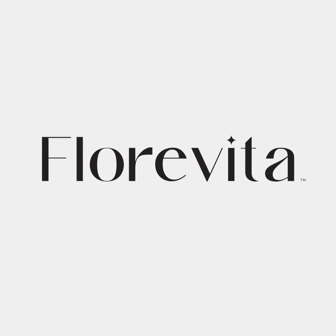
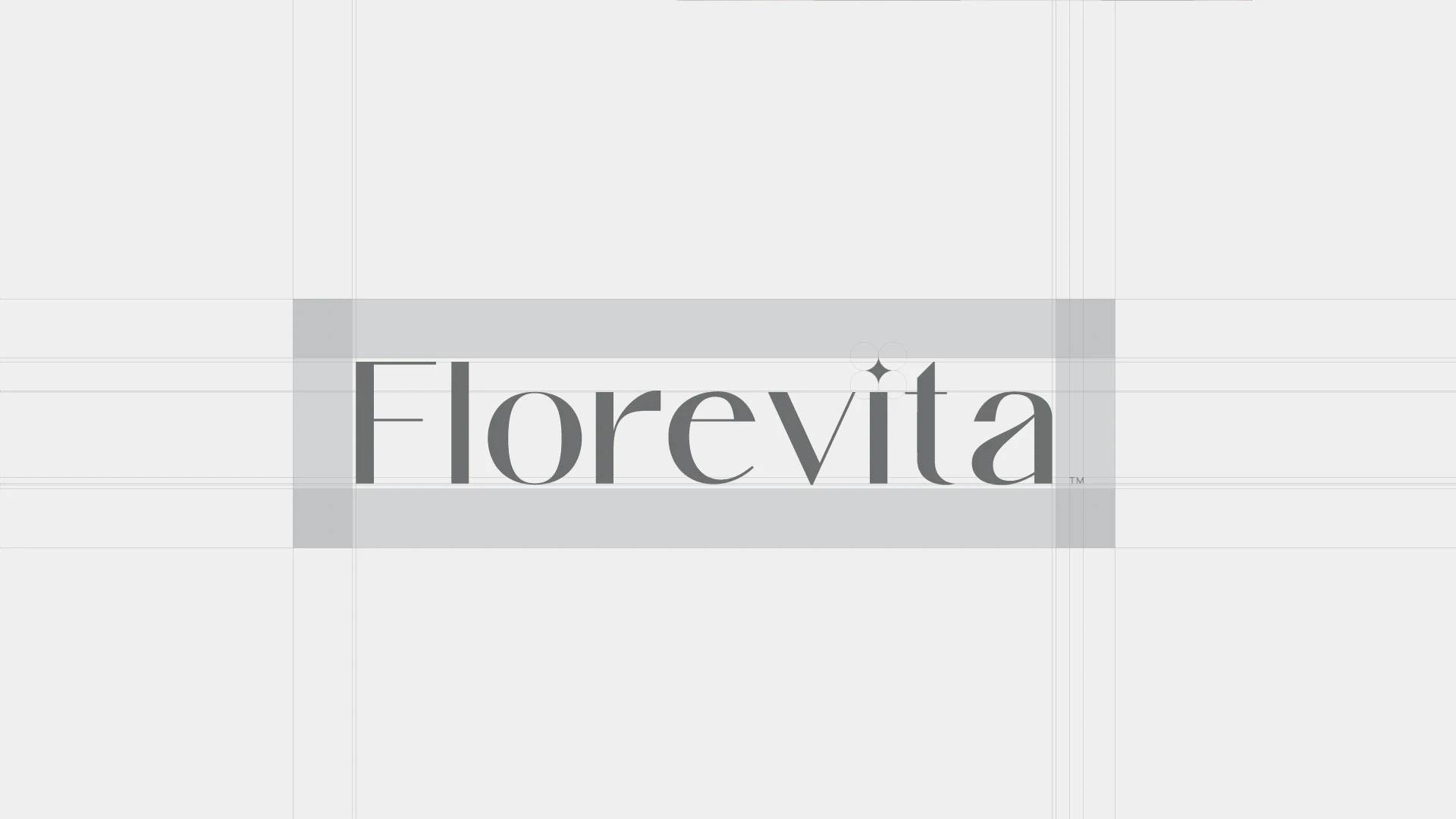
That’s why careful wordmarks are built on construction grids and then refined by eye. Florevita’s wordmark, for example, was drawn on a grid that sets its letter proportions and alignment. See the full Florevita case study.
Now you’ll see it everywhere
Once you notice uneven spacing, you’ll see it on signs, menus and packaging all around you. It’s a small detail, but in a logo, small details separate a design that feels finished from one that doesn’t. Read the seven tests every logo should pass.