Brand positioning is the one idea that makes a brand the obvious choice for a specific audience. The clearest way to understand it is through examples, so here are five brands from our own projects, the position each one owns, and how that idea shaped the design.
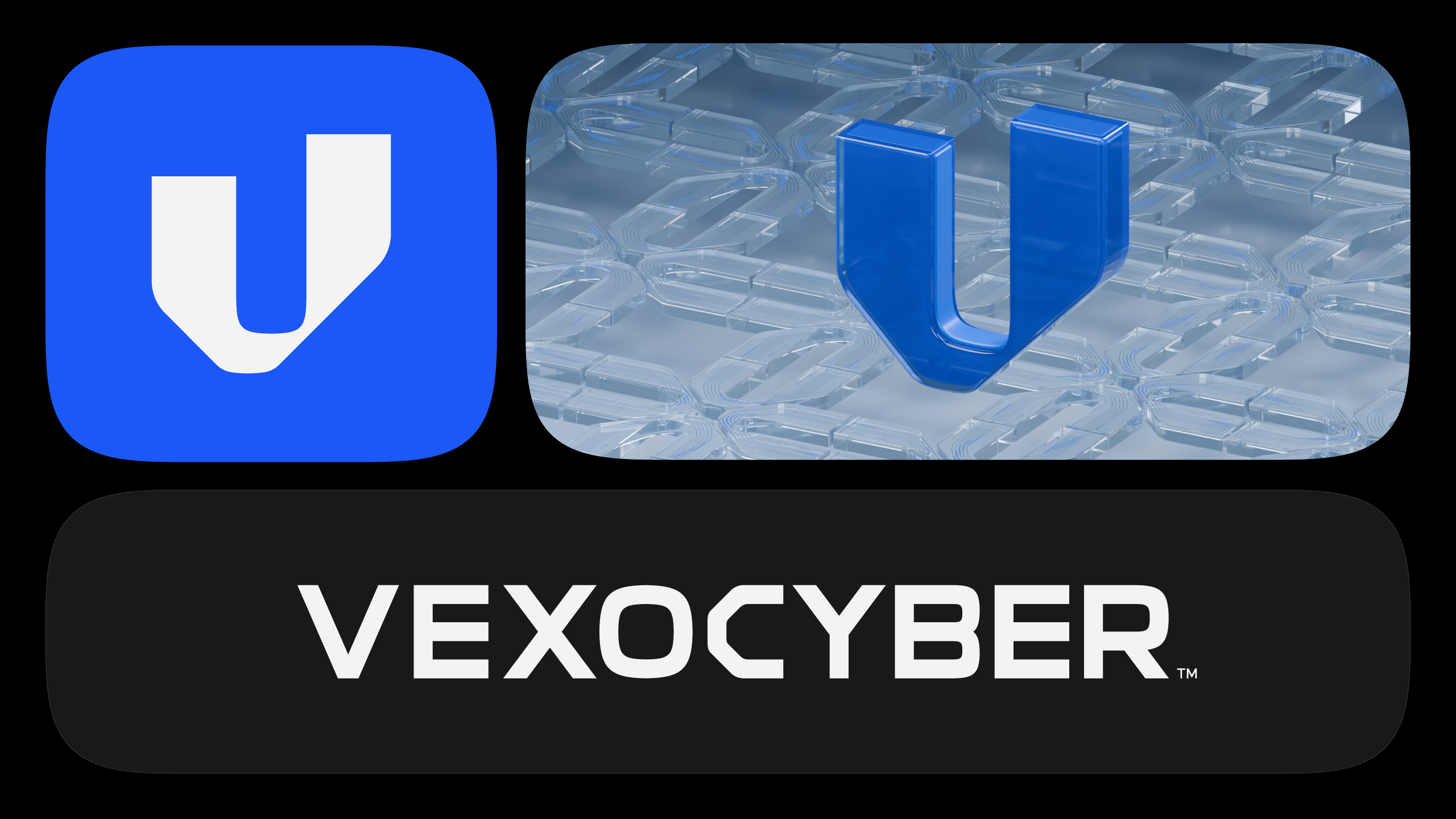
1. VexoCyber: cybersecurity for law firms
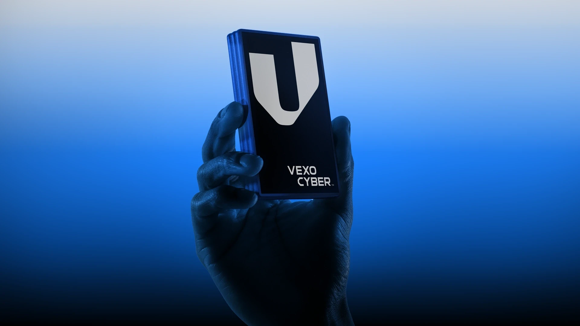
The position: Cybersecurity built for Australian law firms, which hold privileged correspondence, case files and evidence for their clients.
How it shaped the design: Competitors used shields and locks, which said nothing about whom they served. VexoCyber’s symbol draws on the scales of justice, tilted toward protection. The campaign line gives each side a role: “You defend justice. We defend you.” See the full VexoCyber case study.
2. The Black Lumi: Bahraini flavor in London
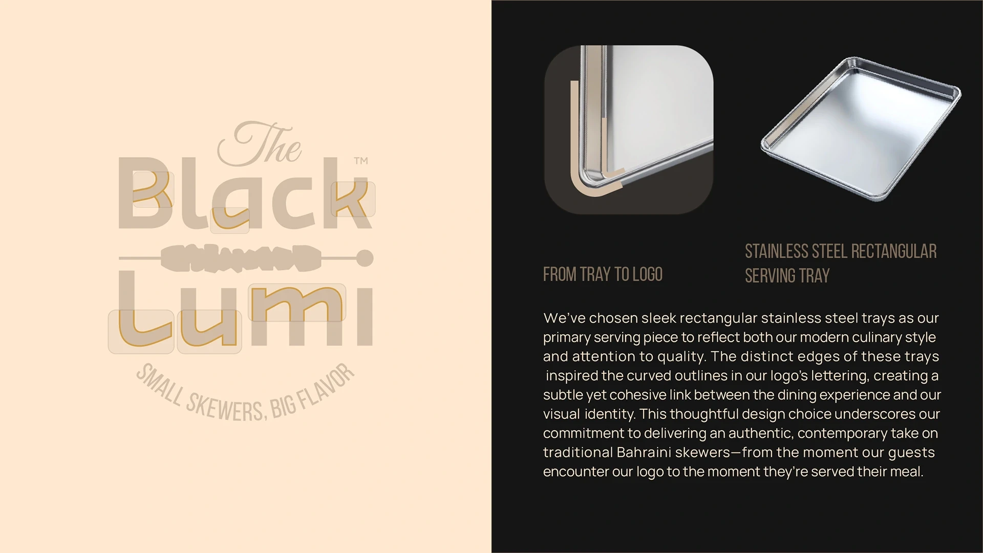
The position: A contemporary London restaurant that brings Bahraini suwaihat and Middle Eastern flavors to a new audience.
How it shaped the design: The serving tray and skewers informed the logo’s structure, and a warm palette with condensed typography connects the restaurant’s roots with its London setting. See the full case study for The Black Lumi.
3. Rukkab: ride-sharing families can trust
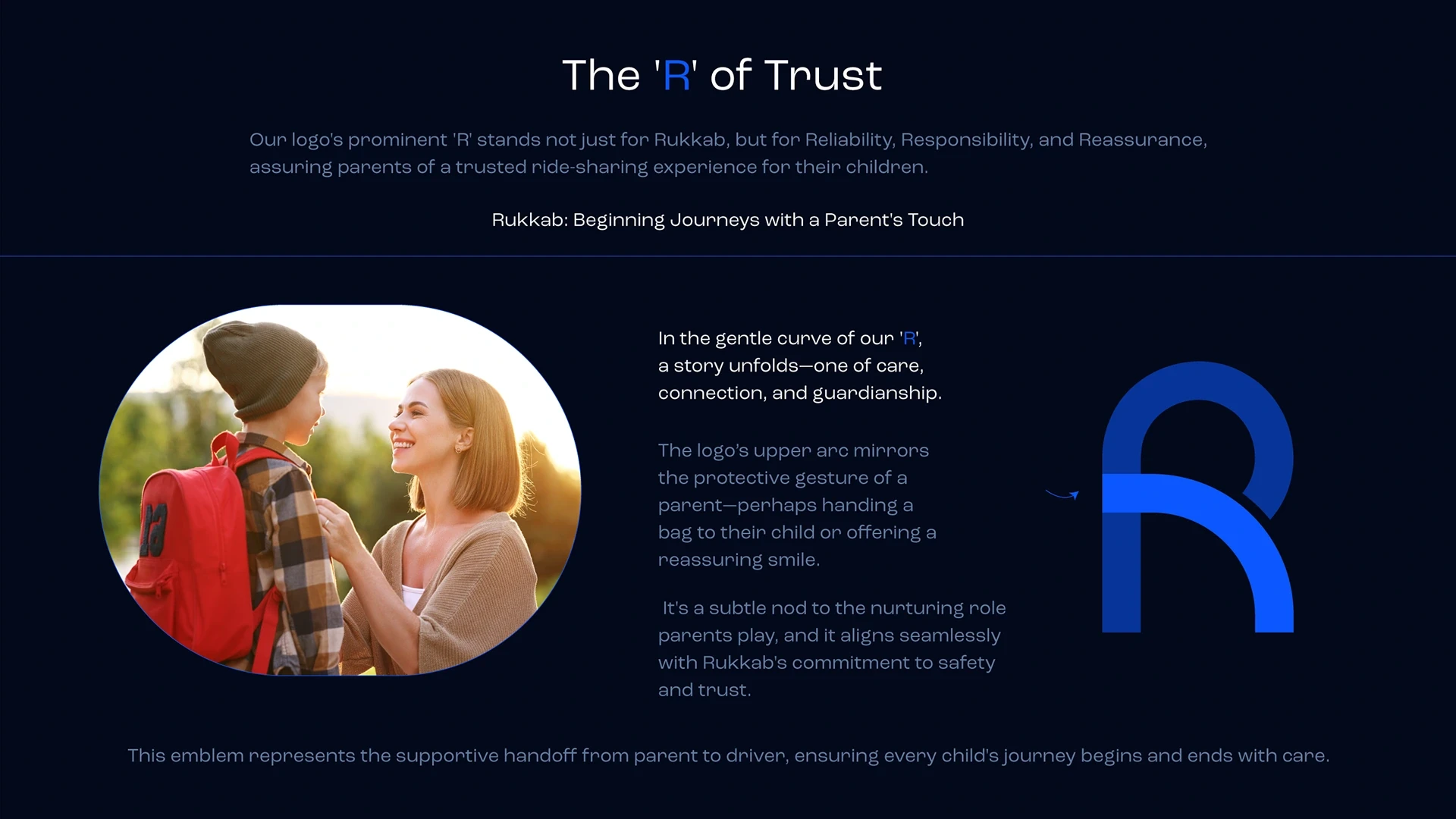
The position: A Bahrain-based ride-sharing service connecting families with trusted drivers, starting with children’s transportation.
How it shaped the design: The symbol brings the driver and passenger into a single shape, and an approachable visual system keeps the app clear and friendly. See the full Rukkab case study.
4. HMS: accessible health monitoring
The position: Digital health and wearable technology focused on accessible, reliable health monitoring, with the character of a caregiver.
How it shaped the design: The symbol combines a heartbeat with the letter M, and a shared structure connects the English and Arabic wordmarks. See the full HMS case study.
5. ELEVR: fashion for modern Saudi youth
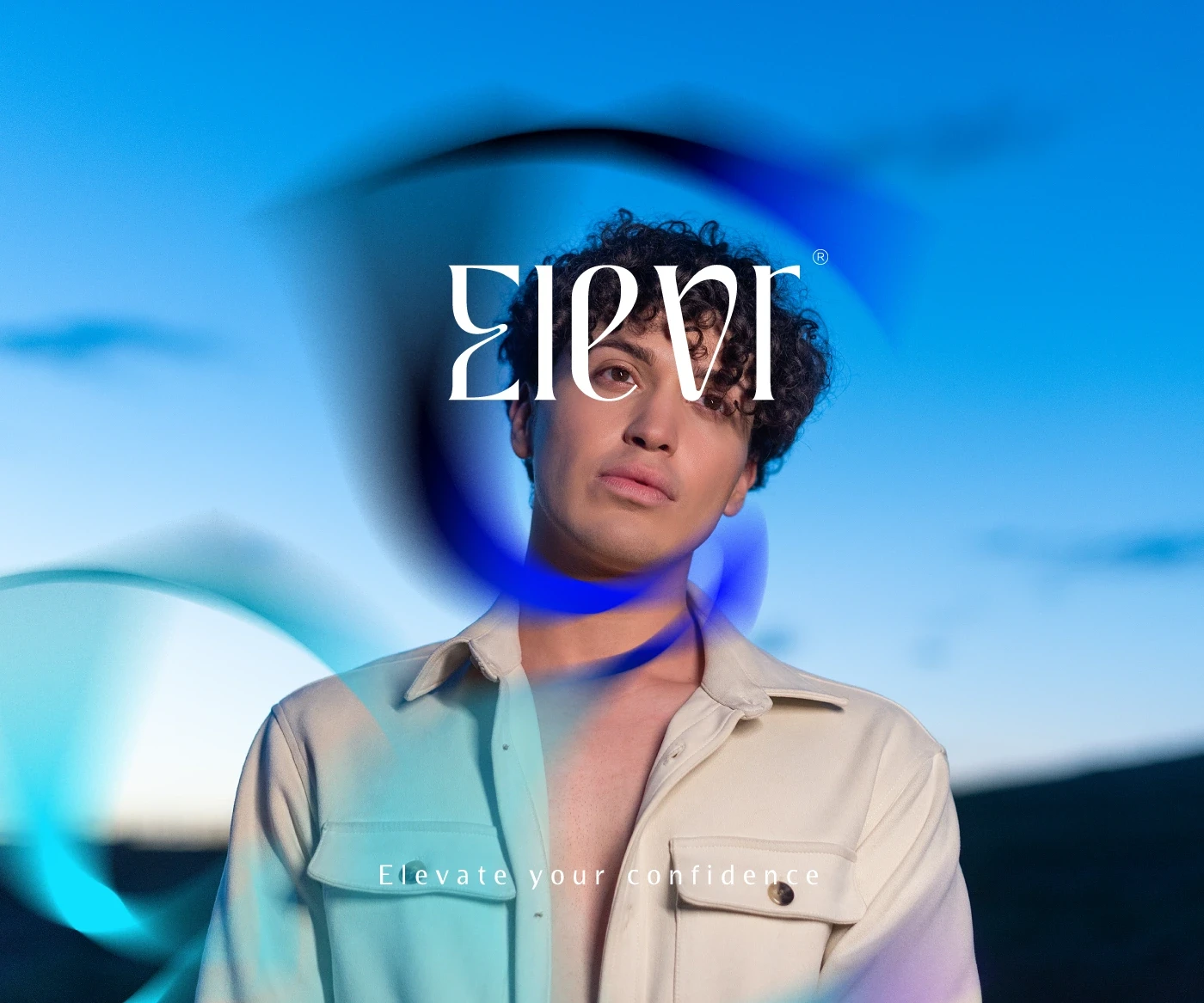
The position: Contemporary everyday fashion for modern Saudi youth, balancing heritage and modernity.
How it shaped the design: A refined wordmark pairs with fluid, dimensional forms across campaigns, packaging and clothing. See the full ELEVR case study.
What these examples have in common
Each position names a specific audience, not everyone. Each one is something competitors can’t easily claim. And each one gave the design a clear starting point, so the logo, colors and imagery all express the same idea.