A strong bilingual identity is designed in both languages from the start, not translated at the end. That means a name that works in Arabic and English, matching wordmarks built on the same structure, typefaces with a similar weight and personality, and layouts that work from right to left as well as left to right.
1. Start with the name
Test how the name sounds, reads and is spelled in both languages. Check its meaning, any unintended associations, and domain and social availability in each market.
2. Design the wordmarks together
The Arabic and English wordmarks should feel like siblings: similar proportions, stroke weight and character. For HMS, a digital health brand, the same pulse-inspired structure connects both wordmarks. For Rukkab, the Arabic wordmark follows the same visual direction as its English counterpart within one shared system.
3. Pair the typography carefully
Choose Arabic and Latin typefaces that match in weight, contrast and mood. A geometric English font paired with a traditional calligraphic Arabic font will feel like two different brands.
4. Plan for direction
Arabic reads right to left. Layouts, icons and arrows may need to flip. Design templates for both directions so your team isn’t guessing.
5. Keep one voice in two languages
Translate meaning, not words. Your tagline may need a different phrase in Arabic to carry the same feeling.
Why it matters in the Gulf
Across Saudi Arabia, the UAE, Bahrain and Kuwait, customers move between Arabic and English every day. A brand that feels natural in both builds trust faster with both audiences.
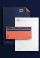
We’ve designed bilingual identities for brands across the Gulf, including HMS, Rukkab, Riyadh Academy, Al Yousif Al Saeed and Saksooka. Tell us about yours.